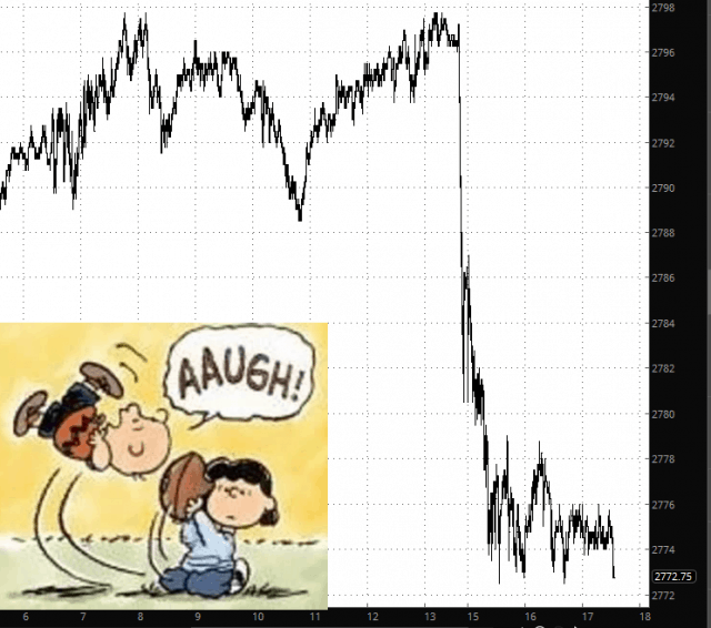
Well, surely you heard the news that Trump has ratcheted up the Chinese Trade War again:
Slope of Hope Blog Posts
Slope initially began as a blog, so this is where most of the website’s content resides. Here we have tens of thousands of posts dating back over a decade. These are listed in reverse chronological order. Click on any category icon below to see posts tagged with that particular subject, or click on a word in the category cloud on the right side of the screen for more specific choices.
10th Year U.S. Bull Market Run vs. ‘Summer Swoon’
Further to my post of March 10, we may be seeing the beginnings of a 10th year bull run, inasmuch as volatility of the SPX, NDX, and RUT has been attempting to stabilize recently.
However, this attempt is not yet a slam dunk. As noted on the following daily ratio charts of the SPX:VIX, NDX:VXN, and RUT:RVX, I’m still waiting for:
SPX:VIX ratio: a bullish crossover of the 50 MA above the 200 MA to form a Golden Cross
NDX:VXN ratio: a bullish crossover of the PMO technical indicator
RUT:RVX ratio: a bullish crossover of the PMO technical indicator
All other technical indicators must continue to hold their present bullish formations, and price needs to hold above their respective major support levels, namely: (more…)
Smart Earnings Page
I am very pleased to let everyone know of a new feature we’ve rolled out (in “alpha” form). You can select it here under the PLUS menu. For a while, I’m going to let everyone have access to it.
Falter or Halter?
I was briefly looking at some charts on a non-SlopeCharts platform, and a trendline I had drawn looked like the item below. As you can see, now the trendline was magically ripped away from the anchor points. This would NEVER happen on SlopeCharts. So I wanted to take this opportunity to again suggest, nay insist, you give SlopeCharts a try if you haven’t already. It’s free, it’s fantastic, and it’s getting better every week.


