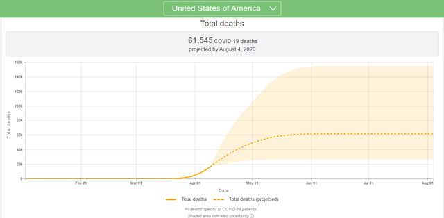
Screen capture via the Institute for Health Metrics and Evaluation.
The Virus
In a Slope post last week (Maybe COVID-19 Won’t Be That Bad), I wrote that the impact of the virus in terms of deaths and strain on American hospitals looked like it might be less than what was feared. Developments over the last week have supported that view. The Institute for Health Metrics and Evaluation at the University of Washington further lowered its estimate of U.S. COVID-19 deaths from about 82,000 to about 62,000 by August.
Similarly, it now looks like we’re on track for about 27,000 deaths by April 15th, rather than 37,000. And, as you can see in the screen capture above, as of Sunday night, the growth in the number of deaths and the number of new cases were both in the single digits, while the growth in patients recovered from the virus was above 30%, all hopeful signs that we may be past the peak of the virus. The economic news will likely get a lot worse though.
The Economy
No economic downturn in America since the Great Depression has been called a depression, but if an economic decline of 10% counts as a depression, and J.P. Morgan predicts a 40% decline in GDP in the second quarter, it’s hard to see how this isn’t a depression. Economist Justin Wolfers estimated earlier this month that we’re already at 13% unemployment, which would be the highest unemployment rate since the Great Depression. Wolfers said unemployment could be rising at half a percent per day, which would be consistent with St. Louis Fed President James Bullard’s prediction last month that it might hit 30%.
The Market And Your Security Selection Method
The market continued its climb from its March low last week, prompting this tweet from New York Congresswoman Alexandria Ocasio-Cortez.
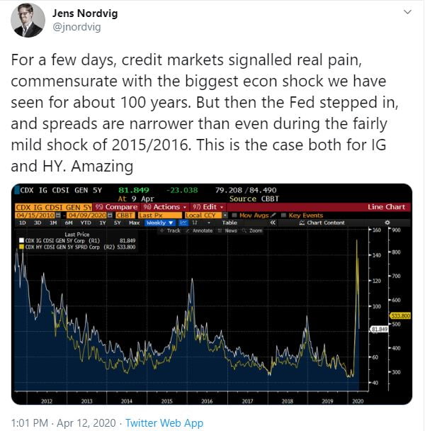
One question that remains is to what extent the trillions in monetary and fiscal stimulus will cushion the economic contraction. Another is to what extent the Fed will intervene by supporting different asset classes, as it has so far with both investment grade and high yield corporate bonds.
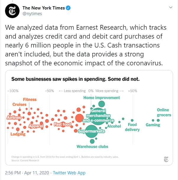
A third question is which companies will benefit in the near term, and as the economy recovers. The New York Times published an analysis of consumer spending data over the weekend that showed some things you’d expect, such as a big increase in groceries.
The boost in gaming threw me off initially, as I thought they were referring to gambling, which presumably has taken a hit with sports leagues shutdown, but in a subsequent tweet they elaborated that they meant video game streaming services.
Of course, I don’t have the answer to these questions, and neither does Portfolio Armor. But it has continued to navigate the market fairly well with its security selection since early March.
Portfolio Armor’s Approach
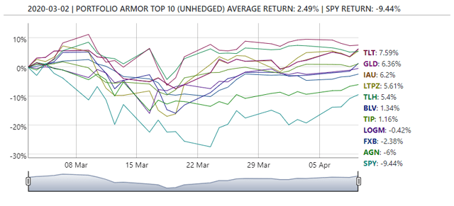
Last week, I mentioned that Portfolio Armor‘s approach since the beginning of March had been to shift away from stocks, and that its top ten names from March 2nd only included two stocks, Allergan (AGN) and LogMeIn (LOGM). That calls for an update and an elaboration. First, the update: the top names cohort from March 2nd continued to outperform versus the SPDR S&P 500 ETF (SPY) last week.
And the most recent top ten cohort, from April 9th, continued the trend away from stocks, with only 8 of the 10 names being stocks (albeit different ones).
The elaboration that’s in order is this: the performance above is the result of a change we made to Portfolio Armor’s security selection method last November. I detailed the change at the time, but, in a nutshell, we gave preference to names that were less risky, as measured by the possibility of hedging them against small declines with optimal puts. So, for example, in the March 2nd top ten cohort above, each of those names was hedgeable against a >6% decline over the next several months with optimal puts (i.e., the cost of hedging them against a >6% decline over that time frame was lower than 6% of position value).
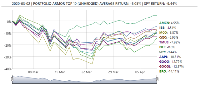
We still run the old security selection method for tracking purposes, and, in contrast, of the March 2nd cohort selected the old way, none were hedgeable against >6% declines. You can see their performance so far below.
As you can see, the top names calculated the old way were down about 8.05%, versus SPY, which was down 9.44%, and the top names calculated the new way, which were up 2.49% over the same time frame.
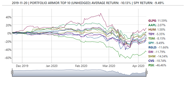
The earliest date for which we have preliminary performance data for top ten names cohorts calculated both ways is November 20th of last year, when we implemented the change. Here’s how the top names calculated the old way have done since.
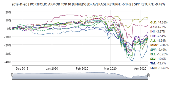
And here’s how the top names calculated the new way have done so far.
Not only have the top names calculated the new way done better so far, but the worst performer in the new method cohort, Equity Residential (EQR), is down less than half as much as the worst performer in the old method cohort, Phillips 66 (PSX).
Something to consider when you look at the 6-month returns of Portfolio Armor’s top names as they come in: you won’t see the impact of the change in its security selection method until May 20th, when the first cohort selected the new way hits the 6 month mark.


