Part of Jim Greco’s meme tweet mocking haters of Cathie Wood, portfolio manager of the Ark Innovation ETF (ARKK).
(more…)Slope initially began as a blog, so this is where most of the website’s content resides. Here we have tens of thousands of posts dating back over a decade. These are listed in reverse chronological order. Click on any category icon below to see posts tagged with that particular subject, or click on a word in the category cloud on the right side of the screen for more specific choices.
Part of Jim Greco’s meme tweet mocking haters of Cathie Wood, portfolio manager of the Ark Innovation ETF (ARKK).
(more…)I have two very exciting new features in SlopeCharts to tell you about.
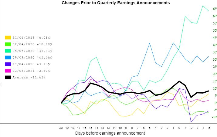
The first was a relatively recent request by a user who wanted the Price Change Charts to have selectable earnings periods. Formerly, when you created one of these charts, it showed you every quarterly earning chart.
Now, you can pick and choose which ones you want to display or hide simply by clicking on any of the specific colors in the key. I have deliberately chosen a stock with a relatively small number of these lines for illustrative purposes, but this would work just as well with a chart that has dozens and dozens of lines):
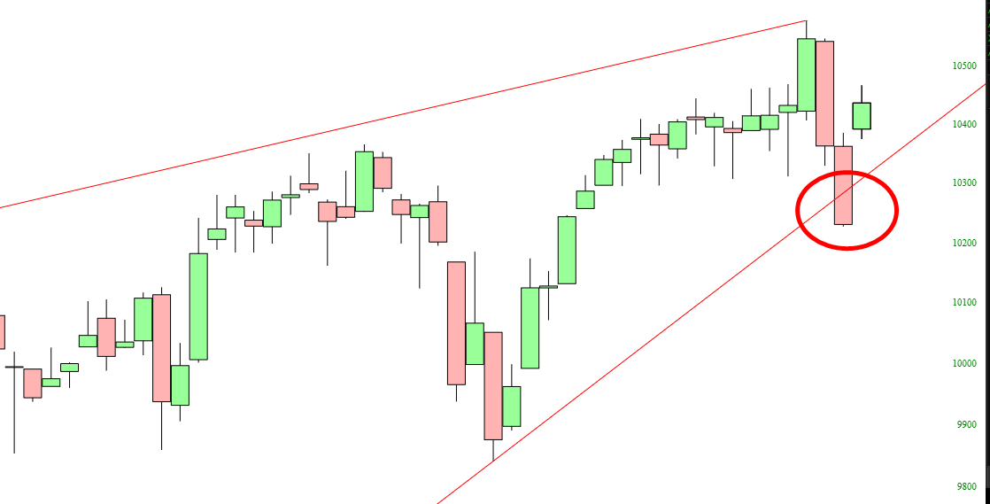
With the giant reversal taking place today, let’s take a fresh look at some important indexes, in alphabetical order.
First is the $COMP, the Dow Jones Composite. This cracked through its trendline on Friday, but it has sprung right back above it. We’ll see if the damage done last week actually signals anything, or if this was just a one-day anomaly. My view is that the trendline break is meaningful.
Gauging the right time to enter a trade is always a key concern.
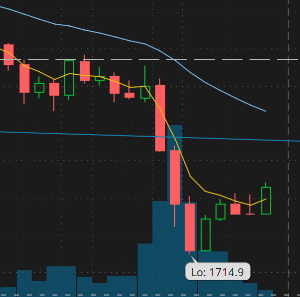
With the metals markets, I portend the right time is now [or very near].
As one way to illustrate Timing, here are two snapshots from Friday’s Think or Swim chart of /GC. The first chart is a 1-hour timeframe, the second is a 5-minute timeframe.