
I have two very exciting new features in SlopeCharts to tell you about.
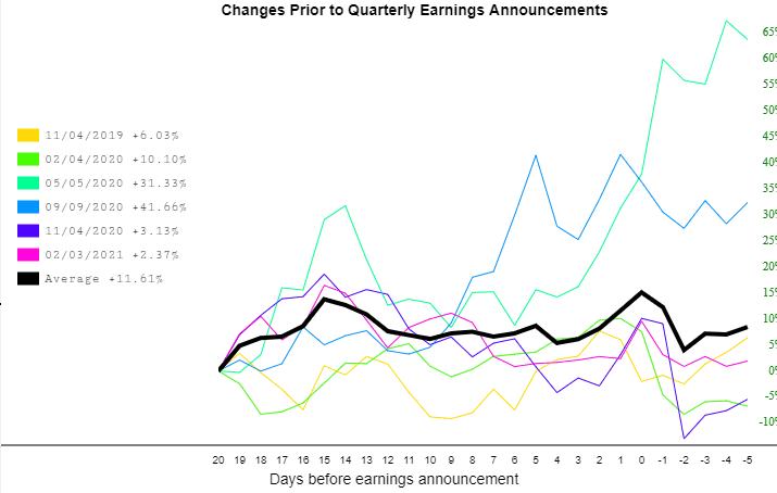
The first was a relatively recent request by a user who wanted the Price Change Charts to have selectable earnings periods. Formerly, when you created one of these charts, it showed you every quarterly earning chart.
Now, you can pick and choose which ones you want to display or hide simply by clicking on any of the specific colors in the key. I have deliberately chosen a stock with a relatively small number of these lines for illustrative purposes, but this would work just as well with a chart that has dozens and dozens of lines):
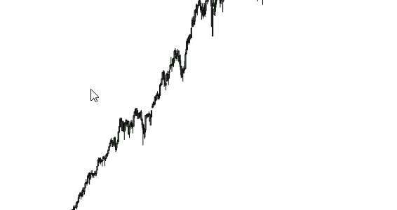
This next one was requested a year ago (which feels like, oh, about fifteen years ago): the ability to rotate a drawn object.
At the moment, it only works with the rectangle, but here’s how it works: you draw the rectangle just like you normally would. When you finish drawing it, however, you will notice two new “dots”.
The two dots on the rectangle are the ones you know already, because they let you change the shape of the rectangle. The two new dots let you do something you’ve never been able to do before:
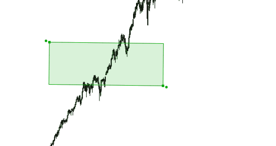
Voila! Pretty spiffy, eh?
Now I know Slopers well enough to know that if I give them “A” their instant response is, “Cool! Now give me B!” But it took me a year of prodding to get this much done, so please be patient and enjoy what we’ve just rolled out.
