Let’s get back to the basics.
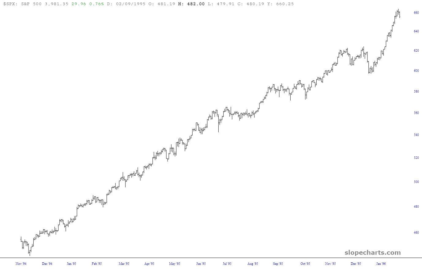
The chart below is a bull market. It happens to be the S&P from the year 1995, which was an incredibly steady, smooth, ascending-all-the-time market.
Slope initially began as a blog, so this is where most of the website’s content resides. Here we have tens of thousands of posts dating back over a decade. These are listed in reverse chronological order. Click on any category icon below to see posts tagged with that particular subject, or click on a word in the category cloud on the right side of the screen for more specific choices.
Let’s get back to the basics.
The chart below is a bull market. It happens to be the S&P from the year 1995, which was an incredibly steady, smooth, ascending-all-the-time market.
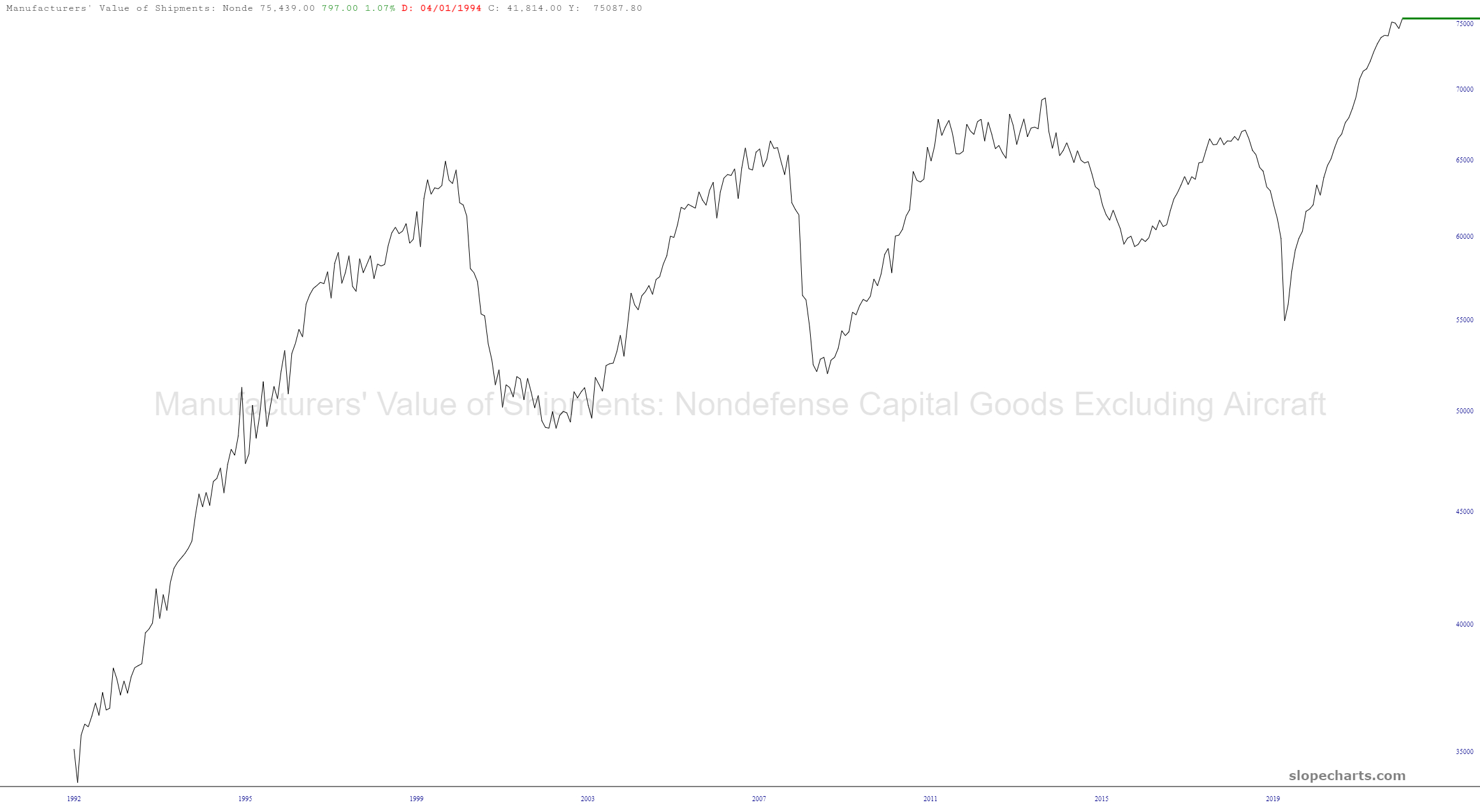
I wanted to share a few relatively up-to-date long-term economics charts. First is the value of manufactured goods. Looks pretty cyclic, doesn’t it? Also looks like a major peak, doesn’t it? Yeah, that’s what I see too.
We projected a rally to run from Q4, 2022 to or through Q1, 2023. It is technically intact with the Gold/Copper ratio trending down since last summer. What’s more, the global market rally has been led by Doctor Copper and companies that dig Cu out of the ground. So the Gold/Copper ratio has trended down the whole way, even as gold has ground out uptrends vs. some other commodities and stock markets.
(more…)