The first release of Virtual Trading is humming along smoothly, and as people are using the system, the data set is beginning to grow. This is where things get fun.
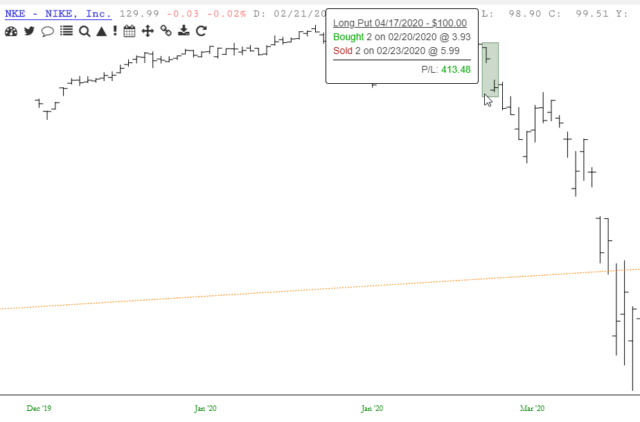
As more and more trade data is created, we get a witch’s brew of profits, losses, trading strategies, and other information that’s going to be a lot of fun to slice ‘n’ dice. It also gives one the opportunity in SlopeCharts to see their actual trades in the context of a chart (the example below shows how I made a profit on my NKE puts – – aren’t I smart??? – – only to close it out before the options went into oh-my-God-profitable mode.)