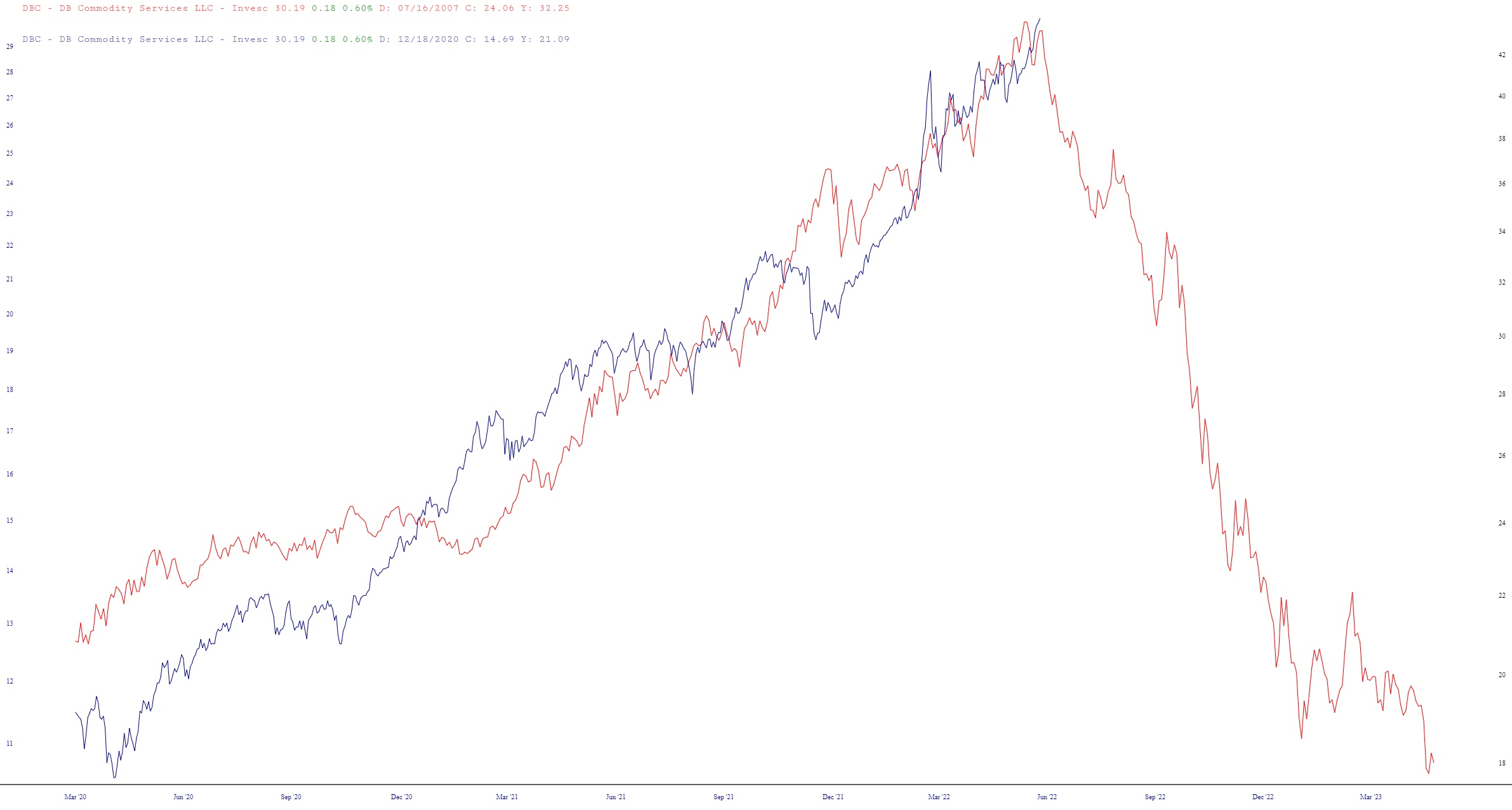
Bored as I was with the “markets”, I was thumbing through some layered charts, and I stumbled across this forgotten gem. Below is the DBC (the commodity ETF) in 2008 (red line) and today (blue line). It’s an interesting analog, for sure:

Bored as I was with the “markets”, I was thumbing through some layered charts, and I stumbled across this forgotten gem. Below is the DBC (the commodity ETF) in 2008 (red line) and today (blue line). It’s an interesting analog, for sure:
