
Bleach will get your stuff white.
Speaking of Clorox here, the company is a lot more than bleach. It boasts that “more than 80% of the company’s sales are generated from brands that hold the No.1 and No.2 market share positions in their category.”
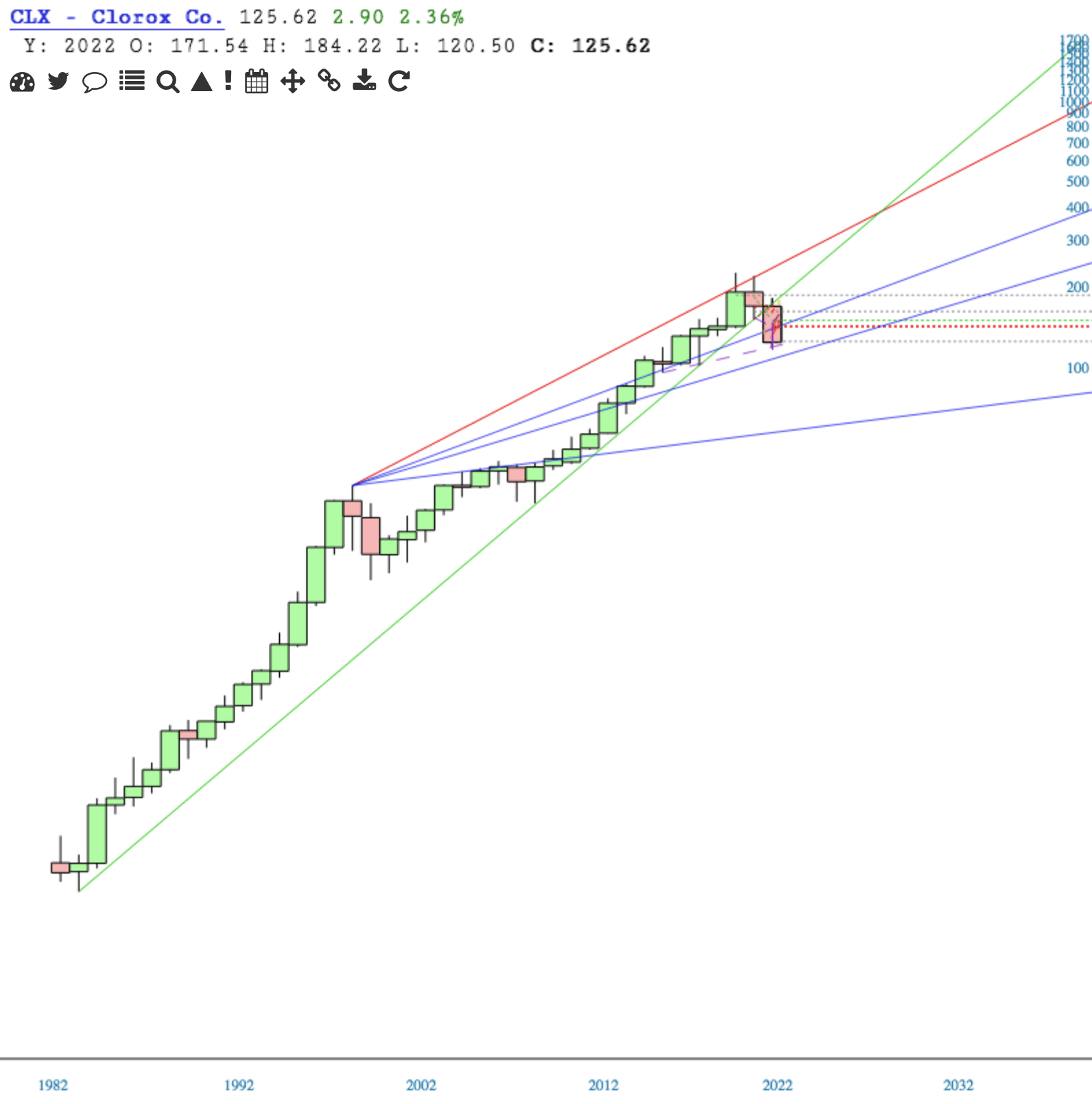
All well and good. And what the company has managed to do over many years has been good. Clorox has been a perma-riser since its beginning, with the exception of a bearish hiccup in 1999 that lasted about two years.
Reviewing its charts, CLX doesn’t look good. I think the 2022 outlook will give the 1999 hiccup a run for its money – and leave it in the dust.
We’ll look at the chart up close in a minute, but first, note that CLX has lost its long term uptrend support from 1984. That’s a big deal. With that fail, price dropped from 170 to 123, and in process, lost another long term line of support from the high of 1999. Another pretty big fail.
On the yearly chart, note the comparison of the 1999 hiccup to the current configuration.
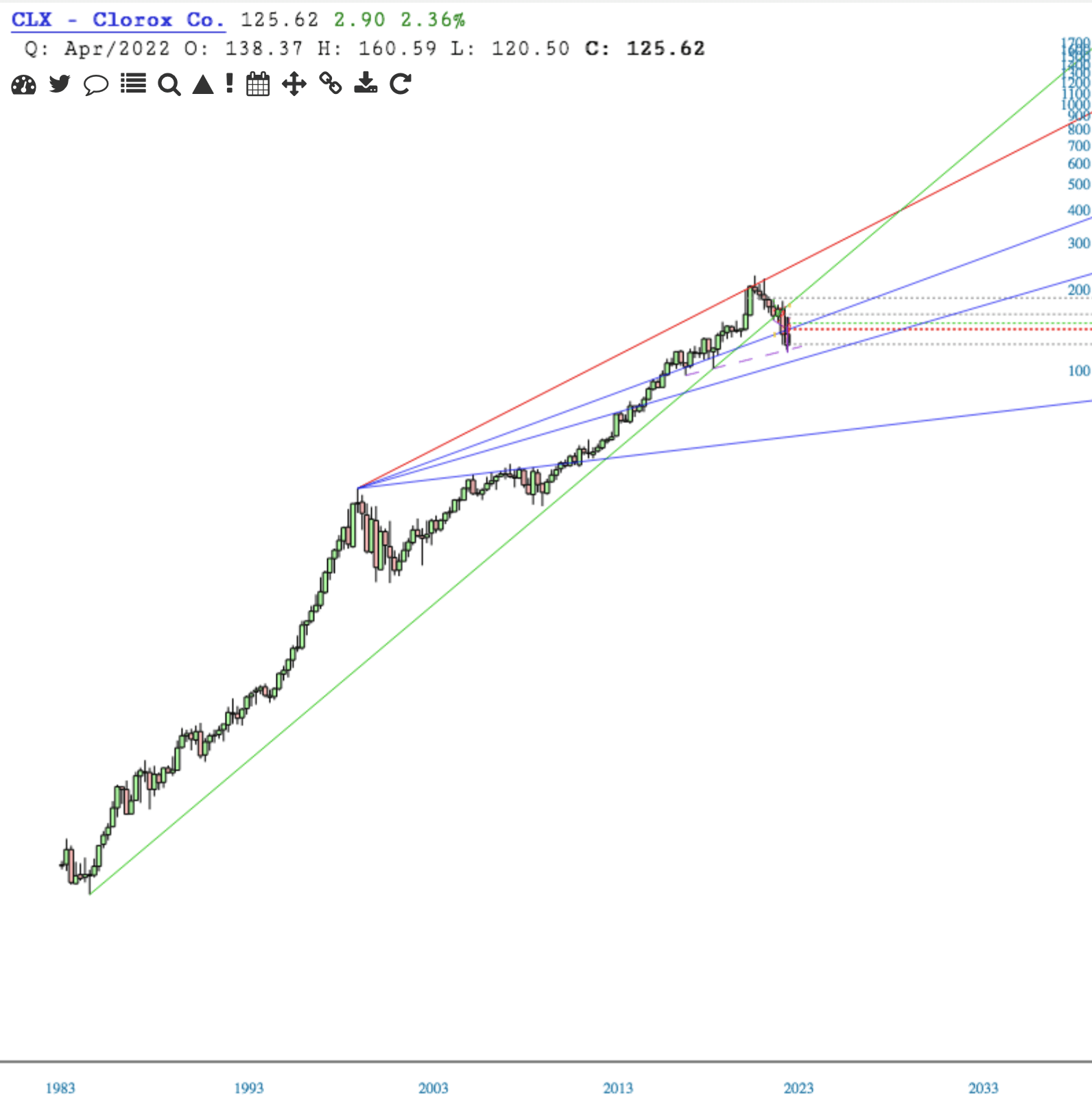
When I look at the quarterly chart, I think, geez-louise, this is drastic.
The monthly chart doesn’t look encouraging. However, I think price has found short term support, and that it warrants attention for a potential short term trade. Note the purple dashed support line.
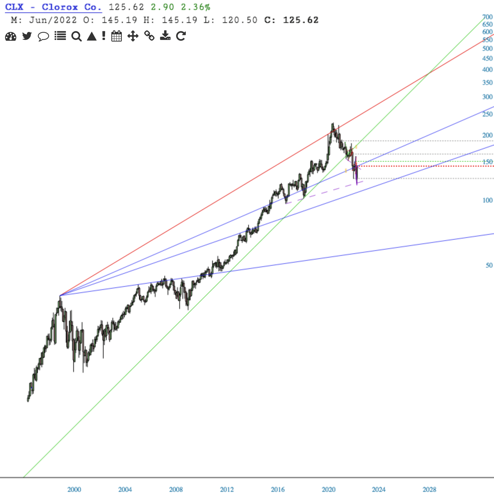
The extremity of the recent 3-week steady drop was such, that we may now be in a position to trade Clorox long. Short term, that is, until it meets resistance when I suspect it will again head lower.
The Daily chart shows a falling wedge, on support [recall the purple dash].
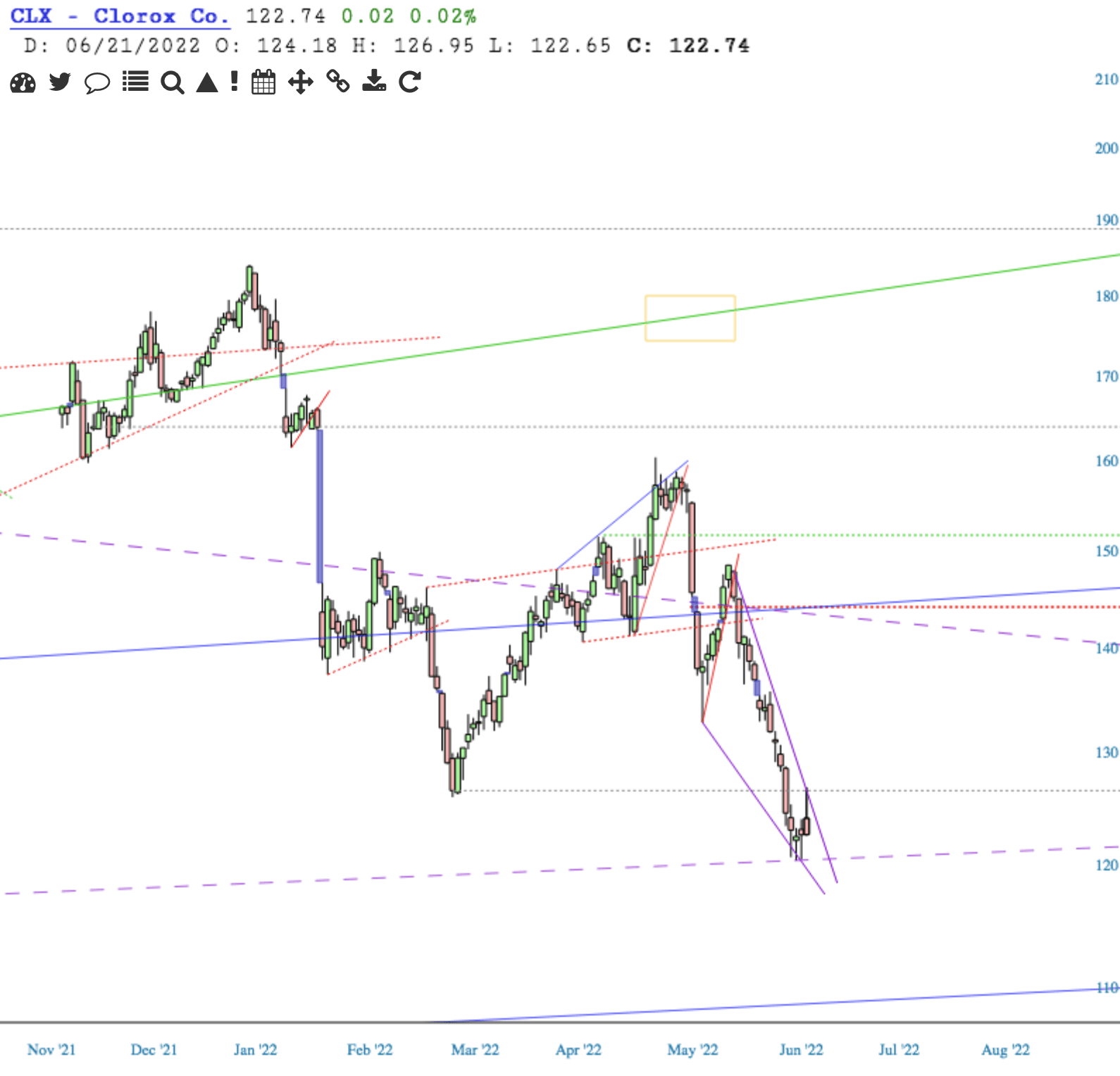
Getting above 126 with some gusto, then even giving a backtest, would put this in good stead to get a decent upside move. The first line of resistance I see is 136-137. After that, there is resistance of the Ichimoku Cloud, referenced by the red and green horizontals.
Here’s a slightly longer perspective on the Daily. I’ve added another purple dashed line as potential resistance.
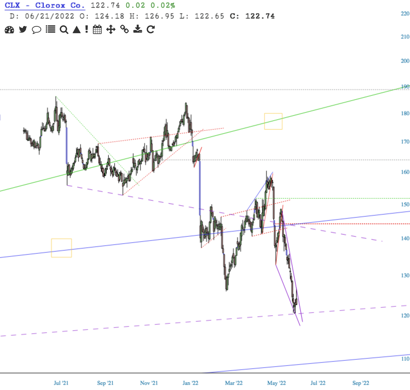
Note how the the Cloud [red and green horizontals] aligns with the long term [blue] trendline from 1999, whose support was recently lost. Heading back to test the underside of that trendline as resistance makes sense.
If it does break to the topside, who knows where it stops. We’ll see which of the resistance lines shown may put a halt on it. If price breaks down out of the falling wedge [and beneath the purple dash], upside potential is nipped in the bud.
