Usually when a person is watching a stock’s price steadily sink, the assumption is that the stock must be in trouble. This is sometimes the case, but there are some instances where the stock is in fact creating a very bullish pattern known as the descending wedge.
Just as an ascending wedge is a bearish pattern, the descending wedge is a bullish pattern. It consists of two non-parallel lines which, if extended, will meet on the their right side. As the price bounces up and down between the two extremes, the price action becomes more compressed as the bullish and bearish reactions drawn the lines closer together. If and when the prices break the upper trendline, the descending wedge pattern is complete, and the stock should move higher in price.
Definition of the Pattern
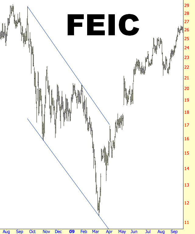
The graph of FEI Company went up 56% after its breakout from the descending wedge pattern. The two trendlines look parallel, but the higher one is descending at a slightly faster rate than the lower one.
The descending wedge is bounded by these two lines. As long as the price bars between the lines are moving lower (hence “descending”) and the lines are angled such that they will eventually converge on their right side (hence “wedge”), the pattern is valid. Whether or not the stock is in a general uptrend or downtrend doesn’t matter. If the stock is in a broad uptrend, the descending wedge is a continuation pattern; if the stock is in a broad downtrend, the descending wedge is a reversal pattern. In either case, a breakout from above the descending wedge is considered bullish.
Psychology Behind the Pattern
Whether the overall direction of the stock is bullish or bearish, the descending wedge behaves as a “clearing out” of the owners of the stock that are not inclined to hold on during a downturn. Those that remain are either more patient with the stock’s downdraft or simply acquired the stock at a newer, lower price.
Each drop down to the supporting trendline acts to scare out the weaker hands of the security, and each push higher to the resisting trendline acts to give owners of the stock hope that things are going to turn out. With each successive dip and rise, holders of the stock are on a roller coaster that alternates between despair and hope, and the volume typically will try up as fewer and fewer people are interesting in hang on to a stock going through these gyrations.
The big change takes place when the resisting trendline is at last broken. For those who bought during the most recent dip, they are suddenly in the happy position of having a profitable stock, and for longer-term purchasers, their losses have at least trimmed down and they see that the stock may have finally changed from a downtrend to an uptrend. A big increase in volume is particularly encouraging here, since it accentuates the fact that the withering volume was a symptom of the stock’s former weakness and not a persistent loss of interest in the stock by the market. Now that the security has found its footing, buyers are willing to participate on a broader basis.
If the stock moves higher and sinks back to approximately the breakout point, it is simply finding its new equilibrium point where those nervous about undergoing another hard dip down want to sell, balanced by those who believe the stock has fundamentally changed its overall direction. A successive push to a new recovery high validates the view of this latter group, and the stock then has the opportunity to truly make a big move higher.
Example: Cytori Therapeutics
This provides a good illustration of how a measured target on a pattern can be prescient and helpful. The descending wedge has a range of approximately $1.50 at its nadir and $7 at its apex, yielding a difference of $5.50. The stock breaks out at $4, meanders gently lower, and then finally founds strong support at about $3.
Adding the stock’s breakout price, $4, to the height of the wedge, $5.50, produces a sum of $9.50, the target price. Late in 2009, once the stock’s new base has firmed up, CYTX swiftly ascends to $9.50, yielding a percentage gain of 138%. It’s worth noting that, as is often the case after breakouts, that the stock didn’t immediately move in its anticipated direction. Holders of the stock had to endure a lot of uncertainty and waiting before the potential was fulfilled, but their patience was awarded not long thereafter.
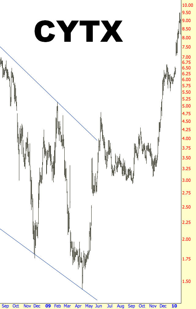
Pattern Start: 7/23/2008
Pattern Break: 6/1/2009
Break Price: $4
Post-Break Price $9.50
Percentage Change: 138%
Example: Intricon Corporation
Let’s step through the price action of Intricon to understand the perception of the stock action while it is taking place. The stock is, during the early summer of 2007, moving smoothly from $16 to above $20. Although unknown at the time, this price establishes the first touchpoint of the resistance trendline, and earlier, at $17, the first touchpoint of the supporting trendline.
Now the stock starts dropping, falling back to $16 at first, wiping out recent profits, recovering partly to $18, and then moving much more swiftly into the single digits before finding any stability. The price double-bottoms and then manages to claw its way back to $13. The second touchpoints of both trendliens have now been made, and remaining owners of the stock are scared and frustrated.
A new plunge begins, dropping the price from its recent $13 peak to half that price, and a great many holders of the stock have been cleared out since two-thirds of their equity’s value has been destroyed between August 2007 and January 2008. At that point the stock begins a very strong rally – its third to take place within the pattern – and stops hard at the resistance trendline when $11 is reached.
Instead of resuming the fall, it begins hammering out some support at $10.50, and as the price continues at this level, it also penetrates the resistance trendline, thus completing the pattern. One last dip late in April takes about 10% off the stock’s value, but the bullish potential for IIN is already in place, and it moves steadily to $18 by early summer, providing a 64% gain and, for longer-term holders, recovering almost all the earlier losses.
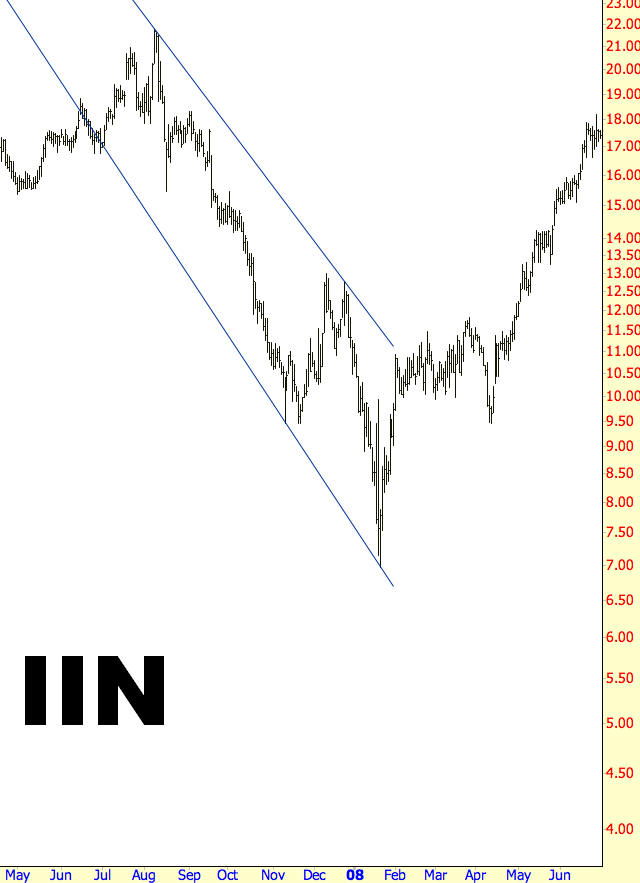
Pattern Start: 7/4/2007
Pattern Break: 2/2/2008
Break Price: $11
Post-Break Price $18
Percentage Change: 64%
Example: Toro Company
The next instance is similar in form to the prior example, although the percentage movement is more substantial. Take note of the high price of the wedge – about $45 – and the low price of the wedge – about $20, indicating a range of $25. This stock fell steadily from nearly $60 to $20, two-thirds of its value, but then broke its descending wedge at $29, implying a target price of $54.
It achieved this target price superbly, although it took about a year to get there. But this length of time is insignificant considering both the size of the gain, 93%, and the steadiness of the price action. The post-breakout behavior of TTC was a steady series of higher highs and higher lows, and although there was a modest dip in early 2010, only a rather tight stop would have taken an owner out of that position, since it did not violate any recent lows.
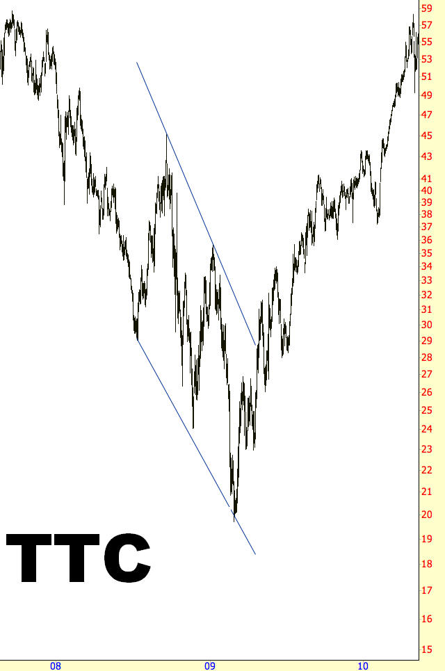
Pattern Start: 7/15/2008
Pattern Break: 4/24/2009
Break Price: $28
Post-Break Price $54
Percentage Change: 93%
Example: Encore Wire
Although it is useful to measure a target price to calculate a place where you may decide to take all or part of your profits, there is of course no guarantee that a target price will be met, even if the direction of the stock is the same as the pattern predicts.
The measured move for instance, should have taken the stock to about $39, but it stalled in the lower 30s. The 60% increase in value after its breakout still is a very handsome return, but it is unwise to hold on to a stock indefinitely until a particular target is achieved.
It is better to simply take note of the most recent major low and use that as your stop-loss value. In this instance, the stock made a series of higher lows at about the $24 level in late 2009 and early 2010, and that would have been a good stop-loss level. Once the stock moved higher, the stop might have been tightened to the reaction low just beneath $30, since sustaining a prospective drop from the lower $30s back to the mid-20s is probably too much of a sacrifice in profits.
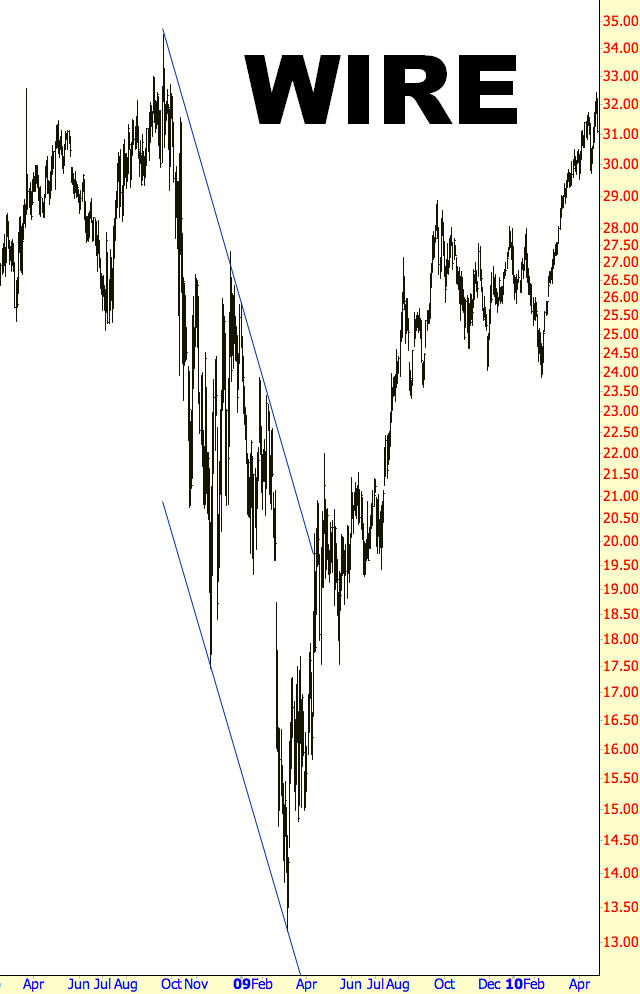
Pattern Start: 8/2/2008
Pattern Break: 5/3/2009
Break Price: $20
Post-Break Price $32
Percentage Change: 60%
Example: Apollo Investment
Judging how much of a reetracement to tolerate is an important part of maintaining a stock position after a breakout. You may find it helpful to extend the trendlines in your charting program and make sure that at least the price doesn’t re-enter the pattern’s internal area after it has clearly broken out.
It is easier – and less nerve-wracking – when a stock retraces only modestly after a breakout, and you can use that retracement low as a stop-loss level. The stock for Apollo Investment breaks smartly above resistance at $4, pushes to $6, and then loses over half its recent gain. However, the drop to about $4.50 is well above the internal portion of the wedge, and a horizontal line (not shown here) at about $4.50 would indicate that the supporting line is holding up both the two post-breakout lows (in the summer of 2009) as well as the second touchpoint of the supporting line that makes up the descending wedge. This is clearly a price level of importance, and a stop-loss just beneath that level would have provided a measure of security while still retaining ownership of a stock that ultimately went on to a 178% post-breakout gain.
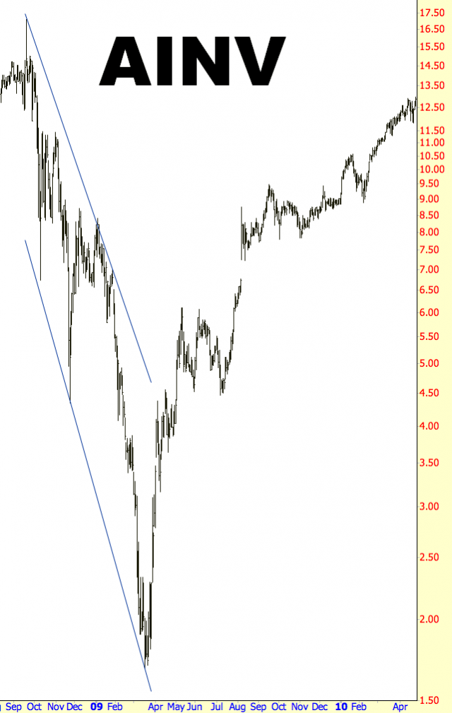
Pattern Start: 9/23/2008
Pattern Break: 4/3/2009
Break Price: $4.50
Post-Break Price $12.50
Percentage Change: 178%
Example: General Dynamics
The military contractor General Dynamics offers another fine example of a retracement which is substantial but not so significant that it would have taken a technician out of the position.
We see that, after the stock’s bottom at $34, the price moves sharply to the resisting trendline at $47. It doesn’t even pause there, instead breaking sharply above the line and reaching nearly $60. The stock loses about $10 in value, but the stock doesn’t approach the inside of the now-broken descending wedge.
Also take not that the penultimate touchpoint of the former supporting line, at about $46, happens to form a left shoulder of an inverted head and shoulders pattern. Indeed, the range from October 2008 to October 2009 establishes an outstanding inverted head and shoulders pattern, with the right shoulder being higher than the left, as it should be. The lowest point of this right shoulder, just below $50, represented a perfect stop-loss level, and GD moved steadily to nearly $80, providing a 64% gain to those who had bought at the breakout.
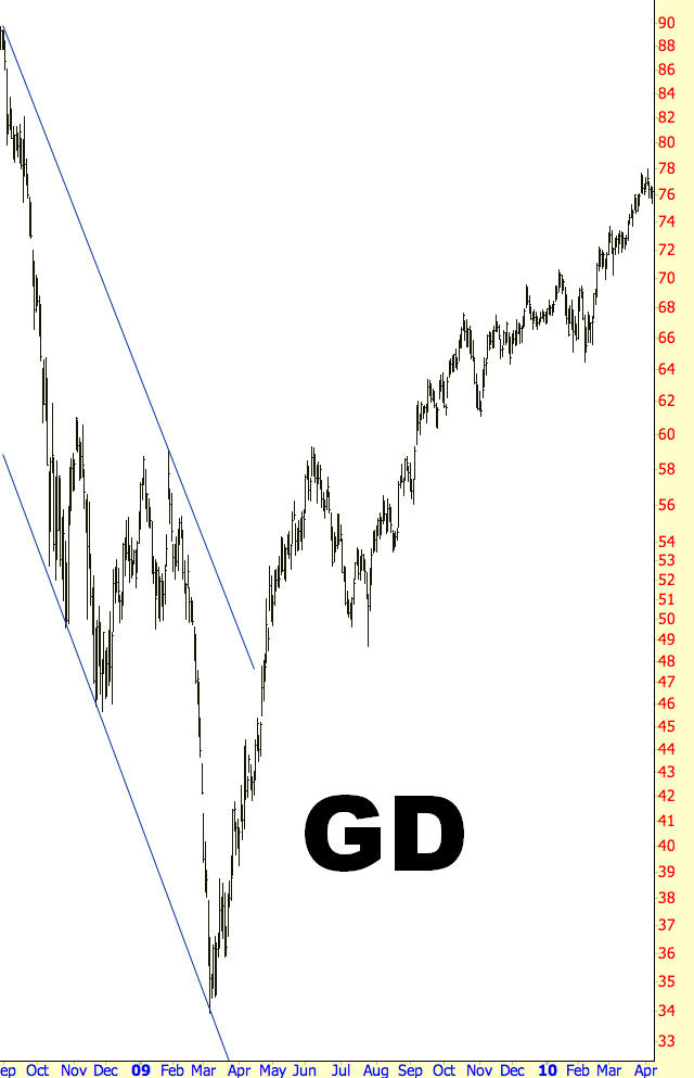
Pattern Start: 9/2/2008
Pattern Break: 4/22/2009
Break Price: $47
Post-Break Price $77
Percentage Change: 64%
Summary
The descending wedge pattern is flexible, because it is useful in both uptrends and downtrends. The percentage gains of this bullish formation may not be as gigantic as some of the other patterns, but they also don’t take as long to reach their target prices. The most artful part about using this pattern effectively is knowing the difference between an acceptable retracement (one which is merely revealing weaker hands that are eager to take their recent profits off the table, since they have been frustrated by the stock’s former inability to rise) and a false breakout (in which, in spite of the price’s agreeable direction, yields price movement that re-enters the pattern and perhaps take the stock to much lower prices.
The key to all of this is to have sensible stops once the position is in place. What defines “sensible” depends on the chart and relies heavily on both your experience and skill. Overly tight stops will take you out of positions that go on to produce outstanding gains, whereas overly liberal stops will keep you in positions that erode your equity based merely on the hope that the price will turn around and move where you want it to move.
