The rate of change is a simple, straightforward momentum indicator whose math is very easy to understand: it measures the percentage change of a given security, on a continuous basis, for “n” periods of time.
For example, if you measured the rate of change with a setting of 30 days, then each point plotted on a chart for ROC would indicate the percentage change on that day compared to 30 trading days ago. Collectively, these points would present to you the upward or downward movement of a security. The lowest setting, 2, would show the percentage change for every single day compared to the prior day, whereas the highest setting, 400, would do so for a period of nearly two calendar years (and thus be a far less volatile chart).
Choose this indicator as you do all others, from the Technical Studies dialog box in SlopeCharts:
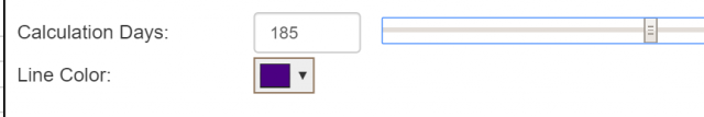
There are just two controls: one for the number of days on which to base the calculation, and the other for the color the line should use. You can type in the number of days or, for a more dynamic experience, move the slider left and right to immediately see what the ROC would look like given any setting you choose.
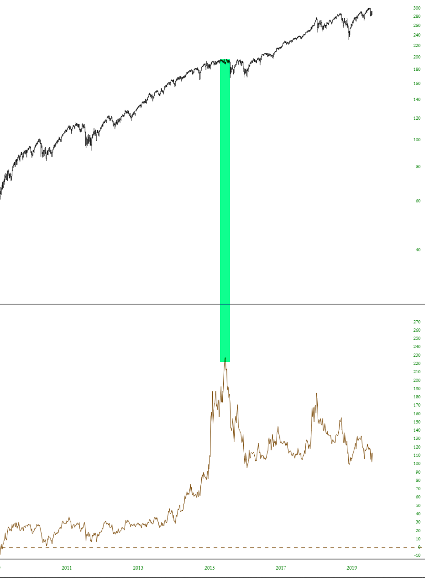
Here is an example of just how different the presentation of price movement can be when seen by way of the ROC. This is the SPY using the slowest ROC, the 400-day. Such a long ROC would illustrate the longest-term price trends. Even though the SPY has, in this chart, moved steadily higher for over a decade, the ROC actually peaked years earlier, when the amount of the change was most extreme. In other words, the “meat” of the bull market – – that is, the richest percentage rewards – – was complete six years into the decade-long run, even though the market kept moving higher. Most recently, those who bought 400 days ago would have experienced almost no gain whatsoever.
One way to use the ROC is by looking for extremes. The lowest an ROC can go is -100, since that would imply a 100% wipeout of value ($0 price). The highest and ROC can go has no theoretical limit. However, over a period of years, instruments do tend to have high and low extremes on the ROC which vary on a symbol-by-symbol basis.
For example, here is the small caps fund symbol IWM. It appears that when the ROC pushes to 85 or higher, the price run is complete, and a reversal may be at hand (see green tints, showing the ROC peaks and where they correspond on the price chart).
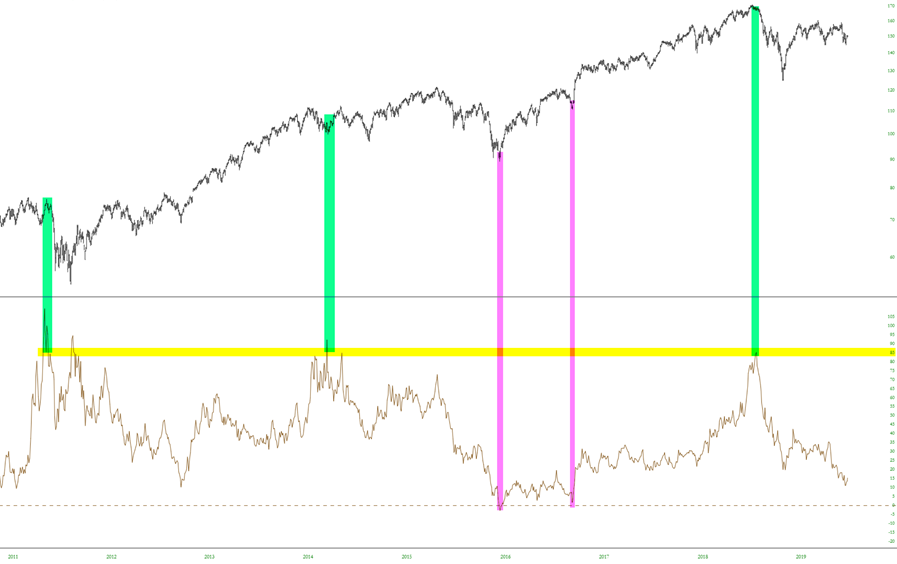
Conversely, when this particular ROC went to 0 (indicating no net price gain over the period being measured), that indicated a good time to buy, as shown with the magenta bars.
To see what Slopers in the comments section have been saying about this indicator, check out the archives located here.
