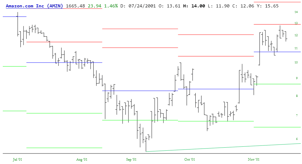
Pivot Points are a series of five horizontal line segments drawn on the chart to indicate zones of support and resistance. Because these are based on daily data, the line segments themselves span one month at a time. In other words, the pivot points for June are based on May’s daily data, those for May are based on April’s daily data, and so on.
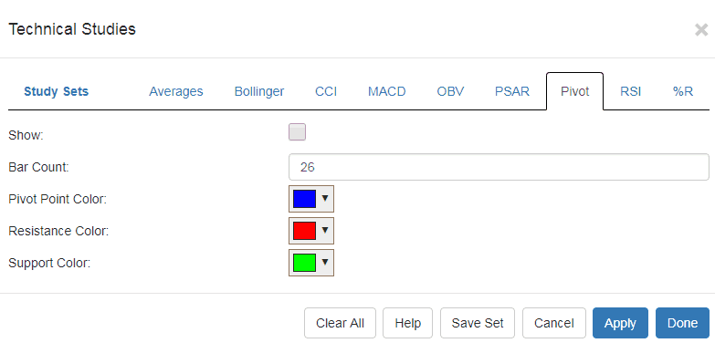
Applying this study is done by clicking the Studies button in the upper right of SlopeCharts and clicking Customize. That brings up the dialog box with all the available studies. Click on Pivot to choose Pivot Points. In that tab you will see the checkbox (to display the study) as well as the drop downs to change the default colors and the number used for the bar count. You will normally just leave these alone and check the checkbox then click Done.
Whatever chart you are looking at will now be shown with the pivot points. Each blue line is a pivot point, while the two red lines above are resistance levels (R1 and R2) and the two green lines below are support levels (S1 and S2). Again, these will span one month at a time and are calculated based on the prior month’s prices.
Zooming in closer, it is easier to see the behavior of the price bars with respect to the various support and resistance levels, as well as the pivot point itself.