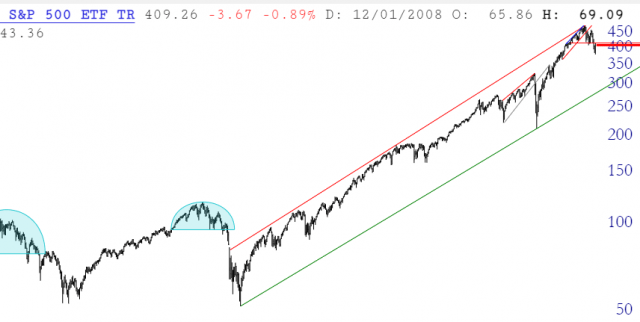
In the lower left of SlopeCharts are three icons, the rightmost which resembles a gear. (The leftmost one expands the chart to full size and the middle one brings up brokerage integration).
Clicking the gear brings up the Preferences dialog box. This lets you control dozens of aspects of SlopeCharts, including whether you want to see notes others have made about any chart, what the default symbol loaded is, how much data to load, and whether or not the chart automatically refreshes.
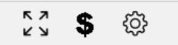
Because there are so many choices, the preferences have been arranged into five well-organized groups, which you can access by clicking on the appropriate tab. When Preferences first appears, the middle tab, General, is selected by default. The checkboxes, dropdowns, and slider controls are self-explanatory.
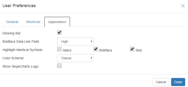
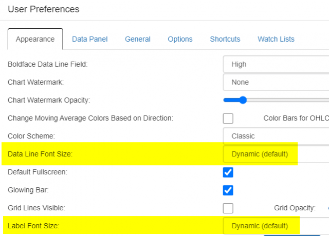
The leftmost tab is Appearance (note that the tabs are alphabetically arranged). These dropdowns and checkboxes control important cosmetic attributes of SlopeCharts.
The Data Panel tab lets you check the items you would like available in the data panel, which is the leftmost portion of SlopeCharts. Because you can navigate in the Data Panel using the arrow keys, you may want to save time by eliminating any particular kinds of information that you find yourself rarely needing.
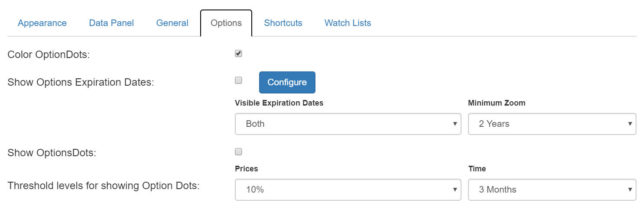
The Options tab is for settings specific to options trading, such as whether Option Dots should appear, what their thresholds should be, and when options expiration dates should be marked on your equity charts.
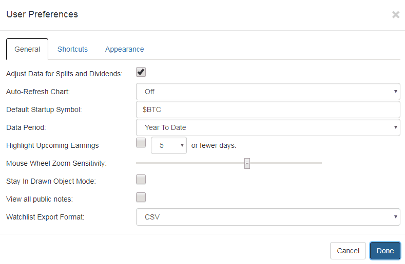
Then there is Shortcuts, which lets you program keyboard shortcuts. You can get detailed information about this powerful feature by clicking here.

Finally, the Watch Lists tab alters how the symbols in your watch lists are displayed and lets you select what kind of format you would like the export function to have.
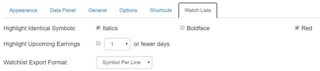
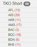
One particular item from this tab merits special attention, which is the item called Highlight Upcoming Earnings.
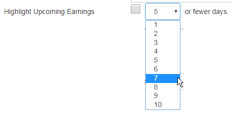
What this does is displays the number of days in the future when earnings will be announced for each symbol. You can control how much information is displayed in the dropdown. For instance, if you only want to know about earnings coming up in week’s time, you could choose 7, so that only earnings 7 days or sooner would be highlighted. (It ranges from 1 to 20)
Below is an example, showing that Bank of America has earnings coming up in 3 days whereas Brandywine’s earnings will be in 6. This is a great “heads up” in your portfolio so that you have a greater awareness of what is going on in your specific financial world.
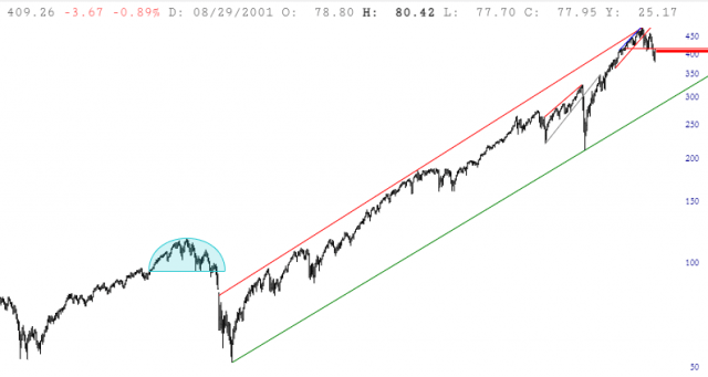
One important note should be made of the ability to change the font size, because sometimes people have trouble reading the axis labels or the data line. Sometimes the data line and the axis labels can be difficult to read.
Now we have added to the Preferences dialog box the ability to change the Data Line (which is at the top of the chart and shows information about whatever price bar you are pointing at) and the axis Labels. You can change either or both of these, and there are literally dozens of font sizes you can choose from, ranging from so small as to be unreadable up to insanely big. (The default is “Dynamic“)
Here, for example, is what it looks like if a somewhat larger font is chosen for both.