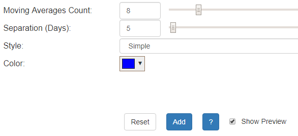
One of the most interesting—some might even say beautiful—studies now available in SlopeCharts is known as the Ribbon Study. This study is comprised of any number of moving averages of various periods. You can access it just like all the other technical studies: via the Technical Studies item in the Analysis menu. Click the Ribbon choice to see the parameters:
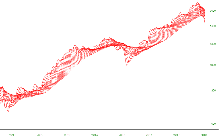
The Ribbon Study is unusual in that it creates somewhat of a three-dimensional representation of price movement. When a price is moving generally higher or lower, the moving averages eventually all move in the same direction and get evenly wide from one another. When a price begins to move sideways (or change direction altogether), the moving averages get tighter and coils into a band, almost as if the threads of the study are forming a rope.
During directional shifts of a security’s price, you can actually see the band turn as it twists from one direction to another. This coiling and turning is helpful in knowing when prices are consolidating and, ultimately, changing direction. Below the prices and rawn objects are hidden so you can plainly see the ribbon study on its own.
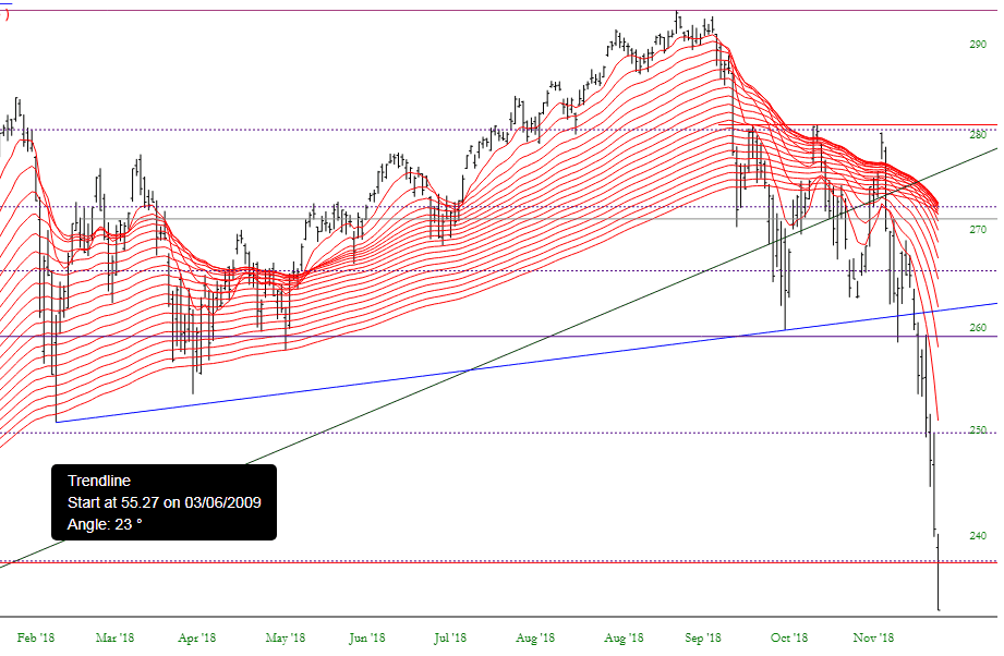
The individual strands of the ribbon are moving moving up together, then started heading down, and then twisted back up again. This “twist of the ribbon” is what can portend fundamental shifts in trend. Below is another example with the prices displayed as well.
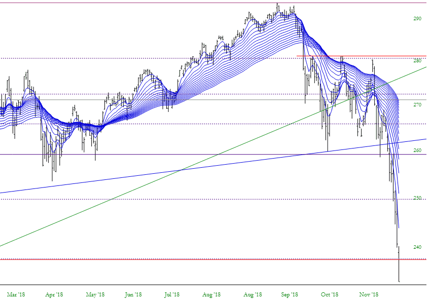
The Ribbon Study is most useful for a stock that is about to commence a broad move up or down. These moves are usually preceded by a compressing of the threads. The more compressed the study, the more powerful the subsequent move, particularly if the ribbon twists and changes direction.
The application of this indicator is very similar to that of the moving average except that, because there are many moving averages involved, you have the added benefit of seeing multiple time periods represented all at once. You can dictate how many moving averages are applied (the “Moving Average Count”) as well as the difference between each of them (“Separation”). For instance, a separation value of 10 and a count of 5 would mean you would see the 10-day, 20–day, 30-day, 40-day, and 50-day moving averages.
To see what Slopers in the comments section have been saying about this indicator, check out the archives located here.
