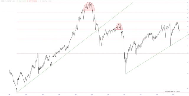
About a week or so ago, I shared this chart of the S&P 500 divided by the M2 money supply in order to create a more realistic picture of the stock market’s valuation, normalized for the trillions of dollars of new fiat sloshing around.

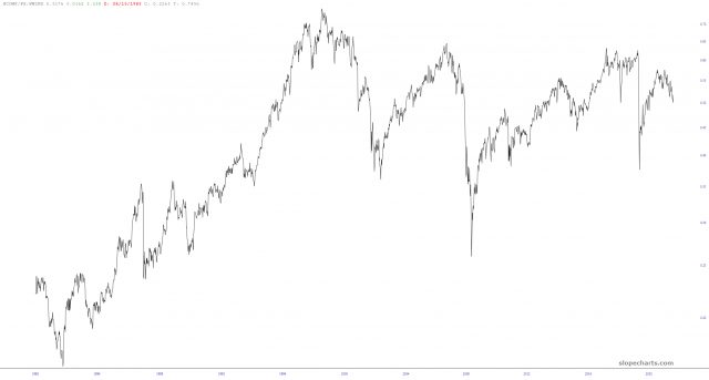
I used the Transformer feature in SlopeCharts to thumb through my set of index charts, and I found a couple of interesting ones with the same “divided by M2” alternation. The first is the Dow Jones Composite, which, as with the S&P 500, never came close to besting its year 2000 peak.

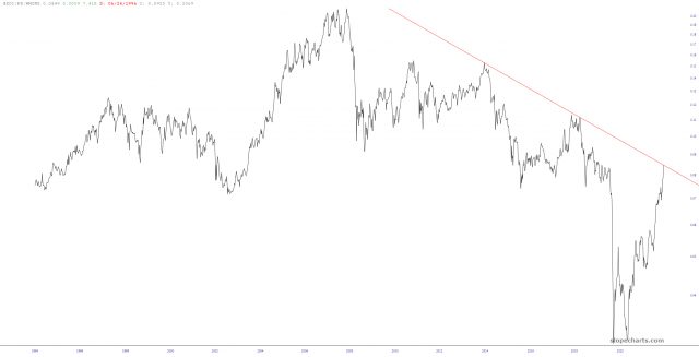
Of more interest to me was the oil index $XOI which has surged to a nice, clean downward-sloping resistance line.


