Slope of Hope Blog Posts

Slope initially began as a blog, so this is where most of the website’s content resides. Here we have tens of thousands of posts dating back over a decade. These are listed in reverse chronological order. Click on any category icon below to see posts tagged with that particular subject, or click on a word in the category cloud on the right side of the screen for more specific choices.

Correction Higher In Risk (by cantabnomad)

By -

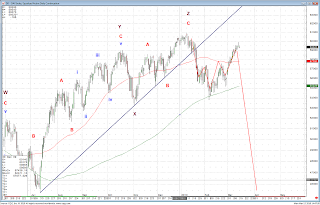
Equities and other risky assets will likely sell-off hard fairly soon. I consider it highly unlikely that sustained upside progress can be made.

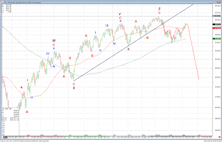
Below is a daily chart of the German DAX. This is my count and projections, unchanged from January 2010.
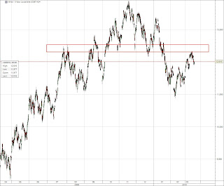
This is an hourly chart of mainland Chinese large caps traded in Hong Kong (the H-shares index). This index is weaker than the Hang Seng, and failed to take out the resistance highlighted by the red box. From Elliott Wave perspective, the rally from February lows has been corrective and is very likely over at current levels. This index is putting in a massive, massive top. All this for the companies that cater to the market that will save the world in 2010???


Flying PI(I)GS (by cantabnomad)

By -

Contrary to their Northern brethren, Portugal, Italy, Ireland, Greece and Spain peaked in October 2009. What followed is now history, and it is widely claimed that Greek problems will be contained.

Below is a GDP-weighted composite index of stock markets of countries listed above. Combined, their GDP is 90% that of China (in nominal USD) – so this is no small fish. I present my favoured scenario in this daily chart. The declines so far have been impulsive; rallies corrective. Of further note is the fact that 55 and 85 day moving averages are falling, and the 55 day one is about to cross the 200 day one from above (bearish).

An alternative scenario for this funky group is presented below. While it is certainly possible that PI(I)GS will fly in what would be a massive "C" wave higher, I consider the outcome unlikely. This will change should we get closes above January 2010 levels, which would confirm the move since October 2009 as an ABC correction lower, pending further upside.

Originally published at http://observemarkets.blogspot.com/

Correction Is Likely Finished (by cantabnomad)

By -

How poor is the outlook for equities? Very, very poor. It is a disaster waiting to happen. While in the short-term marginal new highs are possible for most indices, in the medium-term risk and related assets are likely to face substantial difficulties moving higher, and will most likely move lower swiftly.

Below is a daily chart of the German DAX with my projections from 15 January 2010. So far, everything has been unfolding according to plan. If this continues to be the case, for which there is ample evidence, I believe we will see this index about 20% lower in the next 5 or so weeks.


This is an hourly chart of the Hang Seng Index in Hong Kong. It is currently trading at levels first achieved in August 2009 – fully eight months ago. As you can see, the index is firmly parked in a range (highlighted by the black box) that acted as support and resistance during those last eight months. From Elliott Wave perspective, the rally from February lows has been corrective and is very likely over at current levels. This index is putting in a massive, massive top.

This is an hourly chart shares of mainland Chinese large caps traded in Hong Kong (the H-shares index). This index (also shown on a daily time frame on the last chart in today's post) is weaker than the Hang Seng, currently trading below the price range, highlighted by the black box, that acted as support or resistance since August 2009. From Elliott Wave perspective, the rally from February lows has been corrective and is very likely over at current levels. This index is also putting in a massive, massive top. All this for the companies that cater to the market that will save the world in 2010???
H-shares index in Hong Kong is about to put in a "death cross" of 55 day moving average moving below the 200 day moving average for the first time since March 2008.

Originally published on http://observemarkets.blogspot.com/

Corrections Close to Completion (by cantabnomad)

By -

To continue with the theme of foreign (to US residents) markets, here is my take on the Italian MIB index. Italy is eurozone's third largest economy.

BOTTOM LINE: Corrections higher in risk and related assets are likely very close to completion. While major US indices advanced about 1.5% higher than expected, EU indices, notably EURO area indices are moving along the expected lines. Internal structures of these indices suggest that the next leg of the decline is imminent.

Below is an hourly chart of the Italian MIB index (Italy is the world's seventh largest economy – just below the UK). The MIB has been much weaker than most EURO area indices, and currently retraced just about 50% of its 11.3% decline. The internal structure of the decline and subsequent rally appears to conform very well to wave guidelines, with the correction finishing (?) with a clear impulse higher (15 minute chart below the hourly chart).

Mib
This is a very short-term, 15 minute chart of the Italian MIB.

Mib 15m 

I hope you find this useful, and have a good day. – – - Aidyn Kussainov

European Indices (by cantabnomad)

By -

Good time of the day, Slopers.

It is perhaps a testament to importance of the US to global markets – absolute majority of financial blogs out there focus on major US indices, such as SP500, Nasdaq, DJI and Russell.

As I am based in Europe, I mostly trade EU indices, which I also often find clearer from a charting perspective. Perhaps that is because many fewer people trade those. Perhaps also my posts on EU indices might be useful to you from a cross-asset perspective.

I bring two charts today, both of which look a lot more bearish than US majors, in my opinion. 

This is an hourly chart of EuroSTOXX50 – an index composed of 50 largest stocks in the Euro area (which in terms of GDP is only 5% smaller than the USA). The EuroSTOXX fell through their early October low, and so far retraced about 62% of their 9.3% decline from the high (SP fell a much more modest 6.6%, high to low).

Eurostoxx H

This is an hourly chart of the German DAX (fourth largest economy on Earth). This is one of the weakest Euro area indices, which so far retraced less than 62% of its 9.75% decline.

Dax short term

It is quite unlikely that US markets go much higher without us Europeans. As European markets are much weaker, and do not look like they could challenge the highs any time soon, I'd say chances are high that the second leg of the decline begun on 20 October is about to begin. 

Thank you and have a great week. – - Aidyn Kussainov