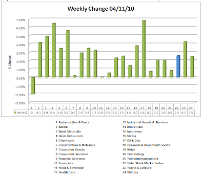
Below is the graph of the Dow Jones (24) Sectors for the week ending 04.09.10. The broad market sector advanced 1.5%. For the Dow Jones (164) sectors, 136/164 sectors were positive–particularly strong were the basic resources sectors.
You can find the chart book of the 24 sectors here presented on a weekly and daily basis in addition to the full listing of the 164 sectors here. I want to encourage you to look at the individual chart books to include the ranking of all 164 industries because that detail has granularity that can be instantly absorbed. For example, the top/bottom 5 sectors were these:
(I see that I have 6 top sectors!)
By looking at the individual subsectors, you can pull charts of individual constituents and using your own TA methodology make some decisions about potential trades.
Market lore is replete with both wisdom and pablum. Unfortunately, some of us (me!) have to learn the hard way how to differentiate between the two. I subscribe to the notion that any stock pick that I have is going to be governed in general as follows:
This model is my mental model that serves as the core of my evaluative process. A few questions one might ask are:
- The market and sector are weak, but this stock is strong. Why? (Could be exciting news such as an earnings report or a new product development.). There might be a long or short opportunity depending on your evaluation of the catalyst.
- This stock is weak but the market and the sector are strong. Why?Maybe there is a short opportunity or perhaps it is in undiscovered gem. A cursory look into the matter might prompt you to put it on your watch list.
- This sector is strong, but the market is looking weak. The market could be undergoing sector rotation. Indices may consolidate, but underlying sectors will shift up/down. Finding leaders within the sector might be helpful for identifying opportunities.
A very quick way to look a stocks is creating a ratio of the stock price to the sector that it is in. For the 24 sectors charts, I provide the sector information for you and it's relative performance to the broad market index.
Here's an example of a gold chart:
The bottom part of the chart shows THM's relative performance to all of the miners. Telling, isn't it?
I highlight these points is to encourage you to develop YOUR modality in looking at the markets and stocks within the market to make informed decisions that meet your risk tolerance and time horizons. When you have a well-developed methodology, then you are informed by the opinions of others, not influenced (read: derailed). I may be a slow learner, but it took me a few years to settle on my current methodology. It suits my style, and your mileage might vary. Test drive the cars that you need to and undertake the required care and maintenance to optimize your driving time.
All data courtesy of Stockcharts | Compilation courtesy of me.


