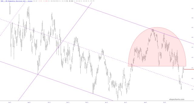
A few days ago, I got the impression that the commodities fund DBC had fallen by 4%, but it was just a dividend distribution. Slope’s data gets adjusted for dividends (which makes the data superior, particularly since a lot of other sites don’t bother) so now the chart is ship-shape again. I’d like to take this opportunity to point out the rounded top is still very much in place, and this time, yeah, the data is accurate!


