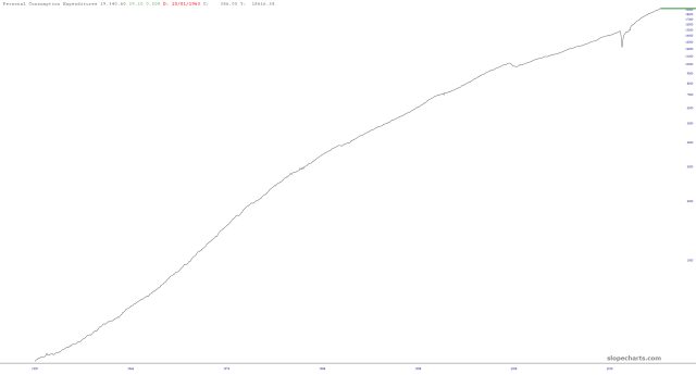
The big economic report this week is the PCE, but it’s a joke. Let me tell you why, and I’ll do so with the chart below, which shows the cumulative effect of the PCE (inflation) over decades.

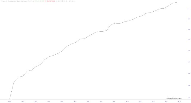
Zooming in, we can see the most recent history, and let’s just all agree inflation isn’t exactly oscillating a lot. Whether it comes in at 0.2% or 0.3% or 0.1% for that matter doesn’t amount to a hill of dog crap.

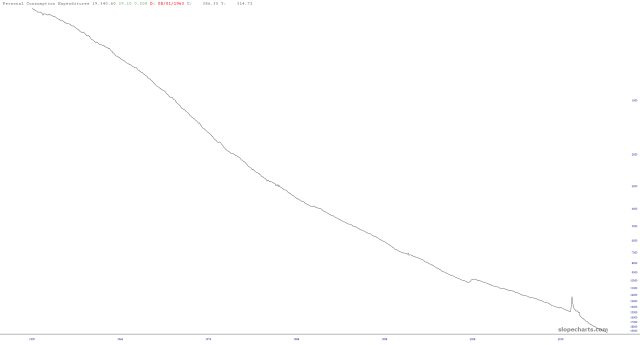
A more useful illustration would be the upside-down version of this chart, which shows neatly what a crackerjack job the Federal Reserve has done destroying your purchase power.


