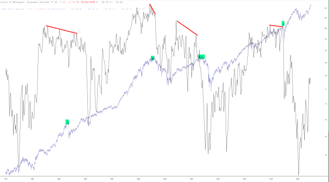
This took a little time to put together but click the chart for a screen-filling version. I have overlaid the S&P 500 with the Michigan Consumer Sentiment Survey. As you can see, major market tops correlated with negative divergences in sentiment. What’s particularly intriguing about this chart is that the plunge in sentiment has been absolutely enormous lately, so I didn’t even bother drawing the insanely-downsloping red line that would be required.


