
For years now, I’ve done something which is a bit unusual, but I find oddly helpful, which is to track the positions I have closed out. In other words, when I close a position, I move it to a different part of my portfolio spreadsheet, updating its “entry” price with its “exit” price so that I can see what would have happened to that position if I had simply hung on to it.
By its nature, this is a constant source of either relief (“Phew, glad I got out!“) or regret (“Idiot! Coward! You should have hung on!“) I constantly have my eye on the rearview mirror.

The past few weeks have been fascinating in this respect, because from July 16 until August 5th, the grand total of Profits/Losses from exited positions just kept growing. To think of this a different way, it’s as if I have unlimited funds and basically hang on to every single position without fear or favor. It’s an absurd hypothetical, but in its own way it is a metric impossible to observe anywhere else.
I don’t have a huge account, and my positions tend to be around $8,000 or so each. On the morning of August 5th, the total profits/losses from the many, many positions I had closed (whose options hadn’t expired) was over $700,000. It was rather painful to see that my “missed profits” was that huge, and it plainly illustrated how virtually every single put option I had purchased had worked out great. For that moment, at least.
What a difference two weeks makes. As I observe it now, the $700,000 is long gone, having reversed by a full million bucks to negative $300,000. Let’s just say I don’t feel quite so bad anymore.
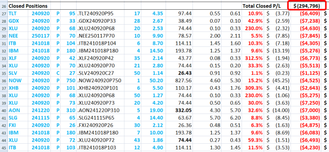
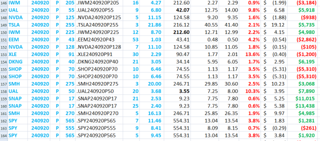
This list of past positions is sorted from worst loss to best profit. I only re-sort it from time to time, so what’s very interesting is to see how little patches of red become green, and vice versa.
Let’s say I sorted the whole list on a Monday. By Friday, the ranked list of profits and losses would have changed to some extent, and the items way at the top (where it’s pure losses) that have turned green catch my interest, just as the ones at the bottom (where profits are fattest) that turn red do as well.
For example, scrolling to the bottom of the list is where, on August 5th, the triple-digit percentage gains were. The most monster percentage gainers were SPY puts. Just look at it now, though. The second-from-the-bottom item is a SPY put showing a small loss, whereas two Mondays ago this was a 200%+ gain.
You can also see how SHOP, which was sporting massive gains a couple of weeks back, is now very deeply in the red, because SHOP went from $48 to $74 (!!!!!!) in just ten trading days. That’ll knock the stuffing out of a put option, to say nothing of the VIX collapsing from nearly 70 to barely in the teens.
I doubt many folks bother to do this “woulda/shoulda/coulda” schtick in their spreadsheet, but speaking personally, I find it to be a real eye opener, particularly during very dynamic times like these.
