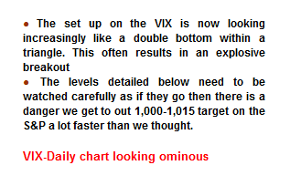
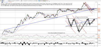
I received an interesting email last night which was a forwarded warning from CITI to clients warning of a triangle on the Vix suggesting that the Vix might spike to new high very soon while equities fell hard accordingly:
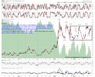
Obviously this was potentially very interesting, and I had a look at the Vix chart. I could see no triangle. However I did see a rectangle and suspect that the setup seen by chartists at CITI was lost in translation as they tried to explain to to non-chartists there. I'll show the rectangle on the 60min, and the target on an upside breakout would be in the 55.50 area, which would indeed be a major move.
The rectangle is a bottoming rectangle, which has only a 45% chance of breaking up, but with an 80% chance on making target on an upside break. Under the current circumstances though an upside breakout looks (from a TA perspective) a lot more likely than a downside breakout, and I've noticed in the past that these rectangle bottoms tend to break up if the decline into the rectangle was small, as in this case:
It's the last day of the month today of course, and the SPX would need to rally to 1206 to close over the monthly 20SMA. That seems unlikely. I showed the chart for this yesterday and you can see that here. This has important implications as in the last two bear markets after the monthly close below the 20SMA, that moving average was an impenetrable ceiling until the start of the next bull market, being retested only once in each of the last two bear markets before further declines.
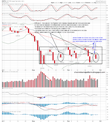
So where does that leave SPX unless we see a huge and unexpected rally today? Not in a good place at all and a sizable rally from here looks unlikely. I've posted my SPX daily range and S/R levels chart a few times recently, and here it is again. I've added some notes noting the similarity between the last three days and three days in late August where the action was a decline preceding the move into the late August high at 1230.71:
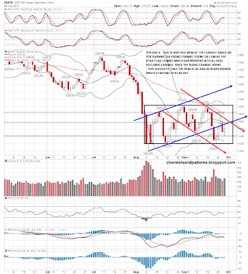
Obviously that looks cautiously bullish, but I have another take on this SPX range chart that points in the other direction, and I think my second take is the correct one. On this chart I've marked the rising channel that formed into the late August high in blue arrows, and the loose declining channel that has formed since the declining channel broke in red arrows. On this take the rising channel / bear flag broke down after the 1220.06 high, and has since been retested, with yesterday's high almost at broken channel support. On this view the bear flag started to break down several days ago, and we haven't noticed yet only because SPX has not yet broken down out of the trading range of the last few weeks, which would be likely to happen soon:
Is there anything else that support this bearish view? Obviously I've been posting the 30yr treasury futures (ZB) charts every day this week with the bearish (for bonds) setup that had formed there. I mentioned yesterday morning that the break down from trendline support and the H&S might be a false break and that if it was, then we might well see ZB break back up through broken support to reach a potential IHS neckline just over 142. That's something I see regularly on charts where an H&S pattern fails in one direction, and then evolves into an H&S facing in the other direction.
As it happens that's exactly what happened on ZB yesterday, completing the head on an IHS, with the right shoulder having then formed overnight. If that's going to break up, we should see that break up today, and the target would be in the 144'15 area, suggesting a spike down on equities:
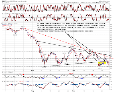
What else? Well one of the best trendlines in recent weeks has been triangle support on the RUT 30min chart. That trendline broke down last week with a recovery over it this week and then another break down. Trendline breaks can be tricky to play, with sometimes a fall directly from the break, sometimes a retest, and often a break back up over the trendline before another break down which would generally be decisive. That happened in February as I recall when SPX first broke rising support before the correction then. This latest breakdown on RUT may therefore hold and takes us to new lows.
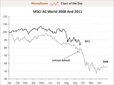
The last chart for the day is an excellent chart I received last night from Chart of the Day. This is an excellent free email I get every day and is well worth signing up for if you're interested. You can sign up here. This chart is an analog of the trading months on the MCSI AC World index for the year up to the 2008 crash compared to the last few trading months this year. It is thought-provoking. Click on the chart for the full write-up:
Overall this is an ominous looking setup right here, and looking at ZB particularly I think equities might well have a very bad day today. (Editor's note: "bad" is such a subjective term) Overall this weak close to September strongly favors the bears and the rectangle on Vix suggests that we may well see very big falls on equities soon, though confirmation of a break up on Vix in my view would be an hourly candle closing at 44 or higher and not until then. Until then this is looking like a market where any rallies should be sold.


