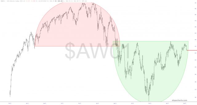
The market has felt really good lately, so let’s take an opportunity to survey nine important index charts, about each of which I’ll say a few words. First there is the All World Index, which is kind of ground zero for my entire “face-off” theory. That is to say, we’ve got the opposing forces of a bearish top (pink) and bullish base (green) which have met on the line of scrimmage and have to resolve in one direction or another.
As you might guess, my desire is for the price to not “escape’ above the bullish base, and instead to slip below, on to the right, of the pattern, thus spoiling it. There’s no definitive answer yet, but recent trading sessions have definitely nudged things in my desired direction.

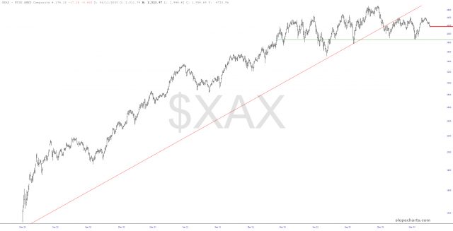
Another interesting angle to the market can be found with the American Stock Exchange Major Market Index, which has been ambling along aimlessly in a sinewave for months and months. It is helpful (and bearish, somewhat) that the ascending trendline has long since failed, but in order to really get this party started, we’re going to need to slip beneath that horizontal line, which is anchored to the March 13th low.

For your free users, this is the end of the post. For all paying members, here are the seven additional charts and my views on them:

