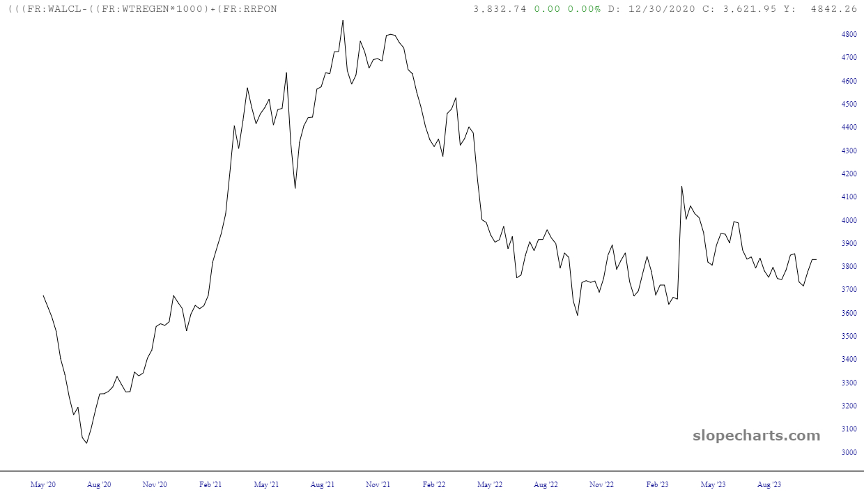
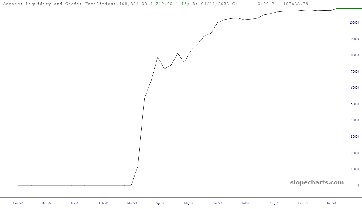
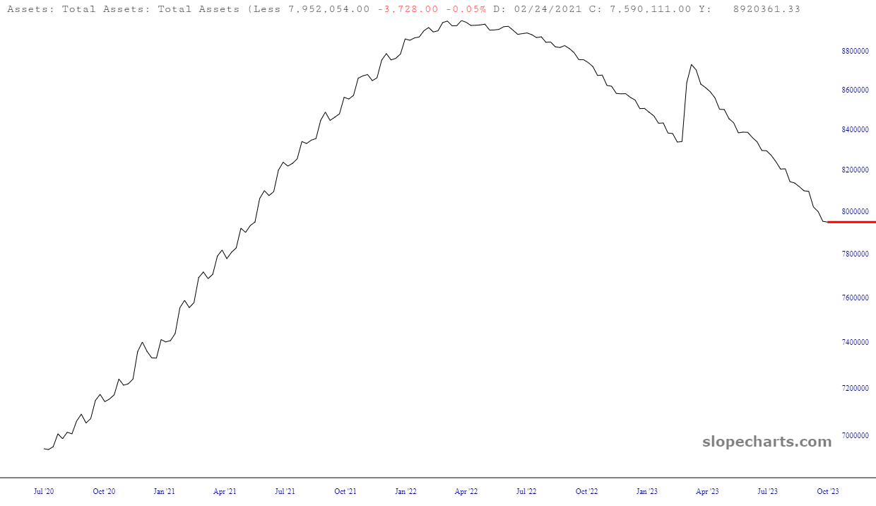
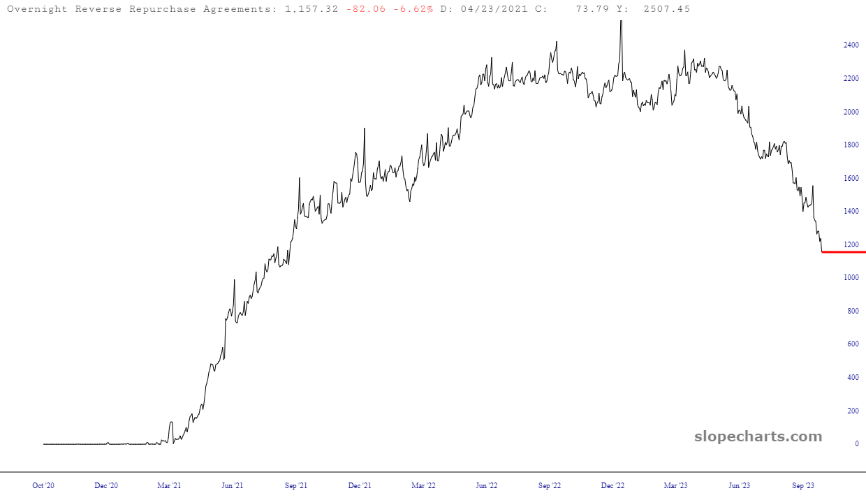
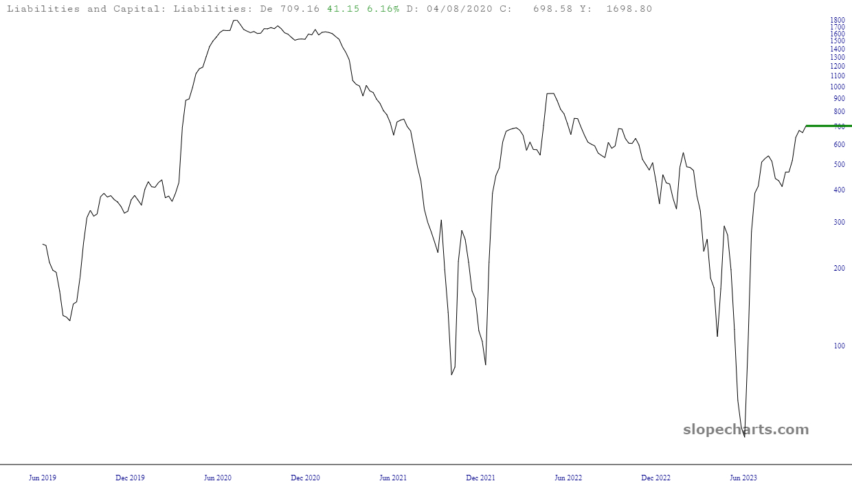
Well, folks, I pretty much said all I needed to say in my video (see prior post), so I’ll leave you with the latest charts from the weekly “Fed Spread” data. This is particularly appropriate since I just sent a cargo ship full of cash to Washington D.C. and Sacramento for taxes (in exchange for……….let’s see……….ah, here it is, the right not to be in prison; thanks, fellers!)
![](https://slopeofhope.com/wp-content/uploads/2023/10/slopechart_FR_H41RESPPALDKNWW-640x370.jpg)
![](https://slopeofhope.com/wp-content/uploads/2023/10/slopechart_FR_WALCL-640x370.jpg)
![](https://slopeofhope.com/wp-content/uploads/2023/10/slopechart_FR_RRPONTSYD-640x370.jpg)
![](https://slopeofhope.com/wp-content/uploads/2023/10/slopechart_FR_WTREGEN-640x370.jpg)
All of which leads us to an S&P 500 that is, appropriately, 500 points too high!
![](https://slopeofhope.com/wp-content/uploads/2023/10/slopechart_FR_WALCL-FR_WTREGEN_1000FR_RRPONTSYD_1000_1000_1.1-1625-640x370.jpg)