
In case you didn’t see my announcement yesterday, we rolled out an important new feature in SlopeCharts yesterday called Chart Lab. The genesis of this feature was my desire to improve the Fed Spread which, now that Chart Lab is live, I was able to do. This isn’t to say I won’t be messing around with it more, but so far, I like the results.

See, I integrated Yellen’s criminal BTFP giveaway program that she concocted (and which I guarantee 100% the old biddy will extend when it “expires” in three months). It seems to be tracking the S&P 500 much better than the old Fed Spread did.

Clicking the Spread button, it’s easy to see where the market has to catch up (green) or catch down (red) with what the liquidity numbers are doing.

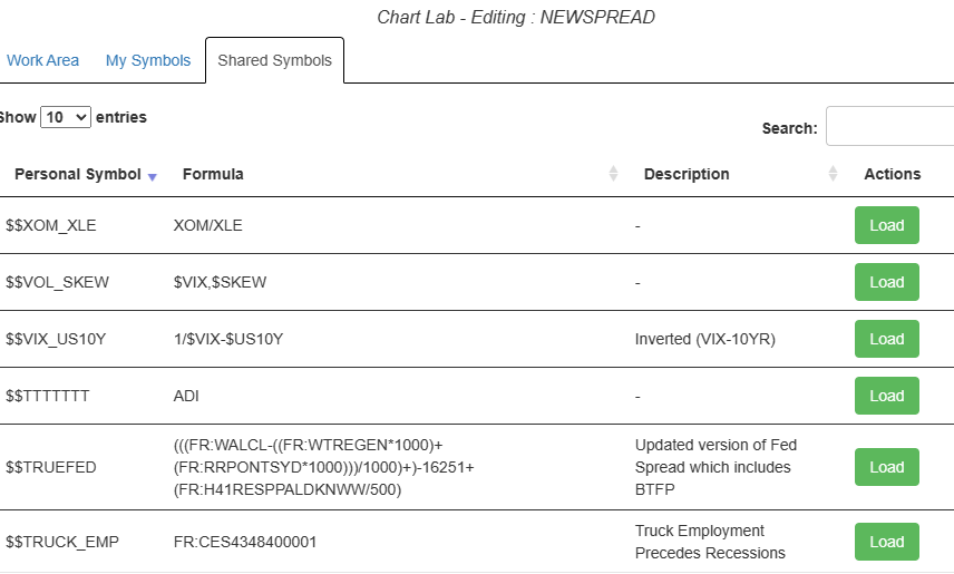
Incidentally, to my beloved Platinum users, please note we’ve added a Shared Symbols tab, which lets you access ALL the symbols that have been created out there. I’m counting on you folks to be inventive and to keep building out this library!
For those who are not already Platinum subscribers, I’ve got an amazing offer for you which will let you try Chart Lab (and the dozens of other features you get) at a nearly 90% discount. Good Gravy!
I am offering Platinum for $9.95 for the first month and, if you continue, a permanent $30/month discount for the life of your subscription. If you want to give it a shot, please click here to see the offer. And, hey, since it’s an investment tool, it might be a tax-deductible expense for your forthcoming return!
