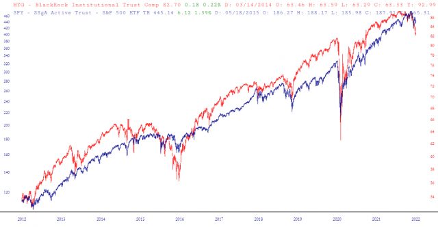
I’m going to be a bum and just paste in the documentation to our new Layered Charts feature. I still need to read the comments from my announcement last night, since I know some of you had good ideas I want to implement. But I am continuing to ask for feedback and ideas to improve this – – and for you to tell me if you’ve seen anything like this anywhere else. I’ve been wanting this feature for years.
The ability to “layer” charts is a unique and powerful feature in SlopeCharts which at first glance might seem to be just an other form of comparison charts, but it is much more flexible and sophisticated than that. This feature allows you to combine charts in ways that are simply not possible with standard comparison charts.
To access this feature, choose Layered Charts from the Mode menu.
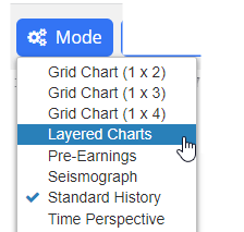
The SlopeCharts screen will change somewhat to accommodate the features in this mode. The most obvious change will be the presence of a row of controls at the top.

Here is what each of these items does:
- Layer One: this is the default chart. The layered chart had two elements – chart one and chart two – and when you are in a certain layer, you can manipulate that chart (and only that chart) is the same way you normally do in SlopeCharts. You can zoom in, zoom out, resize it, flip it upside down, add studies, clear studies, drawn objects, hide objects, and so on. As you work with each layer, you will see the faint image of the other chart in the background, so you can see how they relate to one another.
- Layer Two: this is simply the second chart, or second ‘layer” in the combined chart you are creating. You can freely flip back and forth between layers to manipulate each layer to your satisfaction.
- Reset: clicking this puts back everything to the default. All the shifting, stretching, flipping, zooming, and other alternations will vanish, and you will be back where you began: that is, with a simple single chart in Layer One.
- Flip: this is the equivalent of the Ctrl-U function, which toggles the chart from upside down to right side up, and then back again. It can be useful to invert charts when you are trying to explore a relationship between one financial instrument and another.
- Stretch: this is like clicking the Resize icon in SlopeCharts. We have made this button because the ability to “stretch” a chart is a vital part of using the layered charts feature to its full potential.
- Download: whatever image you have created will be preserved on your computer in a .PNG graphic file which you can share with others or simply preserve for yourself.
- Exit Mode: clicking this leaves the layered mode and returns you to standard price bar charts.
By right-clicking inside the chart area, you will also see a special popup menu that has been created for layered mode:
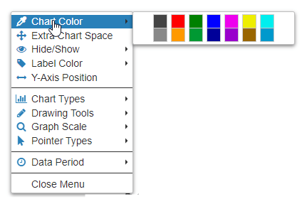
Two special new entries are Chart Color and Label Color, which allow you to pick from any of the available colors to apply to either the price bars or the axis labels of whatever “layer” you are using. This is very useful to help make the layers of the combined chart easier to distinguish.
Here is a simple example of applying the layered charts feature. Here we use the symbol IYR, which is a major real estate fund. We load IYR into both layers, and we zoom in to one of those layers. At this stage, the chart is a mess and yields nothing of value.
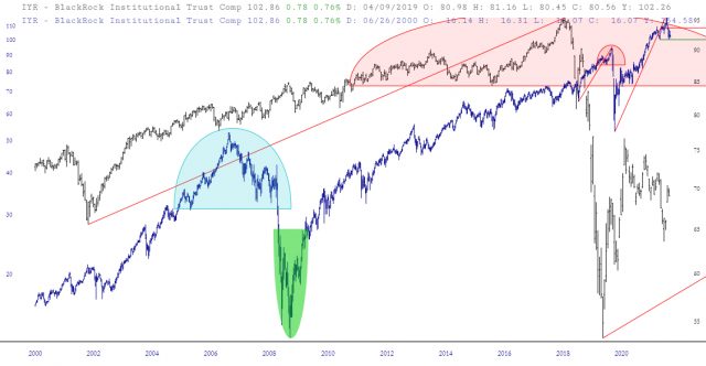
We then switch to the other layer and zoom in on a portion of the chart that seems similar to the portion of the first layer. Now the charts line up somewhat better, although it is still hard to see how the charts are similar to one another.
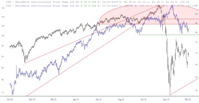
We then use the Stretch (or Resize) feature to help the price bars in blue line up better with the analog chart in the other layer. Now we have a very powerful analog chart, which makes a powerful argument that the present price action suggests a big drop forthcoming in price.
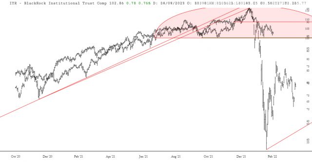
More simply, you can load different symbols in the different layers to try to find parallels between them, or instances in which one item “leads” or “lags” another.
