We only rolled out the awesome new Layers feature late last night, and I’m having a ball with it. As I mentioned, the one feature I really want to add is the ability to Save charts, so rest assured, that’s coming.
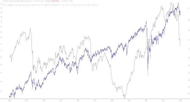
Let me offer an example I just did to show how Layers can be used. So let’s start with the sensible-sounding premise that interest rates have an influence on real estate. So I put the 15-year fixed mortgage in one layer and the IYR in another (note bene: I’m sure other mortgage rates might be better choices, but, meh, what the hell, I landed on this one). Importantly, I did a Flip on the interest rates, which inverts the scale (in other words, the bottom of the chart represents higher rates).
Already, we can see a very cool interaction between these two. Notice how interest rates seem to lead – – by a long time – -the real estate market?

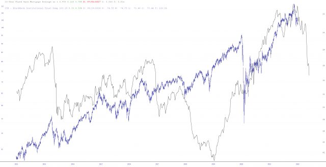
Next, I stretched the IYR to squish it from the left side, thus lining up the peak of real estate with the bottom of interest rates. Now, I realize that these two charts don’t overlay each other perfectly, but at this point, the uptrends and downtrends are very closely matched, suggesting very strong that the plunge in the interest rate chart (which, please recall, represents a RISE in rates, since it’s inverted) has foretold a similar plunge in the IYR itself, which has yet to transpire.

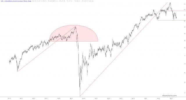
All of which lines up nicely with the analog I’ve mentioned a few billion times.

This feature is as new to me as it is to you. As I mentioned, I’ve wanted this for years, and I’m so pleased it’s finally here. Now that I’ve got my hands on it, I shall be improving it in ways both big and small. Enjoy!

