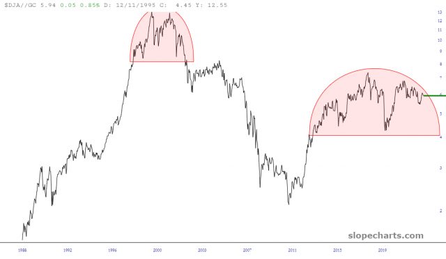
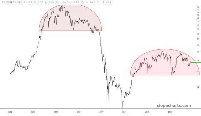
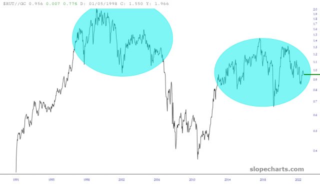
I’m already seeing plenty of chatter about how the sell-off is over, and it’s back to buy, buy, buy again. Yeah, well, I don’t think so. Below I present to you the up-to-date charts of a variety of important indexes, each of which have been divided by the price of gold. This representation of equity values, in real money terms, is a more honest and meaningful portrayal of value.
Here’s the all world index which, like just about every other item, shows the price action cleanly within the confines of what could be a massive topping pattern. This rounded top is similar to the two which preceded it, but vastly larger.

The same goes for the Dow Jones Composite, which had an analogous pattern at the start of the millennium.

As well as the Dow Financial Index……….

A similar argument can be offered for the small caps, by way of the Russell 2000. In this instance, the small caps are sporting something more akin to a diamond pattern than the rounded tops above.

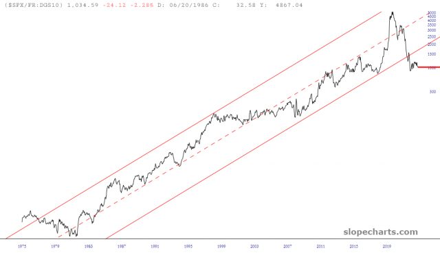
One more perspective to add to this idea that the equity markets are not ready to roar to life again is expressed with the chart below. This graph, which I sometimes called MICE (standing for the Most Important Chart Ever) shows, for the past half century, the S&P 500 divided by the 10-Year Interest Rate. This ratio chart had been confined within this tidy channel year after year, decade after decade, until just recently.
The failure of this ratio below this price channel represents, I believe, a sea change in the markets. A combination of weakening equity prices coupled with rising interest rates caused this historic breakdown, and a failure of a channel this long-lived cannot be brushed off as inconsequential. On the contrary, I think the effects of this channel-break will be felt for years to come.


