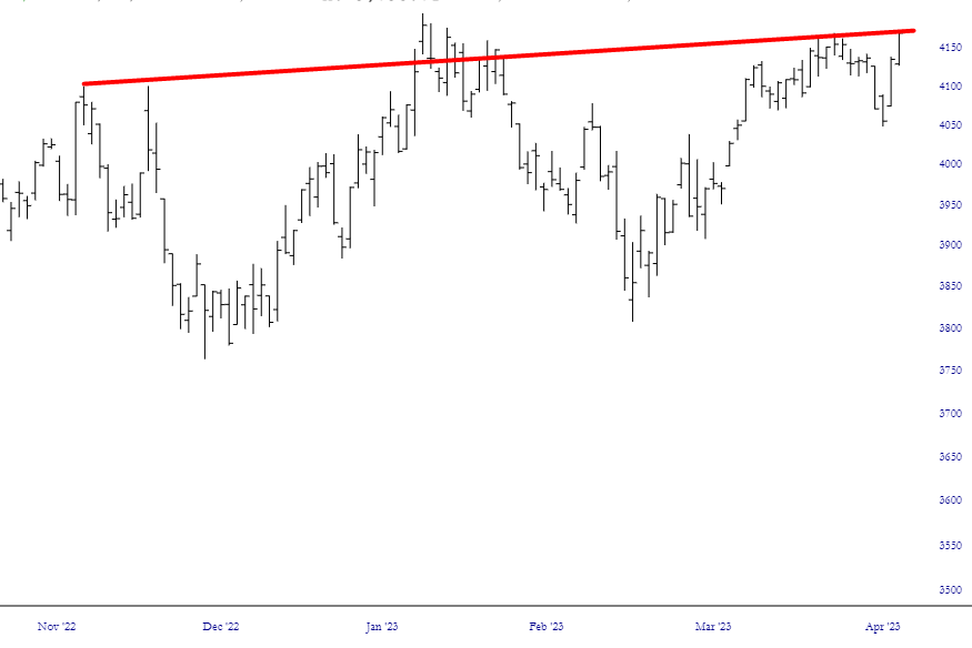
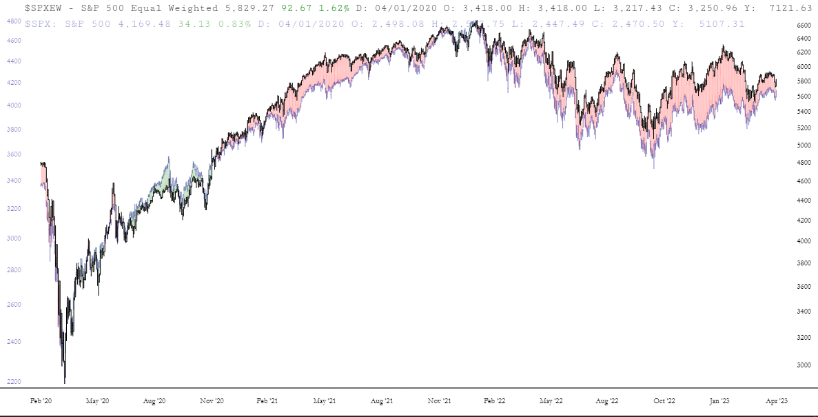
I wanted to share something quite interesting by way of our Layered Charts feature. Here is the past half year of the S&P 500 cash index. Please note how recent highs are higher than those in mid-December.
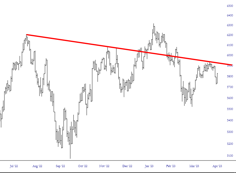
Now here is the exact same market data – – the same 500 stocks – but calculated with equal weighting. In other words, instead of just two stocks (AAPL and MSFT) constituting 14% of the index, and 498 stocks making up the balance, the equal-weighted index treats all 500 stocks equally. I’m certain you’ll immediately notice the difference in the behavior of this data:
By using layered charts, we can overlay these two charts. It is no surprise how closely they track, but the divergences are important.
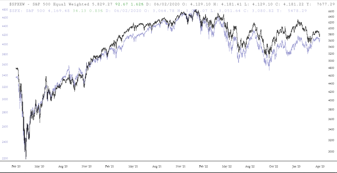
I can click the Spread button to make it very easy to see the delta between these two charts. Whereas the two different S&P 500 charts are in lockstep, they diverge, evidently, when things are starting to get abnormal. For example, you can plainly see the chasm between them which precede the start of the bear market. The different in recent months has been far more pronounced. It’s like the Grand Canyon of divergences.
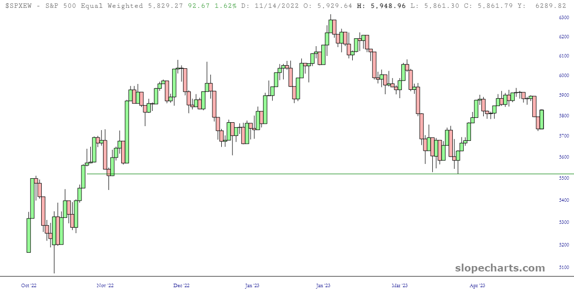
I would finally note that the S&P 500 Equal-Weighted Index is sporting a darling little head & shoulders top which its more popular brother lacks. I’d keep an eye on that neckline.
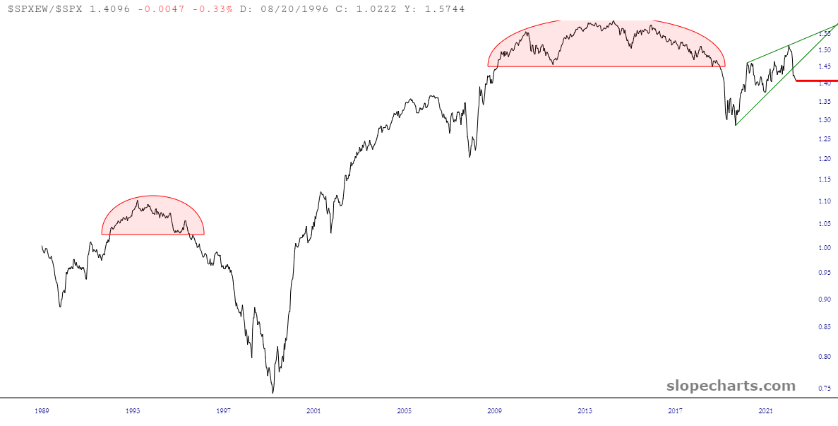
BONUS CHART: The equal-weighted S&P divided by the regular S&P; quite a chart, isn’t it? This is what withering breadth looks like………..