
I was reading an article on another website today when I stumbled upon this comment.

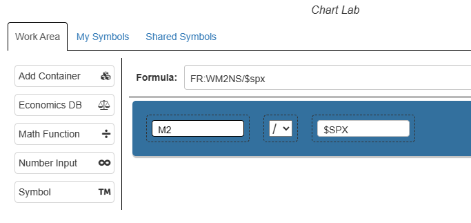
I was quite intrigued by what the fellow was saying about the ratio chart of the M2 versus the S&P 500 so, naturally, I decided to whip out Slope’s latest and greatest tool, Chart Lab. It isn’t a complex formula in the least, but took just a moment to put this experiment together:
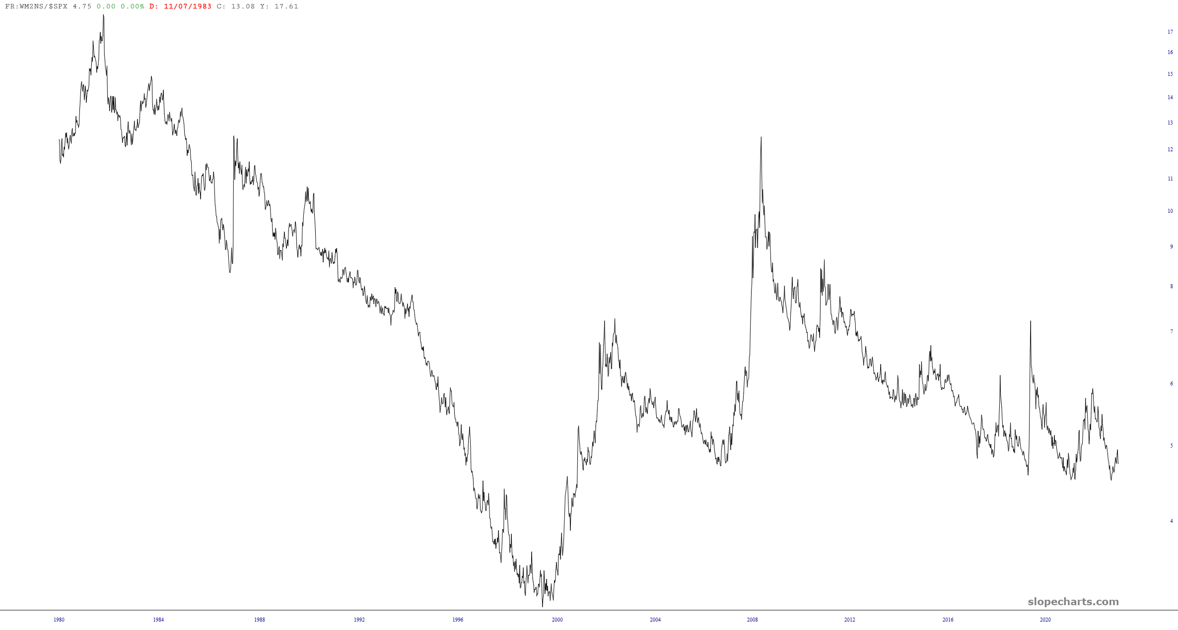
The resulting chart is shown here.
What i was curious to know was how this chart related to the S&P itself. So I piled one Slope tool on top of another by making use of the Layered Chart feature, like so:
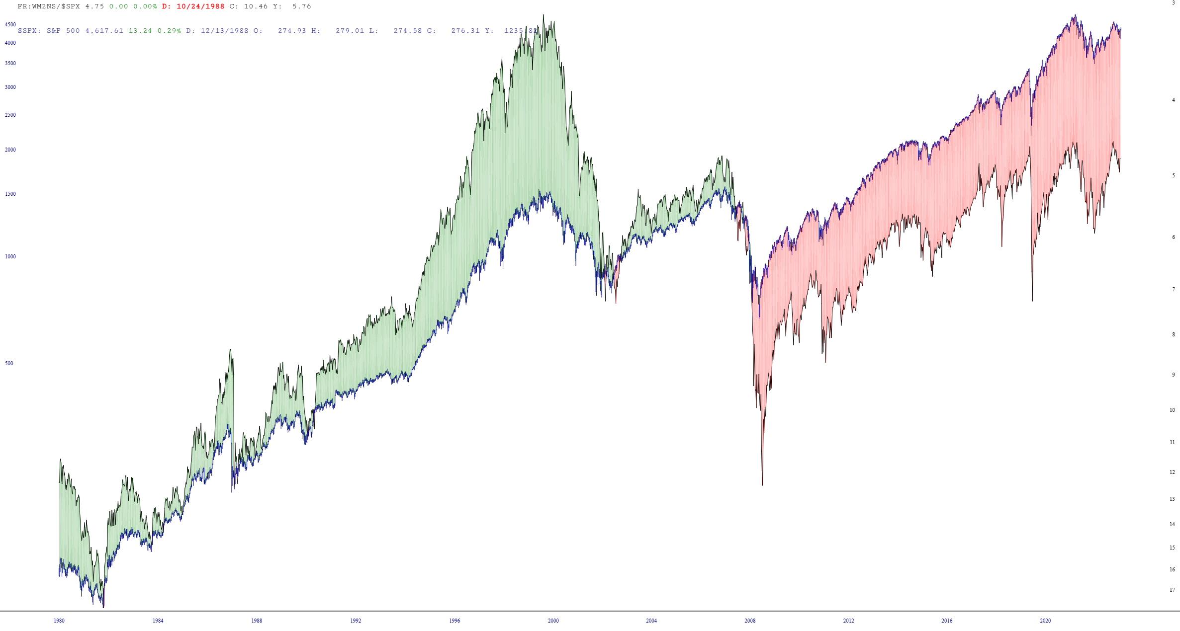
What is shown above is:
- The S&P 500 cash index, represented with the blue line;
- The concoction from above, represented with a black line; (and, by way of Ctrl-U on the keyboard, flipping it upside-down);
- An automatic coloring of the spread between the two
There was no particular “a-ha!” moment for me when I looked at this. In fact, I’m trying to tease out what, if anything, it might be telling us. All I can really see is that the green spread has gone red, since, I suppose, there are so many more trillions dumped into the economy, thus making the nominal S&P much higher when, in fact, it hasn’t actually gone up that much in true wealth terms.
Maybe there’s more to be drawn from this little experiment, and maybe not. The more important I’m trying to make is that Slope makes it easy to see some offhanded remark and immediately play around with it to see what insights might be drawn. Most of the time, there probably won’t be any, but you never know when you’ll hit upon a gem!
