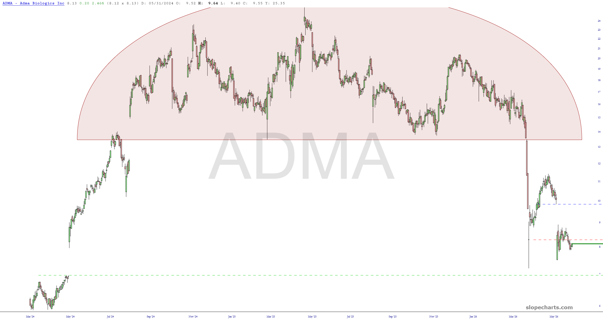
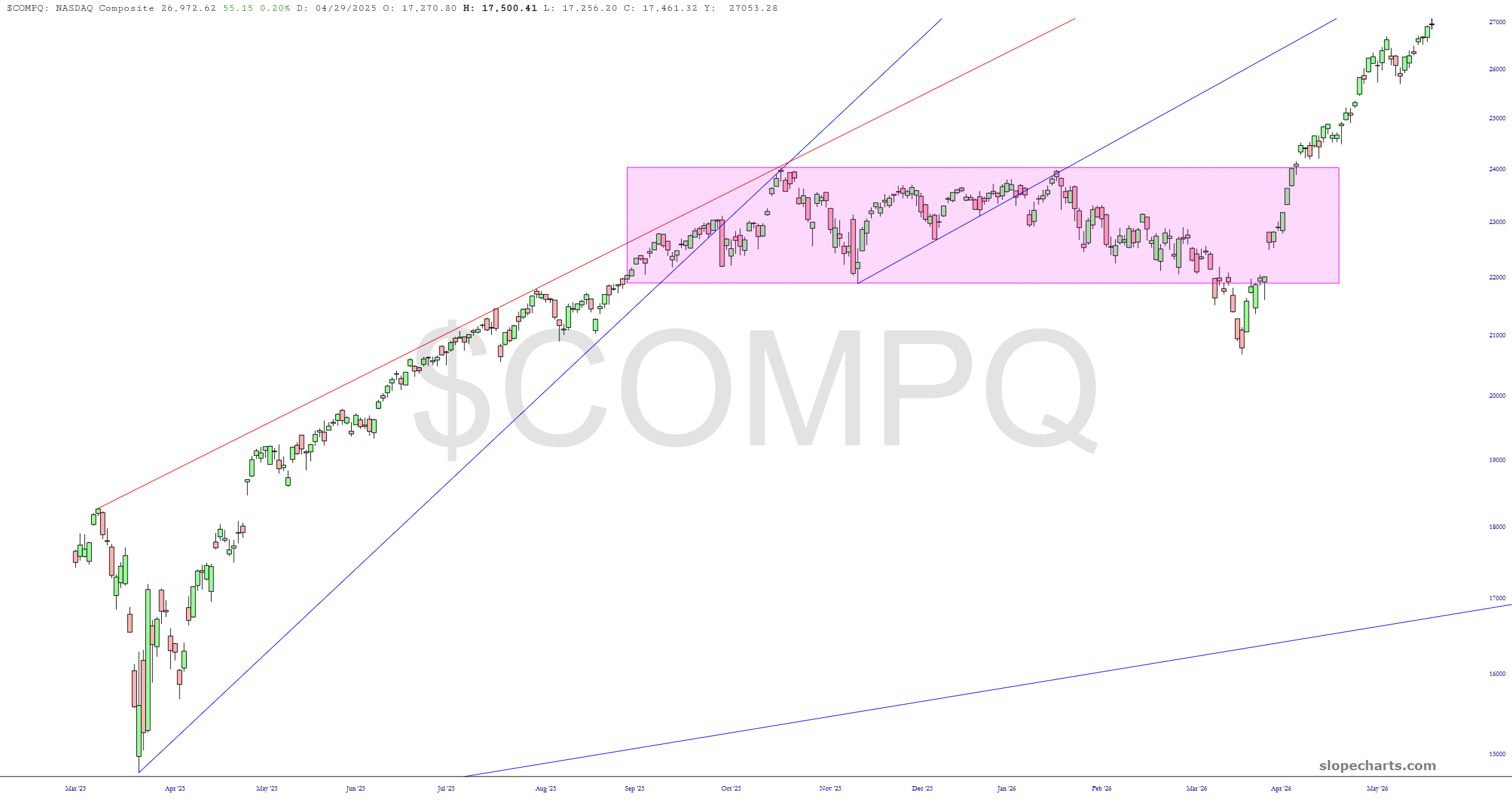
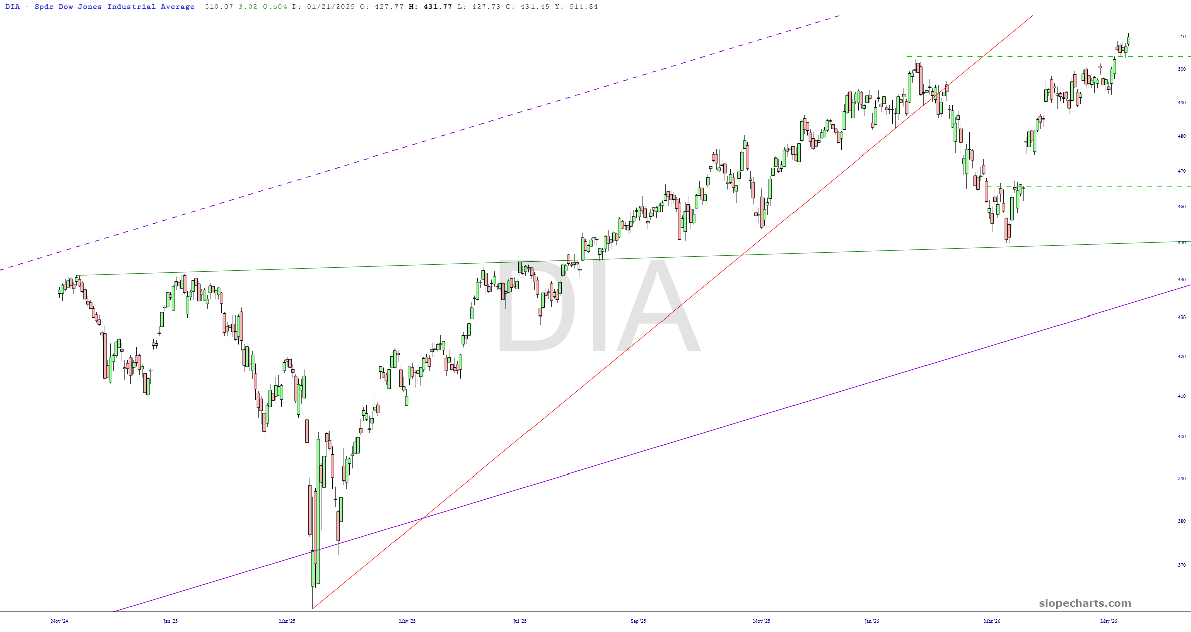
I have twenty-five stocks in my Bear Pen. I am presently short all but eight of these, and I have broken up the charts into two posts. As usual, I have zoomed in to the most relevant recent portions, and clicking on any chart will show a much larger and easier-to-read version.