Welcome back from the long weekend, everyone. Now we get to enjoy a couple of months of holiday-free trading, enriched with the Q1 earnings season which begins in earnest a couple of weeks from now.
Over the past week, the prospect of tech stocks making a meaningful reverse seems to have been blown to smithereens. Things were moving apace quite nicely for many weeks, but the strength we’ve seen in the chart below seems to put us all right back on the road of infinitely higher prices in spite of huge tax increases, an eye-popping debt, and what surely must be an exhausted twelve-year old bull market. And yet…………
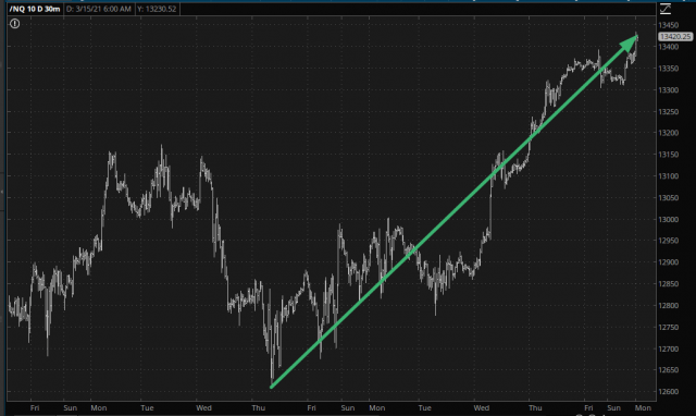
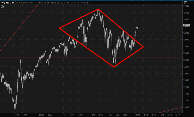
Thus the diamond pattern I’ve been tracking has been pierced beyond help.
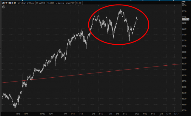
The small caps have been strong simultaneously, although there’s a mildly interesting pattern there still fully intact.
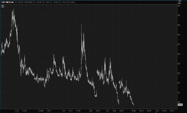
While all this has been going on, of course, volatility has been persistently smothered to death. It’s hard to believe only a year ago this beast was in the 80s and now we’re in the teens. Indeed, this is the lowest volatility has been in the entire Covid era. We are truly back to pre-pandemic levels with respect to fear.
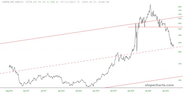
I suppose the ratio chart I’ve presented a few times, showing the S&P 500 divided by interest rates, is in “push back to the neckline” mode. The channel I’ve drawn goes back to when Jimmy Carter was President, and it is exquisitely well-formed. After hitting the midline, we’re gathering strength, and it makes me pale to type these words, but if this chart claws its way back to its neckline, those price levels are a full 50% higher than here!
