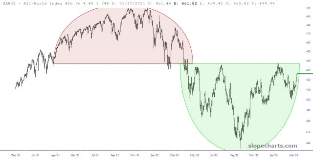
The chart below is fascinating to me. It represents the All World Index, and with a single glance you can see the tension facing equity markets. On the one hand (or, more accurately, on the left side) you’ve got a huge topping pattern, and on the other hand (the right side) you’ve got just as big and just as well-defined a basing pattern. The price is very close to a financial line of scrimmage, and whether it droops away or blasts into the pink area will set the direction of prices for months to come.


