Slope of Hope Blog Posts

Slope initially began as a blog, so this is where most of the website’s content resides. Here we have tens of thousands of posts dating back over a decade. These are listed in reverse chronological order. Click on any category icon below to see posts tagged with that particular subject, or click on a word in the category cloud on the right side of the screen for more specific choices.

Weekly Sector Report Expanded for Month (by Leisa)

By -

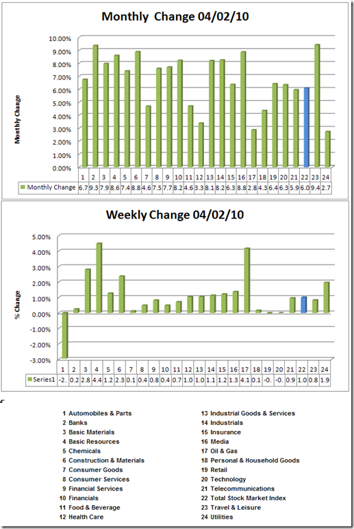
With this report, I plan to migrate from a table presentation to a graphic presentation. I'm leading with the monthly change as we just closed a month. I have colored the total stock market index in blue so you can see that as an easy comparative. I hope you like this new format. Click on the image to make it larger.

image

You can find the detailed report here. It includes all 164 DJ Sectors, the weekly, daily and monthly charts. 


Fujisan in her post today highlights the copper. I'll use that as a springboard to include a sector spotlight chart on the Dow Jones US Industrial Metals Index. If you desire to do a quick view of this sector, you can visit FINVIZ

Industrial metals

I want to point out something important about this chart.  That is that this sector bottomed before most of the other sectors. Russell Napier in his Anatomy of a Bear1  noted that one key to finding a bottom is noting that copper and durable goods orders are two important leading indicators.  I will remind you to from my previous post, that this sector is one of the last top in the last down draft.  Watch this sector interplay.

1 I highly recommend your reading this book.  It will give you great empirical information regarding shared qualities–both quantitative (prices) and qualitative (news flow)  of bear markets. Some of the widely held conventional wisdom are dispatched with impunity. 

Commodity Play (by Fujisan)

By -

While the general market has been going through the consolidation phase, I am seeing many metals and commodity stocks breaking up this week, and one of the good examples is the copper.

When I saw the copper breaking out, I went long other metals and miners expecting the similar price action.  Copper is also known to be a good economic indicator.  This pattern is very similar to AMZN breakout.

Copper Daily

Copper

AMZN Weekly (for comp purpose)

AMZN_weekly

FCX Daily

Fcx 
Silver Daily

Silver closed above the previous high on Thursday.  No volume confirmation due to the pre-holiday trading.  Need a follow through on Monday for a=c pattern confirmation.

Silver_2 
Crude Oil Daily

Crude oil closed above the previous high on Thursday.  No volume confirmation due to the pre-holiday trading.  Need a follow through on Monday for a=c pattern confirmation (needless to say, it needs to clear the trendline first).

Oil

GDX Daily = Possible Gartley pattern formation

Although GDX is going through a lousy consolidation, GDX is possibly forming a bearish Gartley pattern.  Waiting for the confirmation to close above the previous swing high.

Gdx

Gold Daily

Gold is going through the consolidation with a possible IH&S pattern (it's not clean).  Waiting for the confirmation to close above the previous swing high for a=c pattern.

Gc

FXI Daily

Fxi

EEM Daily

Eem 

EUR/USD Daily

EUR/USD did not follow through to the downside and came back up to the "rectangular pattern" trading range.  I came up with two different scenarios for this pair – Gartley or IH&S patterns.

This pair is going to be the key for the commodity play next week.  If the Fed decided to increase the discount rate and the EUR/USD pair resumes to the downside, then, all of the above charts could just be a "fake out", so I will be watching this pair very closely next week.

Eur_daily

EUR/USD 4 hour chart – possible IH&S pattern if the current uptrend channel holds.

EUR_IHS
 
EUR/USD 4 hour chart – possible Gartley pattern formation if the uptrend channel is being broken.

Eur 
ES Futures

Es

The “i” is for Insane

By -

I swung by Palo Alto's Apple store this morning before it opened, and there was a line of about a hundred people waiting to get in, similar to the iPhone introduction I made a video about three years ago. The funny thing is that there is a constant stream of passerby taking photos – – with their iPhone – – of people waiting to buy an iPad. We have truly come full circle.

0403-ipad

If you believe mass media is a contrary indicator, it's time to take profits in AAPL.

0403-jobs

Sixty One Point Eight

By -

OK, for the first time in weeks, a light bulb actually appeared over my head. I have stared at the index charts over and over again. I have done so sitting down; standing up; up close; at a distance; I've looked at intraday bars spanning months and daily bars spanning decades. It's been quite a sight this morning in Tim's home office.

But I finally am comfortable with postulating a direction in the near-term.

I think the Dow's good for about another 300 points on the upside, and the S&P for about another 50 points. These would both achieve the 61.8% retracement levels as measured from 2007's peak to 2009's low. These levels also line up nicely with some other studies I've laid down on the charts.

0403-spx 

Above is the S&P 500 with the suggested target. Below I've revived the 1938 analog – – which makes sense to me again, given what I'm seeing this morning – – shown side-by-side with the present day.

0403-1938

Once the 61.8% level is achieved, I think we could finally be in for some temporary weakness, good for maybe 800 Dow points before serious strength is found again. I also think the high this month would – dare I say it? – finally mark a top.

This actually sort of makes sense in the context of April too. Good Friday's jobs report will almost certainly send the market higher on Monday, and the increasingly sunny news about the economy is bound to cause some retail buying. This is the fuel for the rise. What would cause the modest reversal then? Earnings, I would think, which start in earnest a couple of weeks from now.

Anyway, those are my thoughts this Saturday. I'm not as gung-ho on time analogs as I used to be, but I think the above is worth considering.

Post Cards from the Edge: Mind Maps (by Leisa)

By -

Today's post card from the edge is on radiant thinking. The objective
is to introduce you to the concept, share with you an interesting, free
tool and provide a brief example–in other words, get you interested in
exploring further. I frequently use mind-mapping to assist in creative
exploration and problem solving in personal and business matters.

First, and introduction to
Tony Buzan, the creator of mind mapping. From his website:

Tony
Buzan is the world's foremost expert on thinking visually, and a
leading lecturer on the brain and learning… Tony invented Mind Maps in
the 1970s, and has been instructing millions in this technique ever
since. The Mind Map is a visual representation of the thought process,
and became instantly popular as a creative, innovative and efficient
alternative to linear notation. The Mind Map is an adaptable tool for
just about anything: planning, organising, creating, presenting,
problem solving, communicating and many more!

While
many of us are trained to think linearly, it is believed that the brain
does not operate that way. Buzan posits that the brain works radiantly:
taking a central core idea and then radiating outwards in a various
branches (much like how nerve clusters work). You know that to be true
when you are trying to problem solve, and the answer remains elusive
while you are thinking about it. Once your brain consciously relieved
of thinking about it, the more subtle process of integration takes place
and your 'eureka' moment will spring forth seemingly spontaneously.

A mind
map is what I call systematic creativity–a bit of an oxymoron!
Nevertheless, it is a tool for both stimulating and documenting creative
thinking–and producing a map of that process. I use it frequently to
tackle new projects where I have to plow new ground. Buzan's website has
many interesting mind maps, the image to the left on
example.  I would encourage you to view them to get a flavor for the
output.

The most effective mind map that I created was for my 2008 Resolutions. Essentially it was my personal
balanced scorecard for the year. I posted it by my computer and actively
referred to it every day. I highly recommend this format when you are
in an introspective and personal development mode. I share it not
because I think that it is a great mind map, but rather is was the
single best personal development process and outcome that I had
undertaken.

In looking for a small mind map to post here, I
found this one–My Spider Trading Metaphor. It is very simplistic but
powerful. It allowed me to develop and integrate a metaphor into my
trading/investing life. My full integration of this metaphor is still a
work in process. I could have spent time making the product more creative, but that was
not my purpose.  The purpose is to illustrate the concept
of simplistic but powerful key words and the effectiveness of
presenting the concepts in a non-linear fashion.In writing this post, I
realize that one way to integrate this model is to put together a quick
mind map of a singular trade with the symbol in the middle.

(Click to make larger)


I
use a free program called FreeMind
to produce my mind maps. While doing this on the computer is easy,
there is much to be said for sitting down with some markers and a large
drawing tablet to coax your brain to unleash the power of its
creativity. If you have an interest in reading further, I found Buzan's
book, The Mind Map Book: How to Use Radiant Thinking to
Maximize Your Brain's Untapped Potential
,
both
informative and enjoyable.  I would encourage you to spend a little time
exploring this concept and making a few mind maps of your own.  I think
that you will find the process engaging and the output powerful and
useful.