
A reader recently shared with me some charts which I find remarkable. The point is a simple one, as is the presentation.
Below is a monthly chart of the Dow 30 Industrials. Take note of the two study panes beneath it: the top is the stochastics, and the bottom is the MACD. In particular, notice the line markups on the indicators showing the pattern breaktop (stochastics) and the non-confirmation divergence (MACD). Click on the chart to see a bigger version.
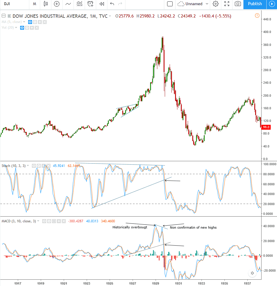
So that took place in 1929, just before the Great Depression. Now take a look at the current market. Notice a similarity? I sure do. It’s uncanny. The only difference is that, unlike the chart above, it doesn’t show the wipeout following these phenomena.
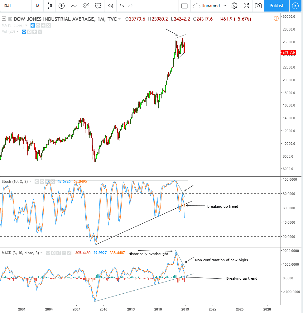
This is certainly not just restricted to the Dow. Here’s the NASDAQ 100 in its present form:

In my own portfolio, I am aggressively short, and I can’t remember a time when the market was so rich with bearish setups. There are certainly “holdouts” which are resisting the selloff so far (some examples include AZO, CME, CSCO, DIS, ISRG, MSFT, and ORCL), but on the whole, I’d say even with the modest selloff we’ve seen to date, equities are far, far away from a bottom.
