Slope of Hope Blog Posts
Slope initially began as a blog, so this is where most of the website’s content resides. Here we have tens of thousands of posts dating back over a decade. These are listed in reverse chronological order. Click on any category icon below to see posts tagged with that particular subject, or click on a word in the category cloud on the right side of the screen for more specific choices.
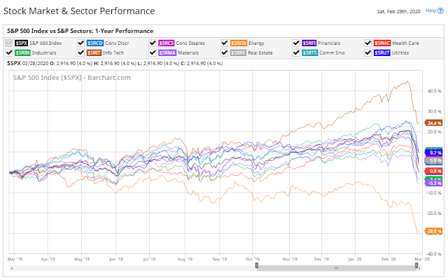
U.S. Stock Market & Sector Performance Heatmaps
The following graph and heatmap are provided courtesy of Barchart.com.
The following percentage graph shows a 1-year comparison of the S&P 500 Index with the S&P Sectors. You can see which Sectors are outperforming or underperforming the Index.
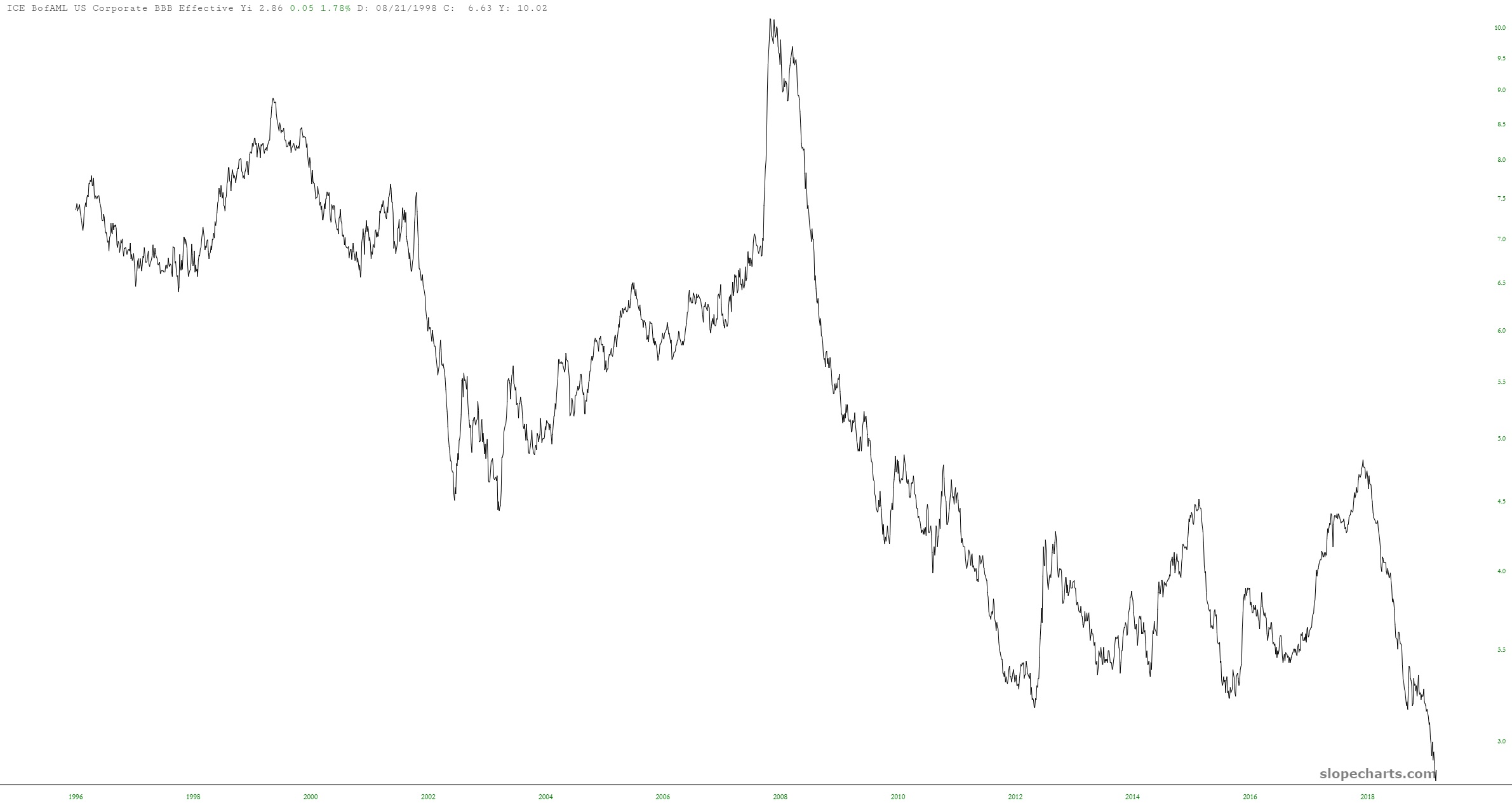
Interest Rate Reversal
China’s Shanghai Index At Its Tipping Point?

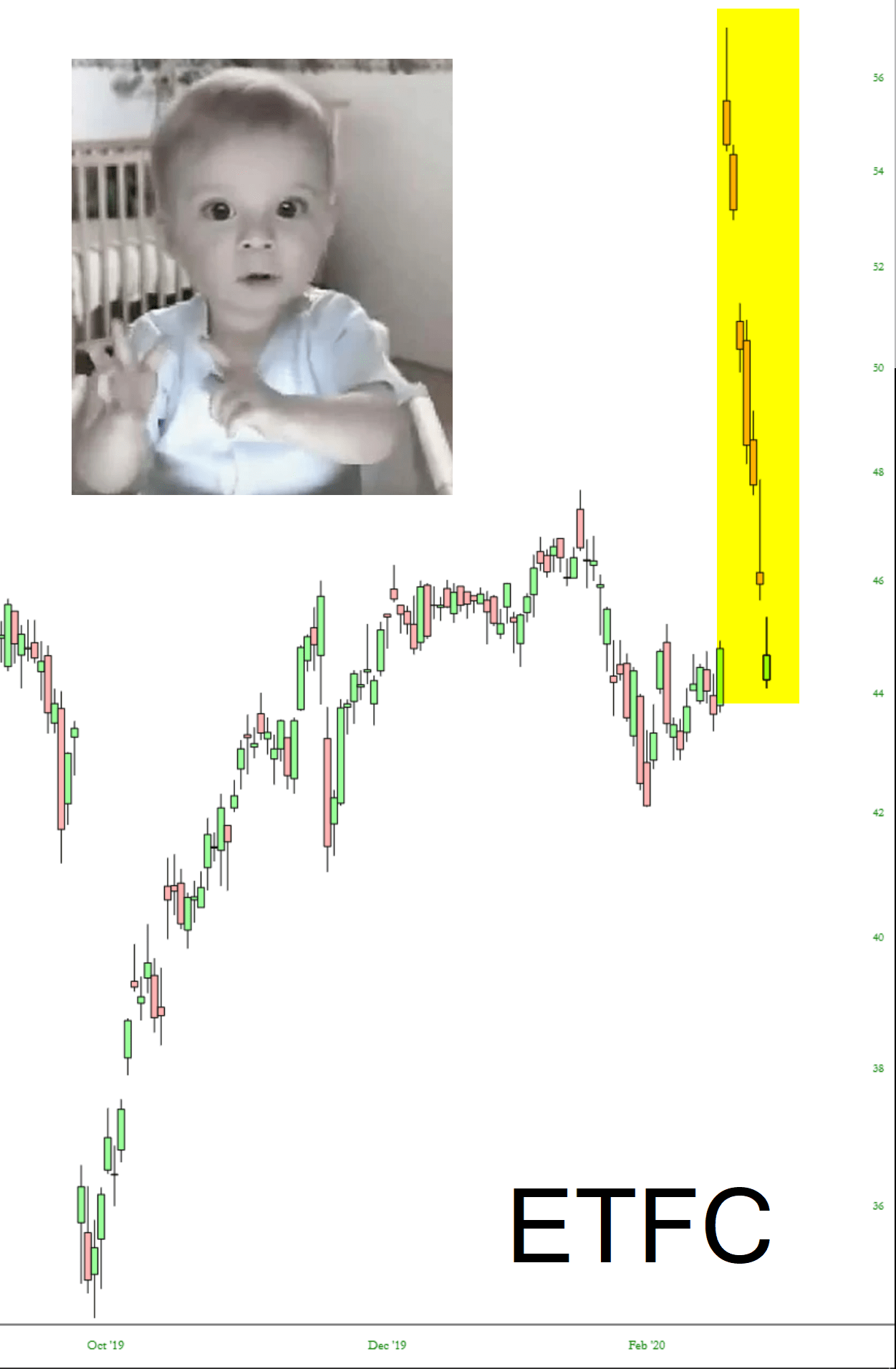
Crib Death
The entirety of the premium Morgan Stanley paid for E-Trade has been destroyed. They sure top-ticked the market on this one. Serves them right for pandering to that creepy spokes-baby.