I’m afraid that this sardonic representation of charting for 2023 is true. All the bullish ones, just fine. All the bearish ones: a slight modification is required. Click on it (as always) for better viewing.
Slope initially began as a blog, so this is where most of the website’s content resides. Here we have tens of thousands of posts dating back over a decade. These are listed in reverse chronological order. Click on any category icon below to see posts tagged with that particular subject, or click on a word in the category cloud on the right side of the screen for more specific choices.
I’m afraid that this sardonic representation of charting for 2023 is true. All the bullish ones, just fine. All the bearish ones: a slight modification is required. Click on it (as always) for better viewing.
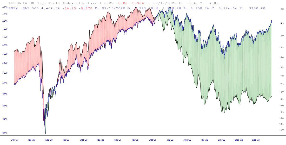
Holy guacamole. Have I got a chart for you. What I did was took the high-yield corporate bond rate (for you Gold and Platinum folks, the symbol is FR:BAMLH0A0HYM2EY). I inverted it. Then I used a Layered Chart to put the S&P 500 on top of it. These two are normally quite closely-correlated. As you can see, the spread between them has become absolutely insane. Let’s just say equities aren’t priced where they should be.