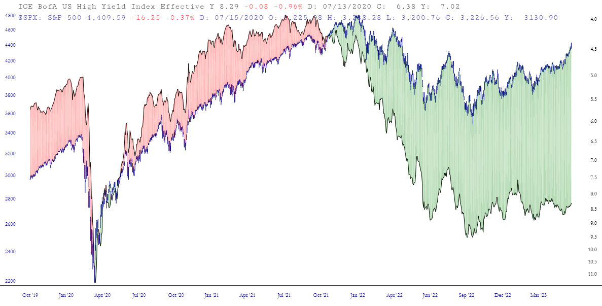
Holy guacamole. Have I got a chart for you. What I did was took the high-yield corporate bond rate (for you Gold and Platinum folks, the symbol is FR:BAMLH0A0HYM2EY). I inverted it. Then I used a Layered Chart to put the S&P 500 on top of it. These two are normally quite closely-correlated. As you can see, the spread between them has become absolutely insane. Let’s just say equities aren’t priced where they should be.