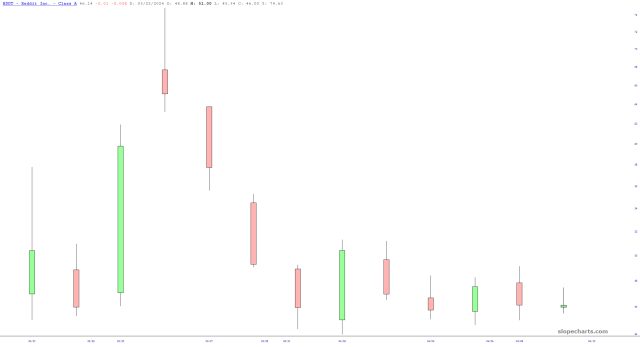
The hot-shot super-high-P/E stock Nvidia seems to have lost its mojo for the moment. Its next big event isn’t until May 22nd, which is earnings. For now, it isn’t exactly behaving the way newer buyers would have expected.

Slope initially began as a blog, so this is where most of the website’s content resides. Here we have tens of thousands of posts dating back over a decade. These are listed in reverse chronological order. Click on any category icon below to see posts tagged with that particular subject, or click on a word in the category cloud on the right side of the screen for more specific choices.
The hot-shot super-high-P/E stock Nvidia seems to have lost its mojo for the moment. Its next big event isn’t until May 22nd, which is earnings. For now, it isn’t exactly behaving the way newer buyers would have expected.
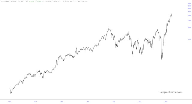
Note from Tim: I've written about my so-called M.I.C.E. chart (Most Important Chart Ever) a number of times, including this post from the summer of 2018 for premium members which preceded a 10% tumble in the S&P. The MICE chart endeavors to blend interest rate and equity data into something that is more insightful than either of them on their own; anyway, LZ has something new for us as follows):
I tried something a little different with MICE: multiplying by the 10yr yield. Bonds are going down in price as yields rise. At some point, they must be the better buy, and the market tops. I don’t know that the level matters for predictive purposes, but the spikes since 2000 have all been proximate to tops.
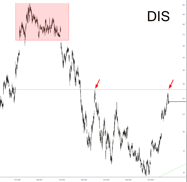
Disney lost 60% of its value from its lifetime high to last autumn. That’s a pretty shocking fall for such a large, well-known company. Since then, it has recovered by going up 50%, but my view is that this recovery is done.
This topic seems appropriate, considering how much music I listened to in the car during our multi-day eclipse journey. (We played a bespoke list of songs having to do with the sun, the moon, and eclipses; I know, sad, right?) We spent a lot of time in Austin, which is actually WAY weirder than Palo Alto ever was, and we visited one of the bigger vinyl record shops in town, which to me felt like the old days of hanging out at Tower Records. It’s heartening to see that old-fashioned vinyl albums are having a renaissance.