
I am very pleased to announce that the latest feature in SlopeCharts, which I’m calling MetaSymbols, is live and ready to use. You can read all about it here, but I’ve taken the key portions of the information and provided them in this post.
For those who don’t have a Gold account, you can get one for all of ninety-nine cents. Click here for immediate access.
For Gold and Platinum members on the Slope of Hope, SlopeCharts lets you create completely new financial instruments with the components and weighting of your choice. You can gather together as many as 100 different equity symbols (including ETFs) to represent anything you like (such as a sector or a particular portion of the market), and our servers will create the data for you and let you chart your creation.
To access this feature, choose MetaSymbols from the Tools menu of SlopeCharts.
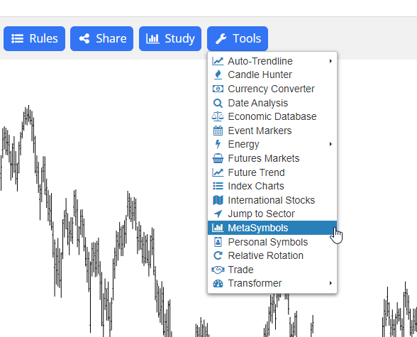
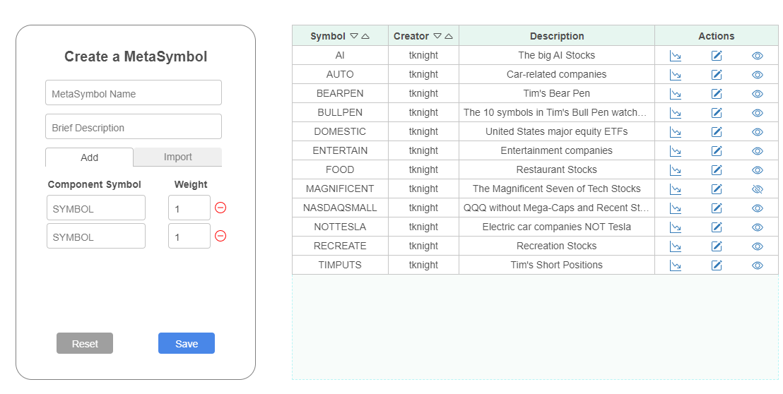
When you do this, you will be presented with a dialog box that will let you create, edit, share, or load MetaSymbols.
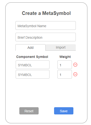
Creating and editing a MetaSymbol is very easy. All you need to do is give it a name, describe its purpose, and define at least two symbols which are its components. You can have anywhere from 2 to 100 different symbols, and you can “weight” their importance. The default is to simply give each symbol a weight of 1, making them all equally important. It should be noted, however, that the price of each component will self-determine its importance, so a $50 stock will have a much bigger influence on the data you are creating than, for example, a $5 stock.
For example, if I wanted to create a symbol to represent businesses related to artificial intelligence, I might come up with a new symbol AI, give it a brief description, and start giving it ticker symbols of companies in that industry.
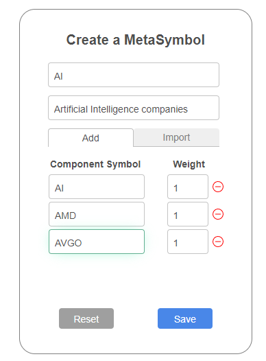
When I am done with my creation, I can click Save, and the servers will immediately start fetching and processing that data. In a few moments, it will be ready for you to chart, or you can continue on and make another MetaSymbol.
Here is a specific example of how a MetaSymbol can provide insight into the markets that simply isn’t otherwise possible.
The popular ETF symbol QQQ represents the most important 100 stocks of the NASDAQ market. Let us suppose we believe the very largest of those stocks have had an outsized effect on the market’s performance, and we want to see if there’s been a time in the past when the NASDAQ 93 (so to speak) different substantially from the NASDAQ 100. We therefore take a list of the 100 ticker symbols of the 100 components and excise the top 7 of them.
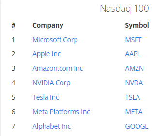
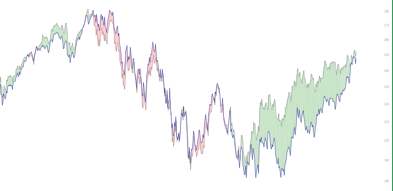
We create a new symbol called NASDAQSMALL, which has the exact same components of the regular QQQ but without the very largest, multi-trillion dollar companies. We then use the Layered Chart feature in SlopeCharts to overlay these two, and we use the Spread function to see how they behave compared to each other.
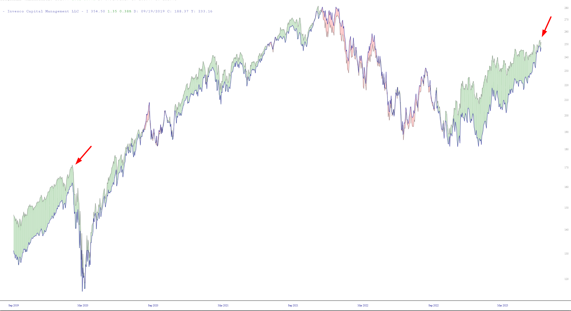
As you can see, whereas these two items used to be exceptionally tightly correlated, in recent months a gargantuan spread has developed between the two of them, suggesting that the very largest of the components are doing all the heavy lifting.
When we take a longer view of these same items, we discover that there was an instance a few years prior in which the exact same phenomenon was taking place. There is no assurance that the outcome which followed that instance will be the same this time, but it is well worth noting.
This is a totally new feature, so there’s probably an imperfection or two in the experience. If you see any problems, please just drop me a line.
