
The week that was – wasn’t very exciting. The shortened trading week and first week of July produced inside price HA Candles on the regular charts. I’ll still show the usual charts and provide some additional research into my gold stock shopping list that I’m working on (first reported here).
First off, the chart that caught my eye this week shows the on-going economic recovery using two important metrics: Unemployment Initial Claims and Vehicle Sales. After the generational crisis in 2008, it has taken four years to get these metrics close to pre-crisis levels. They are not quite there – but close.

(click on image for larger view)
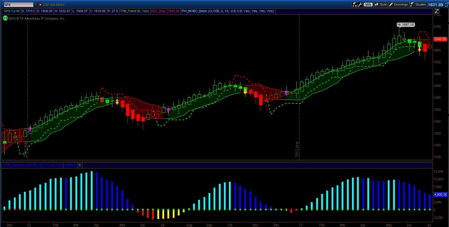
The SPX chart below is still in the context of being out of long positions. For those hedging or going short, the short-stop has moved down to the upper break-out band at 1645 on a weekly closing basis. We saw some positive activity (as per the open HA Candle) but it was all within the expected statistical weekly movements.
(click on image for larger view)
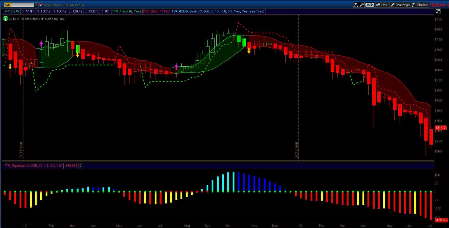
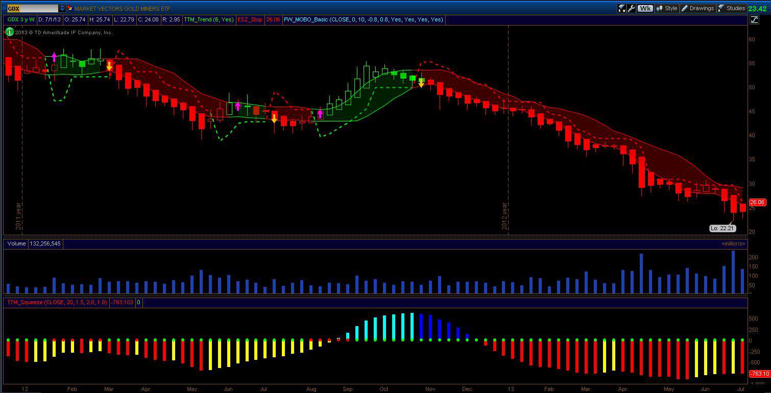
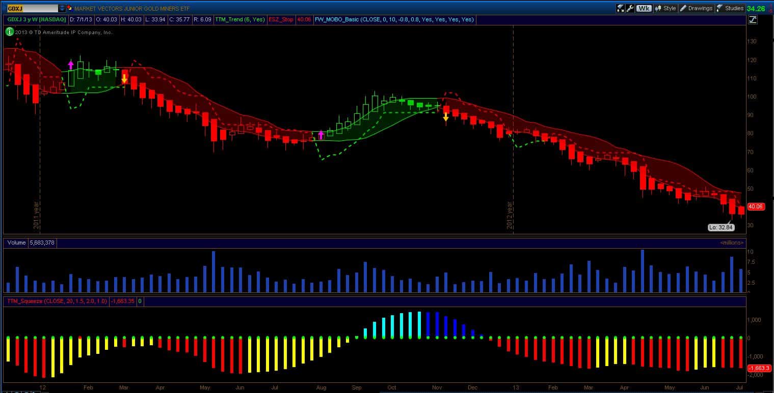
My usual gold charts are shown at the end of this post. Gold, GDX and GDXJ are still in a down trend. Gold is printing increased downside momentum so I don’t expect any turn around right away. GDXJ underwent a 4:1 reverse split so the numbers have changed. You can see where the trailing stop is at the new level of $40 ($10 pre-split).
The news commentary on gold this weekend is interesting stuff. Jim Rogers, who correctly predicted $1200 Gold when it was at all time highs (using a simple 35%-40% correction), is now saying it could go into the $900’s (using a 50% decline). Citi analyst Tom Fitzpatrick has an interesting analog chart showing that after a similar decline in the 70’s, gold rallied 8-fold (this would give $9000 gold from today’s levels). That rise was followed by a 70-ish percent decline following the blow-off in the 80’s. So Roger’s 50% remark is within historical precedent.
In my previous post, I pointed out that gold companies are now trading near or below their book values. A fellow Sloper (thanks 1 Dime) pointed me to this Casey article showing how rare this is. From that Casey article is the following comment:
“We went back as far as 1997 and could not find one episode where gold producers as a group traded below book value – and the late ’90s was known as the “nuclear winter” for the gold mining industry!”
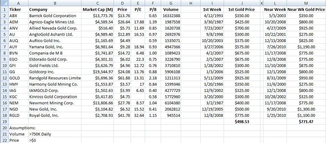
So I began to wonder what the price of gold could be if the share price of the miners today was forecasting future prices gold prices. The study I did was to take the gold companies who had daily trading volumes over 750K and a share price greater than $3 and pose the following two questions: (1) What was the price of gold when their share prices first traded at current prices? and (2) What was the price of gold when their share price most recently traded at current prices? For the most recent pricing, I looked for a time prior to the current year. This turned out to simple enough since the previous time that share prices were at present levels was always more than a year ago. I took the opening price of the week when the share prices occured, and then rounded it up to the nearest $25. The results are given in the table below.
(click on image for larger view)
I should say right up front that there is no fundamental basis for this study. It is a thought experiment. There is no reason to believe that historical share prices correlate to a price in an underlying commodity in such a way that you can use present share prices to predict the future price in an underlying commodity. However, I found the data illuminating.
For one, Barrick could be a poster-child of dysfunctionality (and they are not alone!). Barrick first traded at today’s present share price in 1993 when gold that week was priced at $350. 10 years later in 2003, Barrick was at the same share price and gold was again at $350. Now here we are in 2013 and Barrick is at the same share price but gold in now at $1225 (10 years later again – I’ll leave it to the numerologists to worry about that one). Kinross has an exception from the rest of the pack in that the first time it’s share price traded at today’s price was in the year 2000 when gold that week was trading at $300. The exception for Kinross is that unlike the other companies on the list, that price was recorded one the way down from previous highs (so the other companies recorded their prices on the way up but Kinross had never traded that low). Another observation is that Royal Gold has a very high P/E ratio relative to the rest. A further observation is that comparing today’s shares prices to previous occurrences of the same prices for the same companies reveals that quadruple-digit gold pricing is not common. Perhaps the observation of greatest weight is for the long-term buy-and-holder – “I’m sorry”. This table is a good example of why some form of market timing, at least for these gold companies, is necessary. I mean, look at some of those dates where share prices first reached today’s levels!
I also show the average price of gold for the first and most recent occurrences of today’s share prices of these companies. I assumed equal weighting (I may run a capitalization weighting out of curiosity). There is no reason for equal weighting or otherwise. It’s just an approximation for an experiment that perhaps has it’s greatest merit in answering those two questions. The average prices tell me that historically, present day share prices were supported when the gold price was between $500 and $775.
Finally, the charts for GC, GDX and GDXJ are below (and the commentary above)
(click on images for larger view)
Have a great week!
-Dr. G
