My life revolves about SlopeCharts (both as a user and as a developer), and I don’t think I’ve ever been so excited to announce something new in this product. I call it SWELL (Slopecharts Worldwide Economic Library Lists), and it provides access to an ungodly amount of economic data (literally hundreds of thousands of items) that in some cases goes back hundreds of years. Simply stated, the size of the SlopeCharts database just went up about a hundred-fold.
Using it is a cinch. Click on the SWELL button (take note we’ve made our buttons spiffier).
That brings up a dialog box with two tabs – one for Categories and one for a Custom Search.
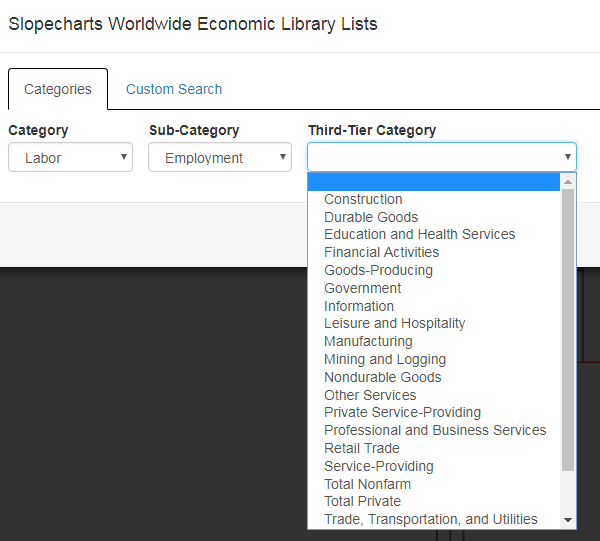
First choose a category, which will in turn present you a list of appropriate sub-categories. Choose one of those, and you will either be presented with a third tier of categories or, in some cases, a list of data sets you can chart. In this example, a third category is available, which is the most common situation.
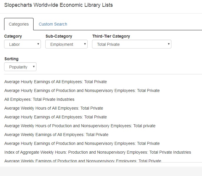
You now have a list of items you can chart listed in order of popularity (you can change the dropdown to alter the sorting to be based on the names). Clicking on any of these will bring up the chart. Once you are satisfied with your choice, click the Done button. Of course, you can do all the normal things with this chart you would with any other including, importantly, adding it to a watch list so you don’t have to “drill down” for it again.
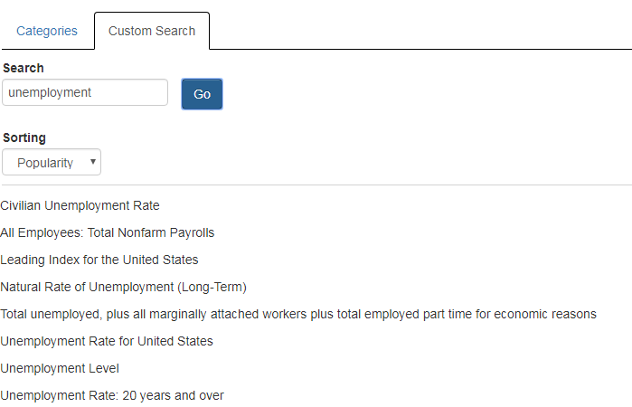
Instead of navigating around categories, you can search directly by using a phrase, a word or even part of a word. Here’s the result of a search for “unemployment”, which scans across hundreds of categories.
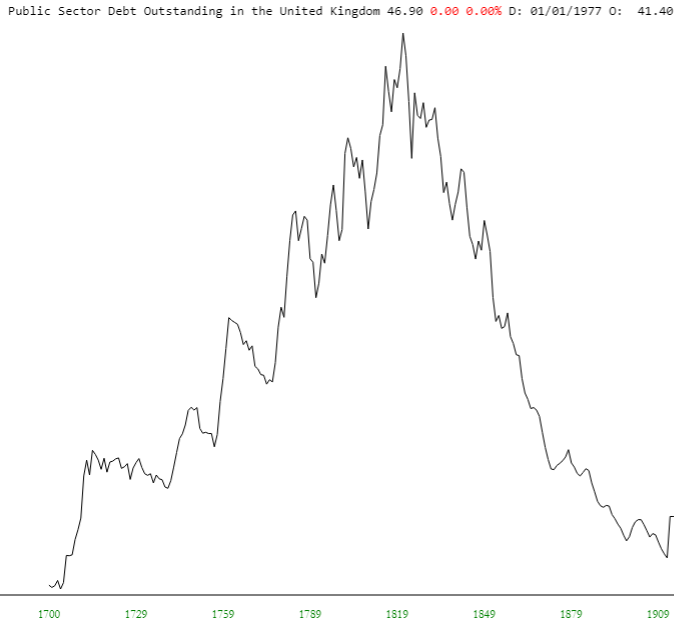
I’ve only just started exploring the data myself, since this feature just rolled off the press, but you won’t believe some of the great stuff in there (TED spreads, 10s2s, and so forth) and other things which are just plain fun to look at, like the United Kingdom’s debt load back in the days of the United States Colonies (take THAT, King George!).


