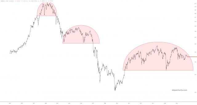
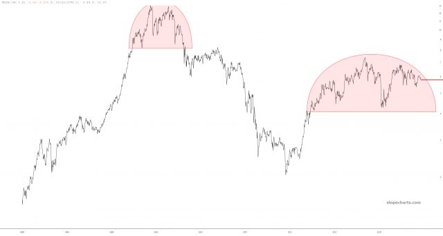
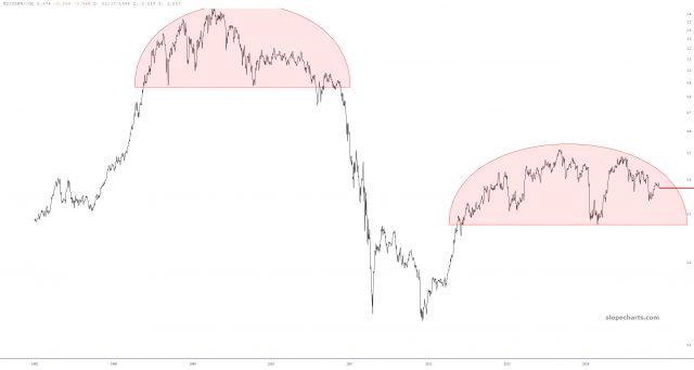
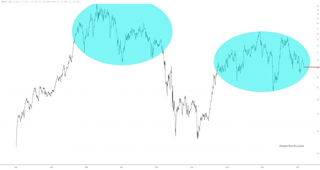
Let’s take a step way, way, way back and look at the stock market from a multi-decade perspective. More importantly, let’s look at it in gold terms (no, I am not channeling Dennis Gartman!)
These four charts show major equity instruments divided by gold. It’s plain to see how well-formed, massive, and potentially disastrous every single one of these topping patterns looks. There is a staggering amount of “push-back” right now in the world of trading, with the universal declaration that the weakness in the market is already over. My contention? It’s got YEARS to go.