
It should first be noted – – nay, emphasized – – that these charts and the words about them are being composed the day before the monthly CPI number is released. Although the CPI was absolutely meaningless for years and years, it has now become an even more important data point than the jobs report, since inflation data has an outsized influence on market strength or weakness. Thus, if you are reading this any time after the CPI of November 14th is released, the conclusions offered may be moot.
Having begun with that important disclaimer, I will say that the ten charts of the ETFs that follow bear an important common element: they have all moved powerfully up toward key resistance levels. In almost all these cases, the resistance is represented by a simple horizontal line (or, its equivalent, a Fibonacci level). Some prices are closer to resistance than others, but on the whole it can be said that (1) the more of these that fail to cross above these lines, the better chance bears have of seizing control of the market again; (2) the more of these lines are crossed to the upside, the higher the chance the bulls will simply continue running roughshod over the bears through at least the end of the year.
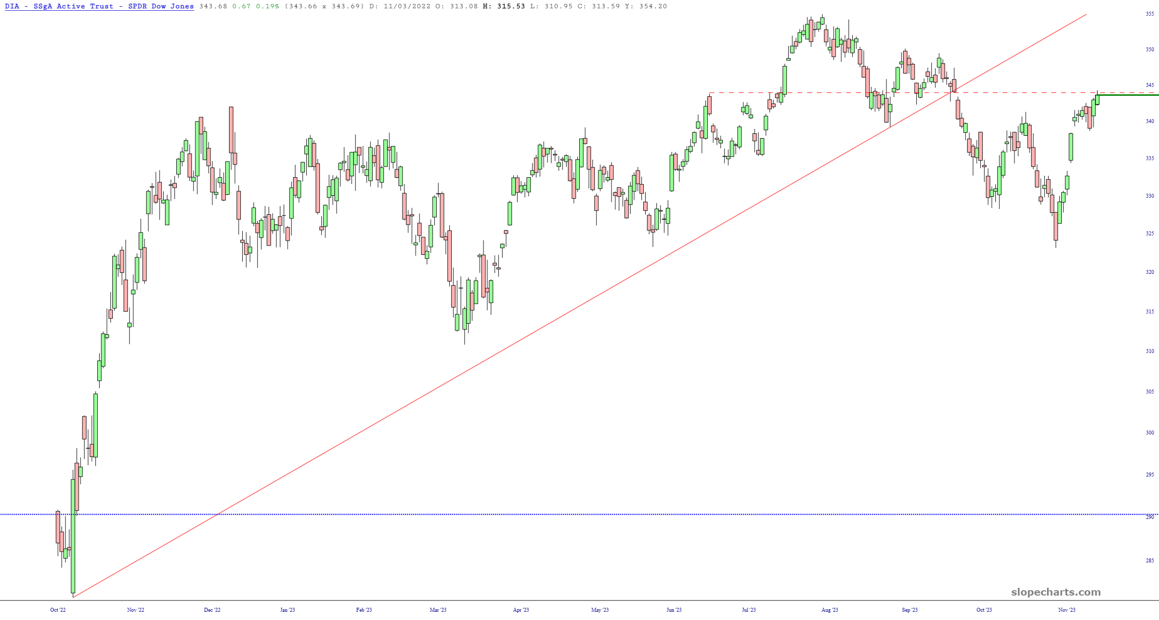
We begin with the Dow Industrials fund, DIA, which has pushed back beautifully to its price gap represented by the dashed line. It failed its ascending trendline many weeks ago.
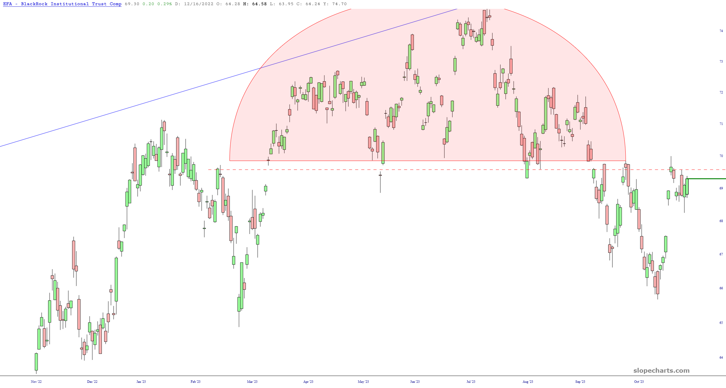
The worldwide fund EFA (sans North America) has a relatively well-formed top, highlighted in pink, and although the precise delineation is tough to pinpoint, the horizontal drawn is a decent rendering.
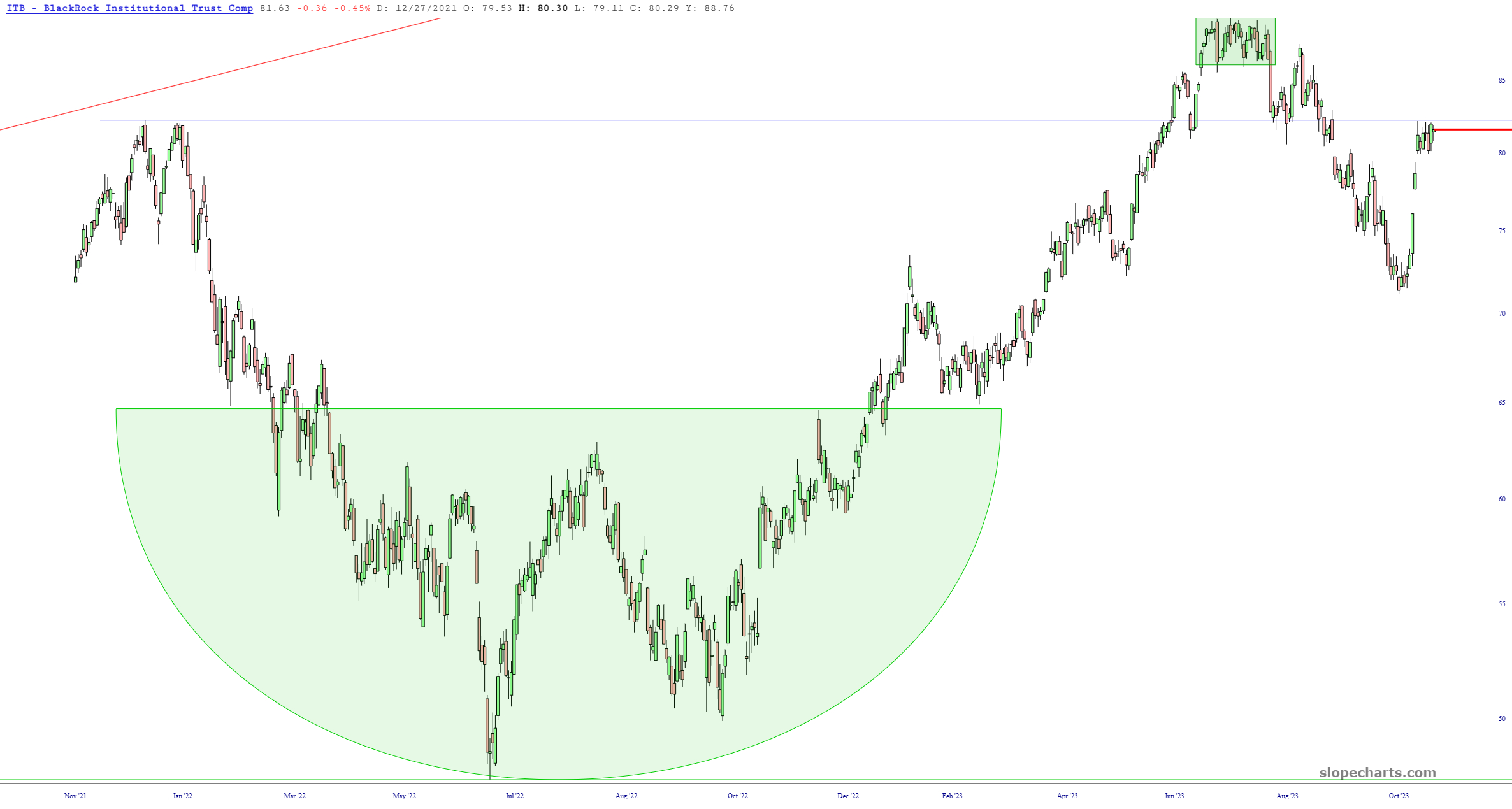
Homebuilders, by way of ITB, broke hard below support and have now come up against the same line, now in the form of resistance.
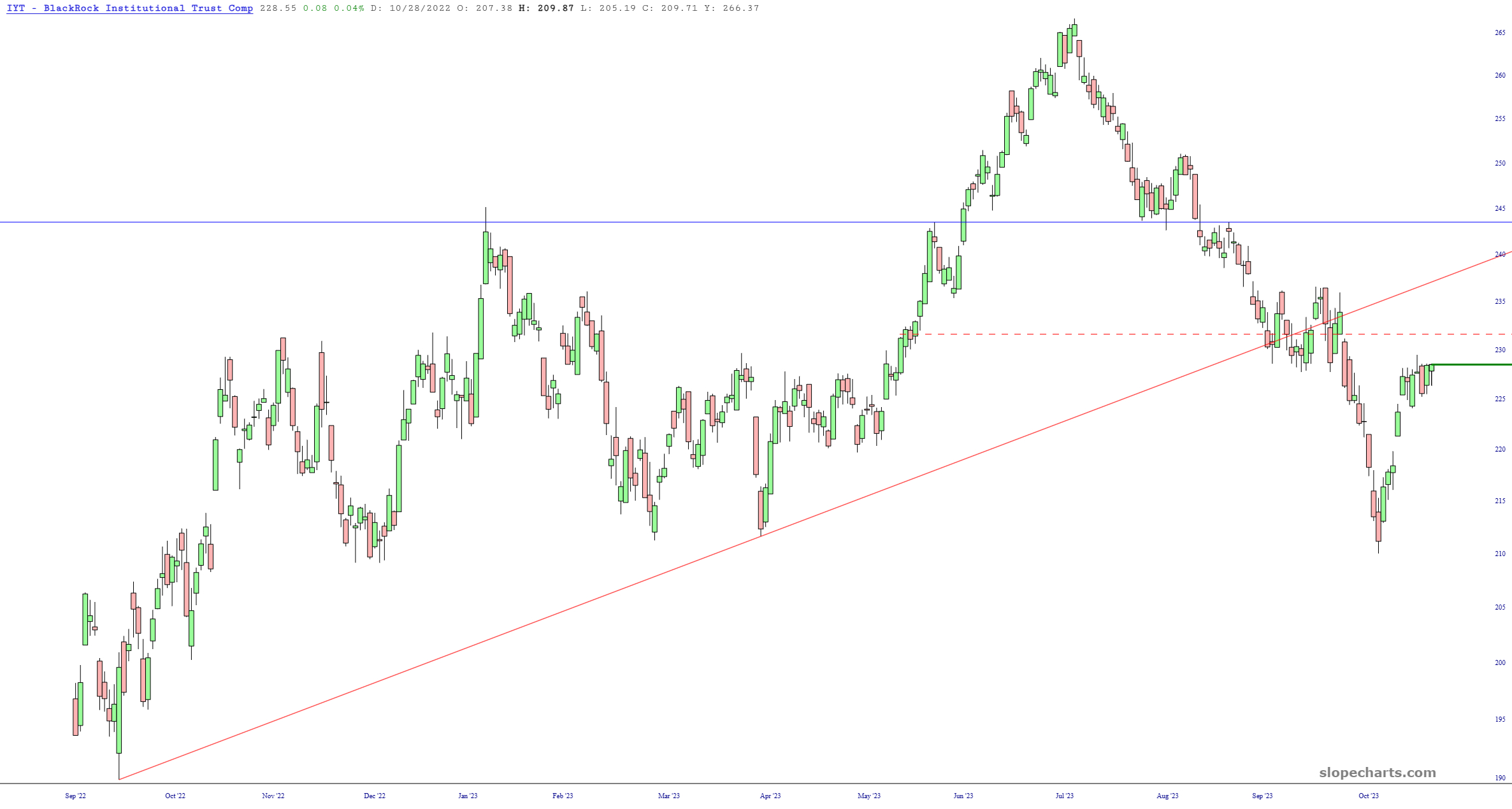
The Transports, IYT, are a particularly good setup, since they have both a price gap and a relatively recent trendline failure. It is a pity that this instrument is so thinly-traded.
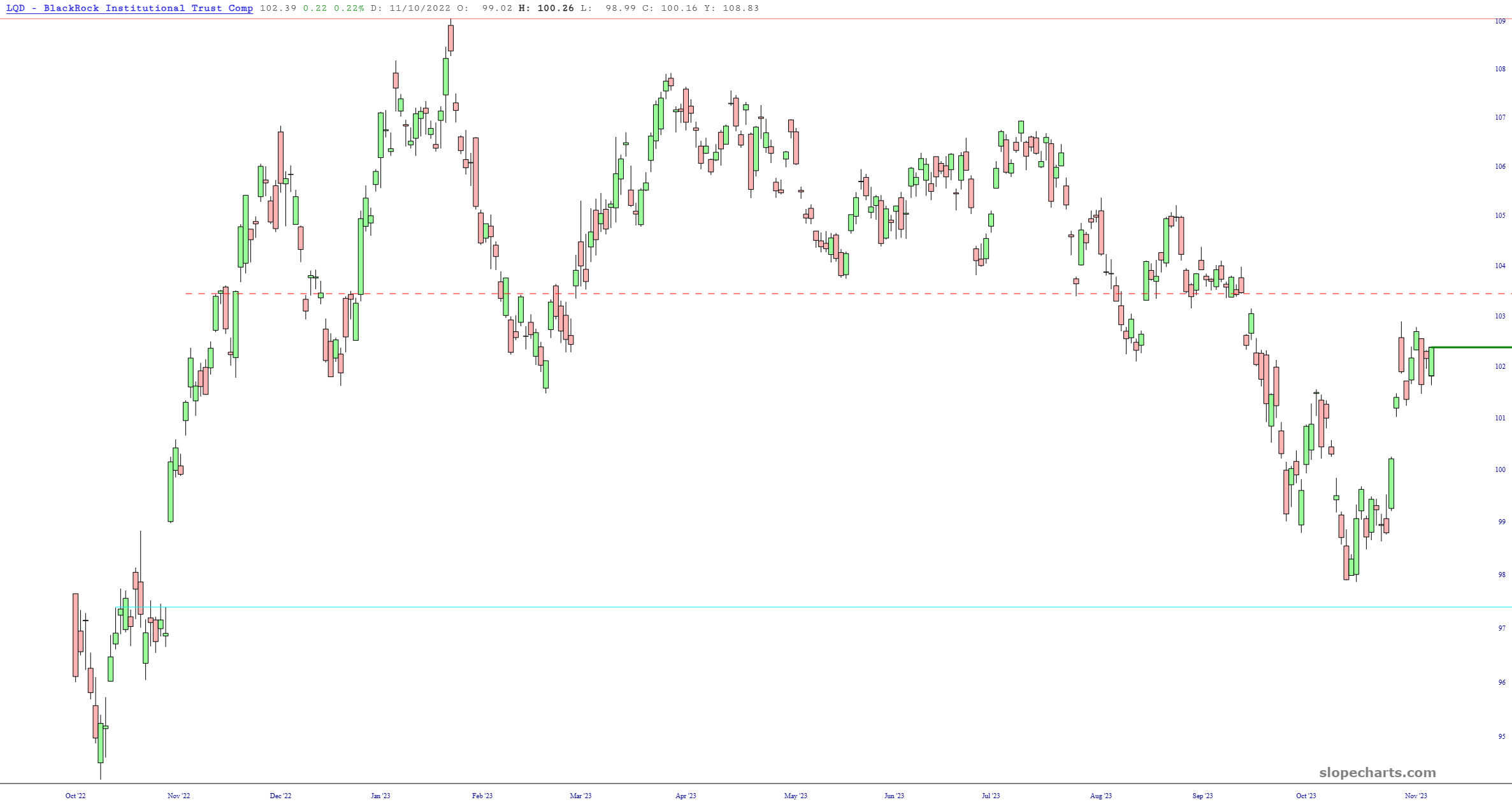
Corporate bonds, represented by LQD, has the horizontal anchored to an important price gap, and this is an example of a bit of wiggle room to the upside before the gap is violated.
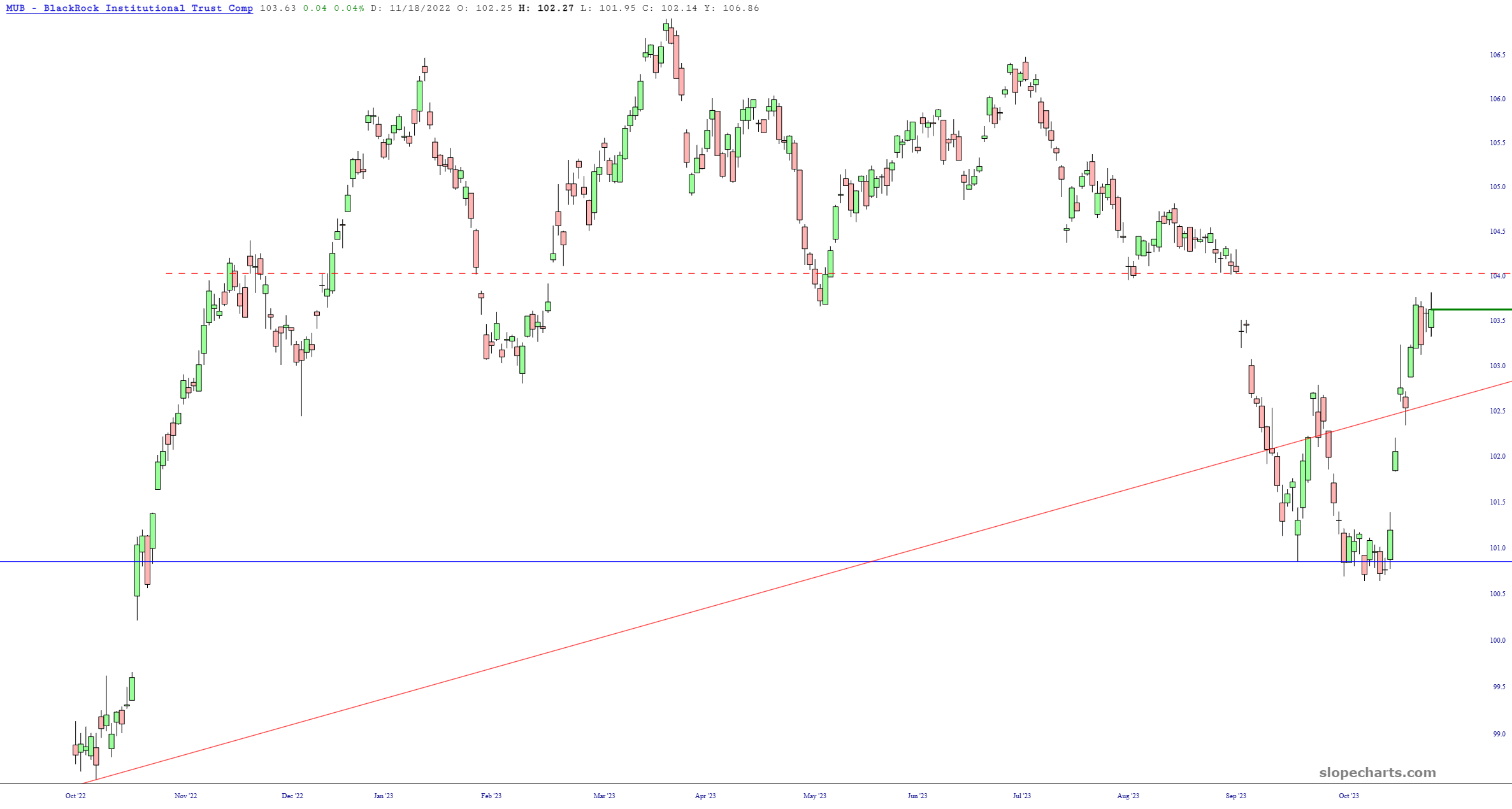
In the same manner, municipal bonds, MUB, has a clean price gap representing where crucial overhead supply begins.
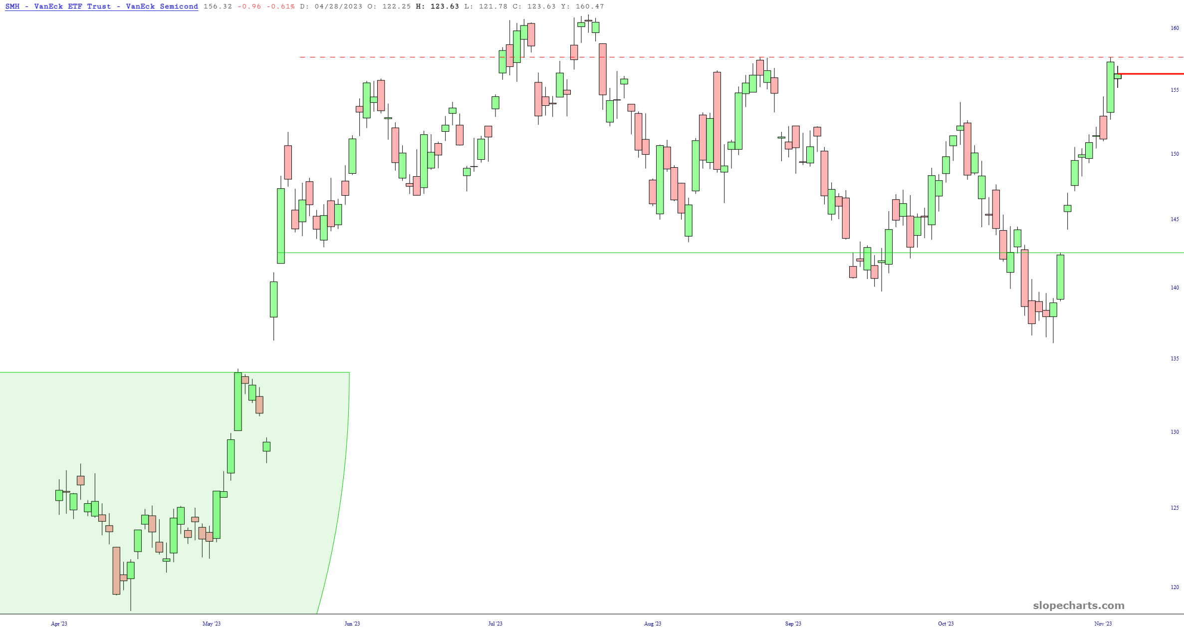
There has been little stronger in all 2023 than semiconductors, and SMH has had a particularly robust move over the past two weeks. This price action doesn’t merit being deemed a “pattern” of any kind, but it has been decently range-bound for months, and the line drawn represents the most recent “lower high” achieved.
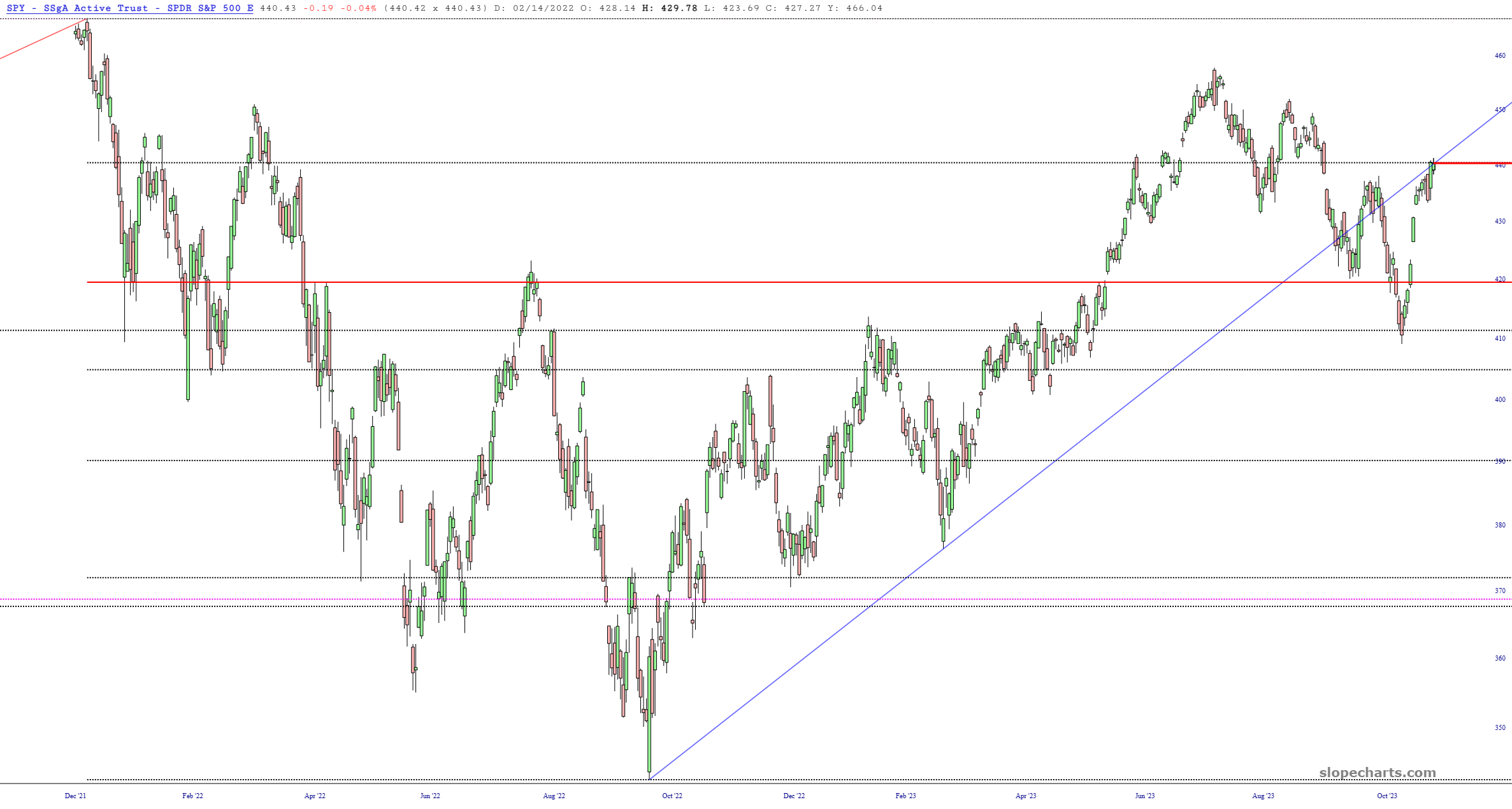
The biggest and important fund of them all, the S&P 500 SPY, is at a doubly-important crossroads. It is at both a major Fibonacci resistance level as well as the underside of a broken trendline that dates back a full thirteen months.
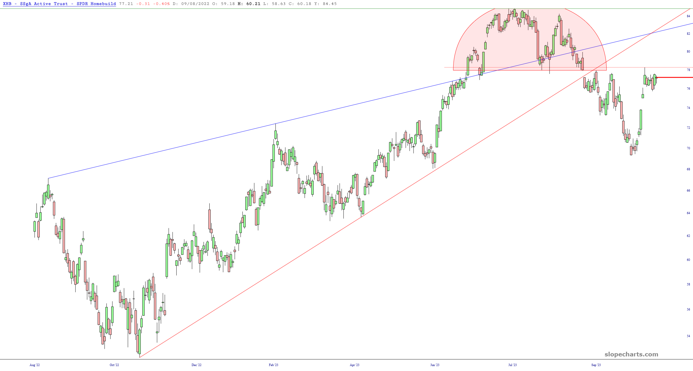
Returning to the homebuilders sector, XHB broke below its ascending price wedge and also has a nifty little top highlighted in the pink area.
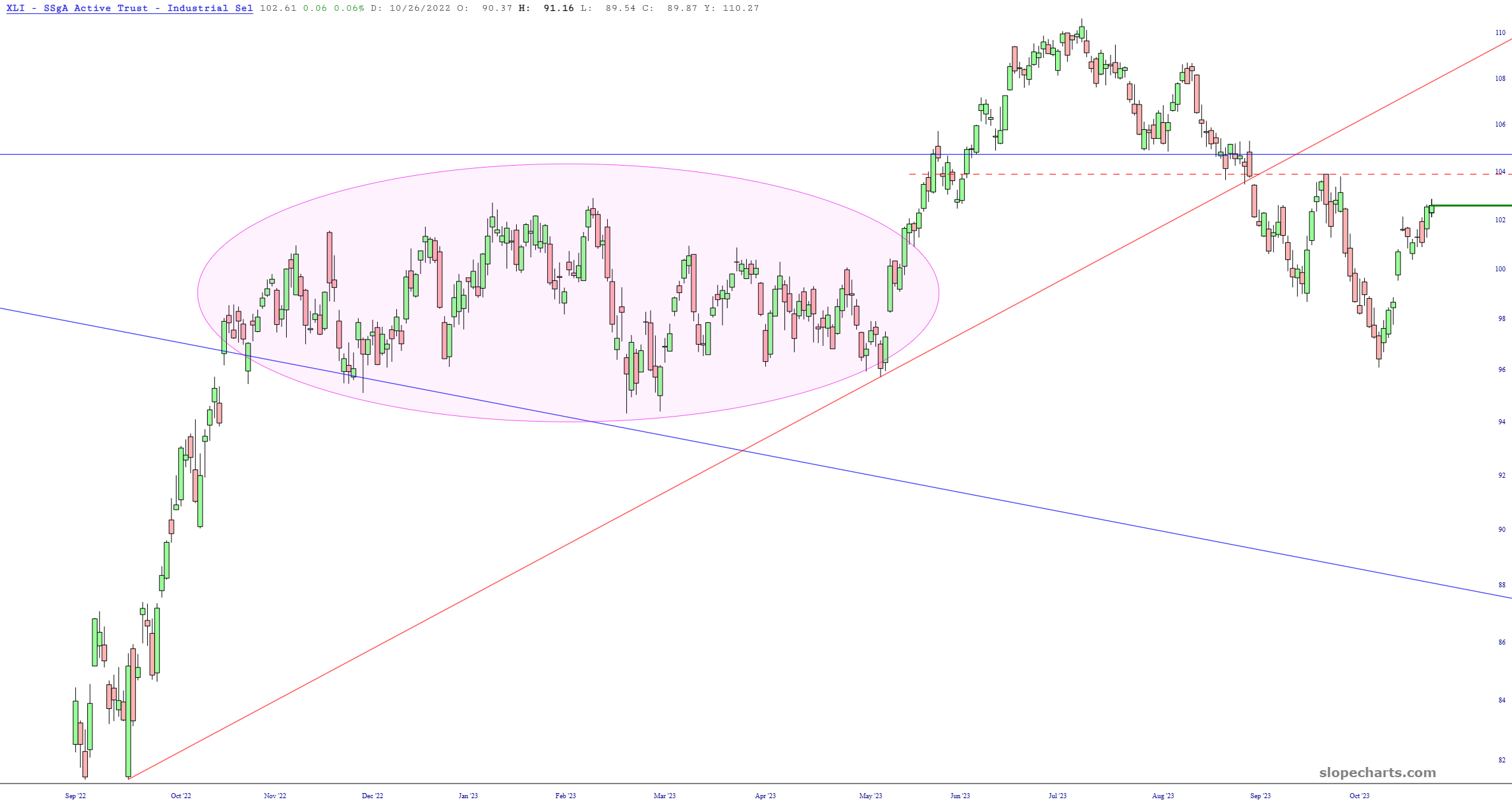
Lastly, the “other” industrials fund, XLI, is approaching the same level (marked with the dashed line) that represented the most recent major reversal.
The year 2023 has been so choppy as to be deemed virtually trendline, and the final weeks of the year should be no different At least it can be said that the general direction for the balance of the year will be largely determined by the binary outcomes of each of the ten charts mentioned above.
