Further to my last weekly market update, here is a summary of where money flow ended for Week 5 of May 2012.
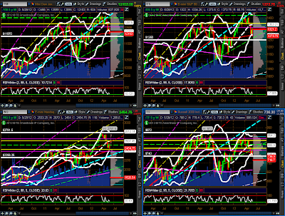
The Weekly charts below of YM, ES, NQ & TF show that they all closed lower than the prior week…on slightly higher volumes on YM & ES and on slightly lower volumes on NQ & TF. With the exception of the NQ, the others have closed below their lower Bollinger Band, their weekly 50 sma, and trendline or price support…the moving average and trendlines are now near-term resistance. The NQ is still just within its rising channel from the 2011 low.
As I mentioned in my weekly market update of April 13th, I’m assigning a weekly bullish or bearish rating on YM, ES, NQ & TF until the end of the year. Please refer to that post for the parameters, and to the Weekly charts below. As of this past week’s close, the ratings for next week are as follows:
- YM = bearish (approaching MAJOR BREAKDOWN)
- ES = bearish (approaching MAJOR BREAKDOWN)
- NQ = mildly bearish (approaching moderately bearish)
- TF = MAJOR BREAKDOWN (anything below 740.00)
The 4-Hour charts below of YM, ES, NQ & TF show a Fibonacci retracement from this year’s high to the lows that were made up until the end of Week 4, as well as a downtrending channel. I left the Fibonacci drawing unchanged so that you could see that price closed below that low and appears to now be on its way to the external 127.2% Fibonacci level of 12015 for YM, 1251.25 for ES, 2376 for NQ, and 712.80 for TF. I would continue with the SELL rating on all of these as long as price continues to trade below the lower one-third level of the Fibonacci retracement (lower horizontal yellow line)…as such, price action is subject to further volatile bearish influences until it breaks and holds above with conviction and higher volumes.
The three Daily charts below depict support and resistance levels on the percentages of Stocks Above 20-Day, 50-Day, and 200-Day Averages.
Stocks Above 20-Day Averages closed lower than the prior week at 15.27%.
Stocks Above 50-Day Averages closed lower than the prior week at 15.93%.
Stocks Above 200-Day Averages closed lower than the prior week at 41.14%.
I’d conclude that, in the short and medium terms stocks are a SELL below 20%, and in the longer term are mildly bearish below 50% to 40%…as has been the case for the past ten weeks, all are still on negative watch for further potential weakness.
The VIX rose on the week by 22.52%, as shown on the graph below.
Further to the comments in my last weekly market update, the Daily ratio chart of the SPX:VIX shows that the SPX fell back and closed below the 200 sma, as well as the prior swing low. The RSI, MACD, and Stochastics indicators have all hooked down again. Near-term support is at 40.00. Near-term resistance is at 50.00, followed by the 200 at 57.08, then 65.00, then the 50 sma at 73.77.
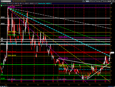
The Daily chart below of the VIX shows that price closed at Fibonacci confluence. A move above that level could send the VIX up to the next confluence level of 30.50ish, or higher.
In addition, I would remind you of the comments made in my post of February 28th, in which I concluded that the odds of another spike in the VIX this year were running around 80% based on my analysis of the past four years of historical data, price levels, and price movements from those levels on the VIX and the SPX. My conclusions remain unchanged.
As shown on the graph below of the Industry Groups, the only group to gain on the week was Gold/Silver. Larger losses were made in Biotech, Oil Services, Semis, and Banks.
As shown on the graph below of the Major Sectors, losses were made in all of them, with the largest in Energy, Financials, Consumer Discretionary, Industrials, Materials, and Technology. The defensive sectors, Health Care, Consumer Staples, and Utilities, lost the least…the markets are still playing defense.
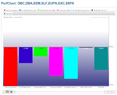
As shown on the graph below of some of the ETFs, the biggest losses were in Commodities (DBC), followed by European Financials (EUFN), U.S. Financials (XLF), Agricultural (DBA), Emerging Markets (EEM), and Chinese Financials (GXC).
Please see my post of May 30th, which compares the SPX with European indices. I concluded that I expect further weakness in all of these indices (including the SPX) until I see evidence of a reversal of price and indicator trend, a retest, and a subsequent rally with the backing of powerful financial, monetary, and fiscal cohesiveness…until those materialize, I doubt we’ll see much of a sustainable rally.
Also, the Daily charts below the graph provides an update on price action on DBC and AUD/USD since my post of May 24th. DBC has closed below its 2011 low, while AUD/USD came close to a retest of its 2011 low. They’re both trading under the bearish influences of a moving average “Death Cross” formation, and, as such, will likely continue to exhibit volatile (and possibly, choppy/whippy) price action for awhile. Ones to watch in the days/weeks ahead, as they will likely affect equity markets, as well.
As shown on the graph below, there were gains in Gold and Silver, and losses in Oil and Copper.
The following four Weekly charts of Gold, Oil, Copper, and Silver show support and resistance levels…ones to watch, particularly Oil and Copper.
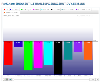
As shown on the graph below of the Major Indices, the Russell 2000 lost the most, followed by Dow Transports, S&P 500, Nadsaq 100 & Dow 30 are tied, and Dow Utilities. There were also losses in the High Dividend-Paying Stocks ETF (DVY), Corporate Bonds (JNK), and the Emerging Markets ETF (EEM).
As shown on the currency graph below, money continued to flow into the U.S. $ and out of the British Pound, Canadian $, Aussie $, and the Euro.
The Daily ratio chart below of the SPX:U.S.$ shows that the SPX broke below its recent consolidation and continued its decline from the beginning of May. The RSI, MACD, and Stochastics indicators have hooked down again, after failing to break and hold above their downtrends. Near-term support sits at 15.00 and resistance at 16.00. This ratio pair is worth watching to see if the momentum continues to accelerate to the downside, which would indicate increased selling pressure in equities.
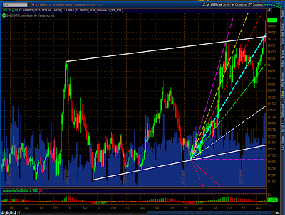
The next chart of interest is the Weekly chart below of the 30-Year bonds (ZB). Price has broken above its confluence of trendline and Fibonacci levels…what was resistance is now near-term support.

Enjoy your weekend!


