Another new feature on the site, folks! And I think you’re going to love it.

Yes, correlations! And it couldn’t be easier to use.
Just to to the Correlations page, and you will have the opportunity to either type in some equity symbols manually or, much faster, choose a watch list of your own. Here, for instance, I’ve just punched in a couple of symbols that I known have a clean inverse correlation:

You can see how this grid works. When the symbol is compared to itself (QQQ versus QQQ, QID versus QID) the correlation is a perfect 1. QQQ versus QID, however, is -.96, since the QID is designed to move in the opposite direction of QQQ.
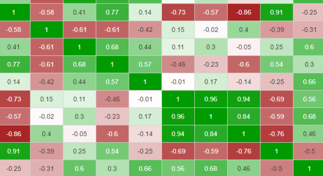
For ease of viewing, we color the correlations ranging from bright red (for the negatively correlated -1) to bright green (for perfectly-correlated +1), with white in the middle for no correlation at all. You can see how much this helps when you are examining a grid:

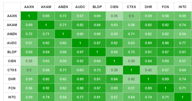
As a different example, I choose my “Bull Pen” watch list, which has 18 symbols. Since these are all normal U.S. equities, they are all fairly well correlated, so it’s a sea of green.

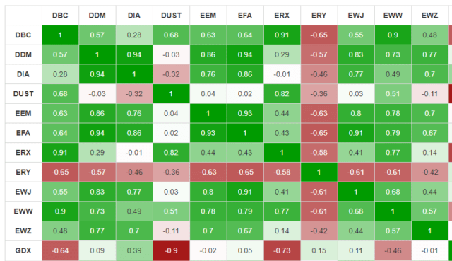
As a more diverse example, I loaded my ETF list. We have purpose designed the correlation page to handle up to 20 symbols, so if your list is larger than that, it still gives you the option to create a correlation grid of the first twenty symbols.
Thus, here is my ETF grid, and there is a very interest variety of correlations here, since a variety of industries are represented, as well as some “short” style ETFs.

Long-time Slopers remember when this place was just a simple blog, and I’m as amazed as anyone at how much Slope has grown. And, believe me, there’s a ton more coming. Please leave me feedback and ideas about this new Correlations page. I hope you enjoy it!

