This is absolutely hysterical (and, as my mama used to tell me, if you didn’t laugh, you’d cry…………)
The Great Bear Depression of 2020 from r/wallstreetbets
Slope initially began as a blog, so this is where most of the website’s content resides. Here we have tens of thousands of posts dating back over a decade. These are listed in reverse chronological order. Click on any category icon below to see posts tagged with that particular subject, or click on a word in the category cloud on the right side of the screen for more specific choices.
This is absolutely hysterical (and, as my mama used to tell me, if you didn’t laugh, you’d cry…………)
The Great Bear Depression of 2020 from r/wallstreetbets
If there’s one consistent reaction the public has to the stock market these days it is confusion. Whether bull or bear, people watching the stock market over the past three months can hardly believe their eyes. Most of them are thrilled, of course, since the so-called market seems to be virtually printing money, even in the face of horrible economic and social problems, but hardly anyone is arguing with it.
For instance, if my house in Palo Alto increased in value 5%, month in and month out, without any apparent rhyme or reason, that would be just fine by me. Would the utility of my house have increased? Would its appearance have improved? Not at all.
It would simply be worth more, and my net worth would increase, while simultaneously those who wanted to own a home in Palo Alto would be farther and farther away from their goal. The wealth disparity – – measured, in this case, in residential housing – – would be getting worse. I’d be happy. Non-home-owners would not.
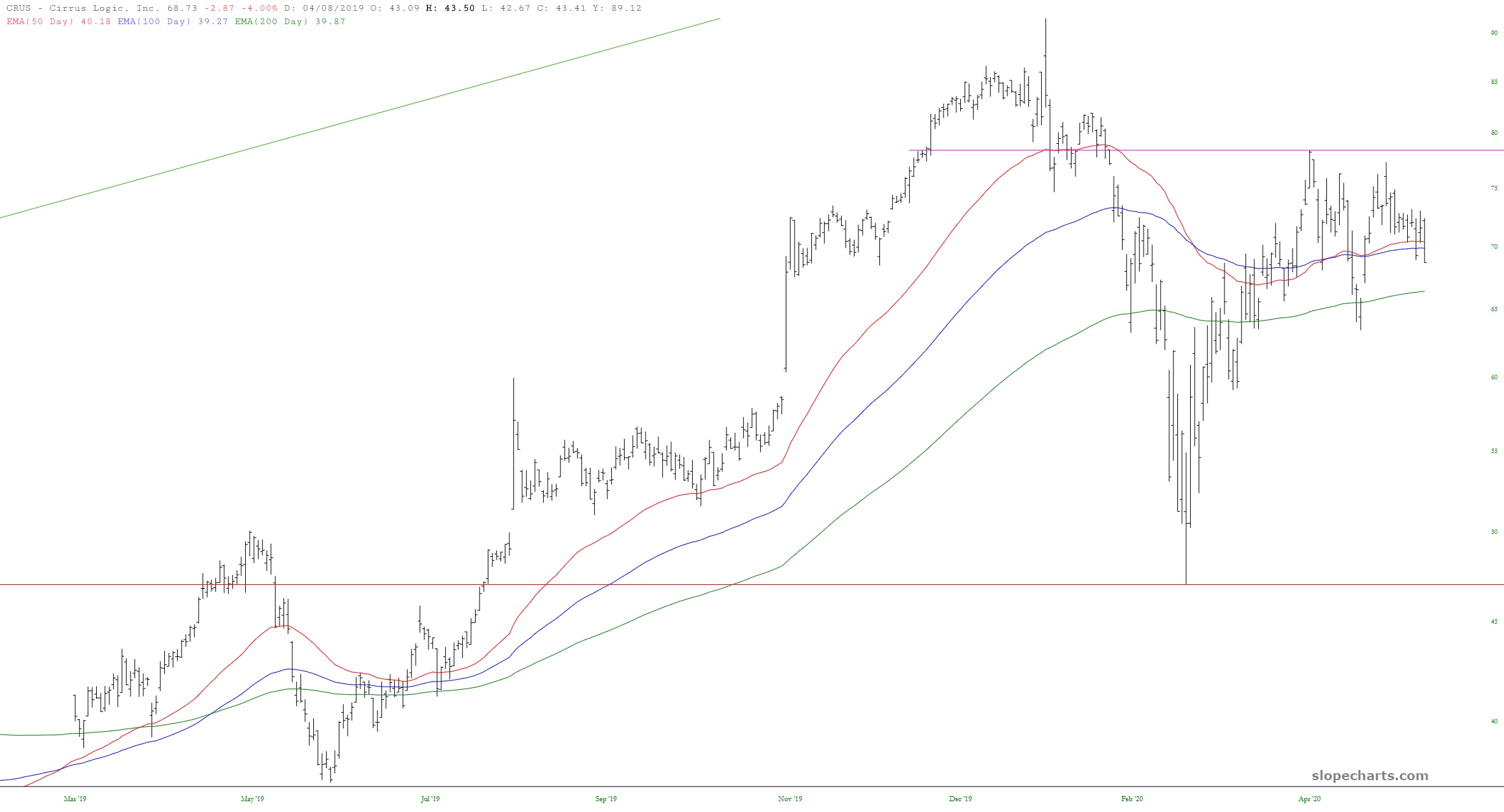
(more…)The semiconductor sector has been an important propeller for the good ship U.S.S. NASDAQ over the past decade, but there’s one particular semi stock I am short which I wanted to share: Cirrus Logic (symbol CRUS). Here is some recent history of the price action with some selected technical indciators:
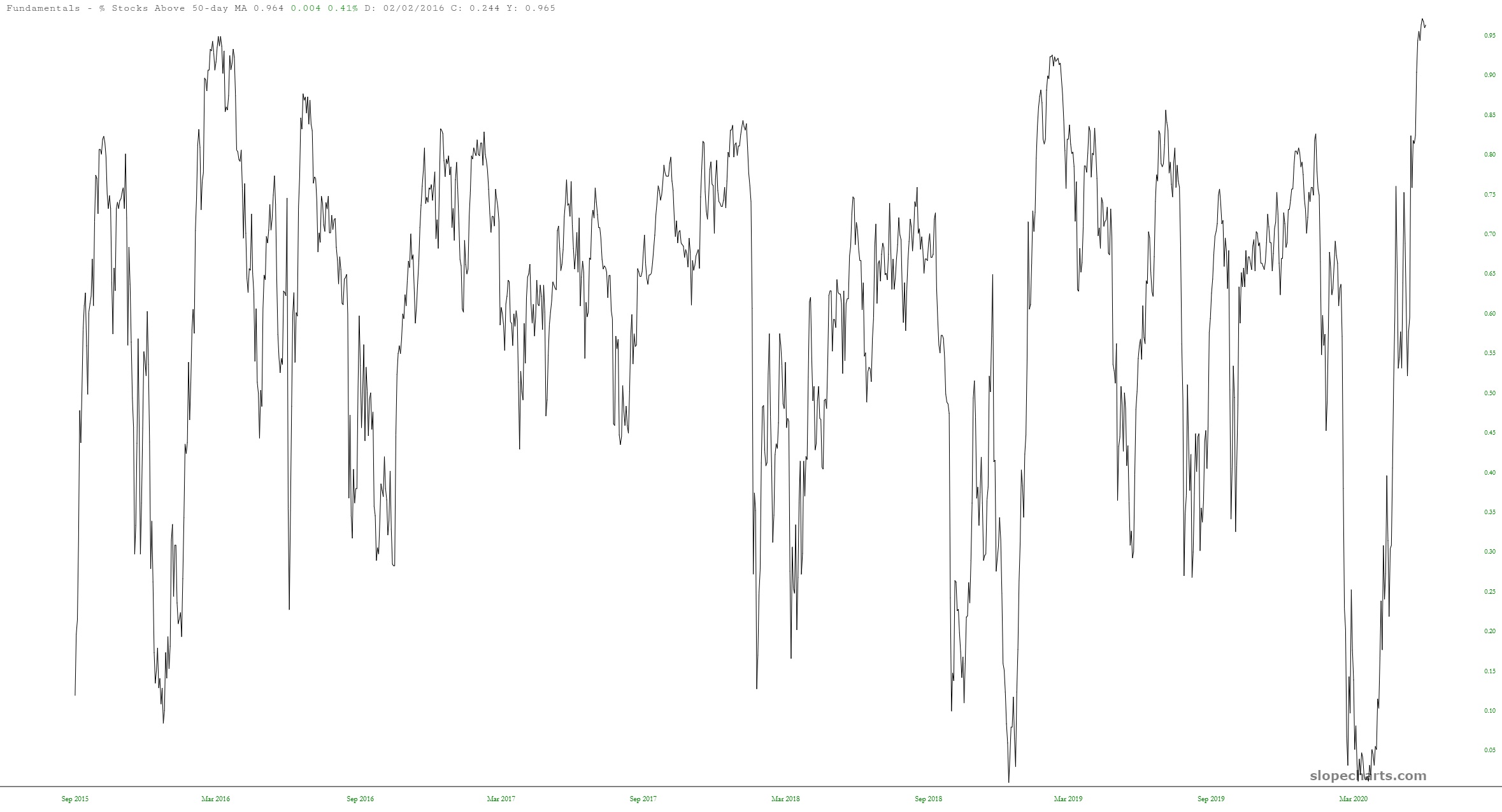
Just to show how “pegged” the market is, look at how SlopeCharts tells us the percentage of stocks that are above their 50- and 100-day moving averages. Just jaw-dropping, people…………