
There are two premium features I used in SlopeCharts to create this post: Custom Symbols and access to the Economic Database. I created a variety of ratio charts, nine of which I found interesting enough to share here. I’m going to show everyone one of them, but the other eight are for paying members only (Bronze, Silver, Gold, or Platinum).
The first ratio chart I wanted to show was the All World index divided by the continuous contract of gold prices. Why on earth would I choose this goofy combination? Simple: because gold is real money, and by representing global equities with real money, it provides a vastly more realistic (indeed, the ONLY realistic) view into what global equities have actually done over the decades.
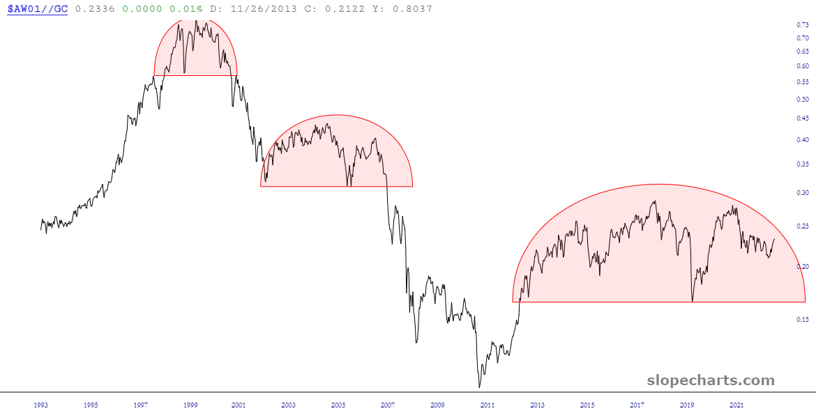
And what can we conclude from this chart? Well, I see three things right away:
- Over the course of the past thirty years, we’ve had three major tops;
- The most recent top is not complete yet (and there’s no guarantee it ever will complete), but it’s vastly bigger than the other two;
- In spite of the huge bull runs of the housing bubble and the everything bubble, these tops were substantially lower than the Internet bubble. In other words, as measured truthfully, the stock market was much more valuable in the year 2000 than it is right now. I’ll say again: the stock market was MUCH (and I mean MUCH) more valuable a quarter century ago. So, yeah, when measured in the toilet paper known as the US dollar, a firm like Nvidia can be in the Trillion Dollar Club, but it doesn’t mean quite as much as you might guess.
For paying folks, let’s check out those other eight charts………….
