Slope of Hope Blog Posts

Slope initially began as a blog, so this is where most of the website’s content resides. Here we have tens of thousands of posts dating back over a decade. These are listed in reverse chronological order. Click on any category icon below to see posts tagged with that particular subject, or click on a word in the category cloud on the right side of the screen for more specific choices.

Afraid Of The Debtmageddon?

By -

131015681518
I borrowed the word from Lee Adler.

Right now it is easy to be afraid and difficult to be objective.  So let’s review the market actions in that light.
SPX came down about 5 points today. Big deal! If there is going to be Debtmageddon , there should be mad selling. What the smart money is doing? Why are they not selling out yet? Once again, let us look at things with objectivity.
Below is the SPX daily chart.
SPX daily 26th july

We are above than where we were one month back.
Shouldn’t there be a sell-off of Bonds, pushing the yields higher?  After all, the AAA ratings are about to go. Look at TNX, the 10 year bond yield indicator
Tnx 26th july

Nope. The yield is still below 3% whereas the 10 year average is 4 %.
I am not a big fan of TA. I think when you torture the data for long; you can make it confess anything. So for each bull case in TA, there is a bear case, all from the same chart. However, let us look at the following hourly chart.

Spx hourly 26th july

It looks like we have kind of a bottom or base.
For me more important is the money flow and I will borrow a chart from Lea Adler of The Wall Street Examiner. This is one indicator I follow amongst many other.

Graphic850

As you can see,  cumulative net money flow is still positive and well above the SPX.  Lee’s chart is “based upon the theory that as cash moves between money market funds and the banking system, there's a relationship between that movement and the movement of stock prices. As you can see, it has correlated well with stock prices over the past couple of years.”


In his latest email newsletter Lee writes as follows:

“It seemed that virtually every market observer expected that event to have a bearish impact. My expectation was that it would not be felt until mid July due to technical factors having to do with the Treasury supply settlement schedule. But over the past month, the indicator shown above began to surge, boosting support for the market just as the Fed was ready to step away.

Hysterical media pundits have been loudly proclaiming that the sky is falling as a result of the approaching US Debtmageddon. The markets, however, are revealing them as the know nothing clowns that they are. In fact, the opposite of their dire predictions has been occurring, with both stocks and bonds remaining resilient. The Treasury market is even rallying today after the uber depressing N'Obama Boner show last night. You gotta laugh.

 The chart above makes clear the reason for this market resiliency. Money has been flooding into the US banking system over the past month. The source is apparently capital flight out of the Eurozone. While I don't track the data at the source of those flows, we know from anecdotal reports that there's been capital flight out of parts of Europe. Other US banking system indicators suggest that this is the source of the surge of cash into US bank accounts. The cash account balances of  US based foreign banks have been surging in recent weeks. So have their trading accounts. Deposits in domestically chartered banks have also surged, but their trading accounts have not. It would appear that that the resiliency in the US equity market has been driven by foreign private buying. The Fed's data shows that foreign central banks have not been a factor. This is coming from the private sector”

For some reason private capital all over the world considers US to be safer than Europe and I suppose they know more than I do. But this is one reason I have not gone short yet.

But I am not blindly long and I may switch sides all of a sudden inter-day and shout “let’s get out”. Follow me on Twitter to get my latest calls.

Once again, make no mistake; these are all part of forming the top. But we do not want to go short when the market is still going up. That is not smart. I talked about 27th July before and we are almost there. For me the most crucial dates  are between 27th of July to 5th of  August. And I willl be watching the market activities closely to see if my calls are still valid. You see, I do not mind bring wrong, but I do not want to be wrong for a long time.

If you like what you are reading, please forward it to your friends. http://bbfinance.blogspot.com/

Chart on FCX (by Mike Paulenoff)

By -

In theory, the commodity mining, producer type names should perform well in an environment of dollar weakness. Such is the case with Freeport-McMoRan Copper & Gold (FCX). FCX is pushing up towards a retest of its prior multi-month rally peak at 56.68 from July 21, which should be hurdled and will trigger upside continuation that projects to 58.00-59.00 next.

At this juncture, only a failure to hurdle 56.68 followed by a decline that breaks 54.80 will compromise the timing of the upside breakout of this very constructive pattern.

Full-2qazLrvcmtKFJPFpvZay
Originally published on MPTrader.com.

Petrobras Swing Trade Opportunity (by Leaf_West)

By -

I have had Petrobras on my radar for a while and it was looking more and more interesting the past couple of weeks.  I know PBR's warts include that it was previously a hedge-fund darling, it has the Brazilian Gov't as its defacto CEO and that it is doing some major league elephant hunting in deep water oil plays (billions of $ to drill).

All that said, I need to take the charts at their face value and to me they are telling me to start a swing trade.  I did so this morning at yesterday's HOD $34.56.  I'm going to keep it small so I can keep it at the front of my brain and add to this trade when it shows me that it is working (i.e., takes out important levels).


Weekly Chart:

PBR_July 26, 2011_Weekly

Weekly charts are always important to review for swing trade candidates … PBR shows a major trend line providing resistance from the 2008 highs where it was at its zenith as a hedge fund darling.

The first test will be to see if PBR can get back up to that level of $36.00ish over the next couple of weeks.  Notice the last time it tested the line back in early 2011 … breaks are often retested.  In that case the break failed and then it performed as it should, it went to the opposite side of the price pattern.  The positive thing from that move is that it didn't seem like it wanted to break-out lower.  When this happens, the subsequent test of the upper trend line can often occur WITHOUT a retest of the new break level (just keep your mind open to a clean break).


Daily Chart:

PBR_July 26, 2011_Daily

The daily chart is telling me that traders should start a swing trade position NOW … we have a nice possible reversal pattern taking place:

  • Momentum divergence … momentum made a higher low (point 2 vs point 1) while price was making a lower low ($31.55 vs $32.61)
  • a clean break of a significant trend line (3-month daily trend line)
  • a successful retest of the low price of this trend … higher low ($32.11 vs $31.55)
  • 3rd-Push of the 3-Push Pattern made on the successful retest
  • Swing high of trend line break is taken out ($34.25) on a strong price thrust higher (i.e., "kick-off" move)

Price is nearing the next significant swing high level of $35.08 … getting above this level and "accepting" it will trigger me to add to my swing trade.


15-Minute Chart:

PBR_July 26, 2011_15min

The 15-minute chart shows more clearly the "kick-off" thrust that PBR had when it moved/reversed off its lows.  A nice consolidation pattern (rectangle) confirmed the direction of the move when it broke through the high

All-in-all PBR has all the things I like to see in a potential swing trade …. obviously all trades can have heat and/or fail, but to me this has good potential. Cheers … Leaf_West

Uncommon Indicators, Same Results (By Goatmug)

By -

I found an interesting video on CNBC (yes, all fluff and they try to make all things positive).  The CNBC gang interviews Nick Colas who tracks internet searches on Google to attempt to find trends that might indicate where companies and the economy are going.

Clearly everything in the economy is not roses as he responded several times, "that's a tough one" meaning that because the search term was showing up more and more that didn't mean that things were getting better.  Essentially this interview highlights one of my issues with the CNBC hosts, they enter into the interview with the thought that these indicators are to reveal bullish information, hence the panelist is in a position to defend the data and almost apologize if the data is negative.  Truthfully, it isn't hard to figure it out, you just examine the results, question it, and then accept it.


Here are the search trends he follows;

GOOGLE SEARCHES FOR HOME BUYING - I get this one, I hadn't thought about that.  I would state though that I'm hearing more and more complaints from realtors and mortgage lenders that they can't get buyers that can get financing.  In my city this is really blowing up potential deals and causing slow sales. 

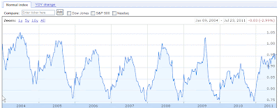
SEARCHES FOR USED CARS  – He doesn't share with us the numbers for used cars, but this would be useful to see if folks are going to try to buy new cars or buying used.  I keep hearing lots of optimism from the auto industry about their growth prospects and how things have changed.  I wanted to examine these indicators for myself and so I used the Google Automotive Search Index results as a high level "smell" test.  Interestingly the index values show a couple of striking things.  First, we are currently at a level that is much higher than last year, which was horrible.  This is wonderful and you can see how the executives at the manufacturers are excited that things are looking up.  Despite the good news, we see that this is also a level that is similar to 2007, which wasn't exactly awesome.  On top of that you must account for a growing number of searches as people are using media and search more, much more than they did 4 years ago, so this too should make us pause a little.  Finally, we have just exited the typical peak point in sales and searches in terms of seasonality. 

Last week I posted a chart on GM, I'm not getting long anytime soon. – GM CHART FROM 7/22/11.  Take a look at the Google Search Index for Autos below.

SEARCHES FOR GUNS

I'm not exactly sure that guns are a great indicator of improving financial health as Nick tried to spin this.  His angle is that guns are a $300 to $500 durable good like a washing machine or refrigerator.  Somehow I'm not thinking that gun searches are a marker that citizens feel confidence in an improving economy.  I believe that folks feel like the system is breaking down and the government cannot protect them.  Perhaps folks aren't looking to prepare for Mad Max times, but their search for the best gun for them may mean that they are concerned about the increasing risk of break-ins and their security.  Oh yes, if you are in the market for guns you might consider the Mossberg 500 or 590 and the Glock 23 as a starting point in your research.

SILVER AND GOLD -

We've discussed this at great length, people across the world are buying gold and silver as the un-currency and as an inflation hedge.  If "investors" are looking to buy gold and silver, they don't have a lot of confidence in traditional investments. 

FOOD STAMPS –

The Goatmug Blog tracks food stamp usage every month, but I like the idea of watching these trends to see how many searches are being performed in real time. This approach may give us insight into what numbers will look like several months in advance.  Regular readers know that we report these dismal figures in the monthly update and last month's figures show that almost 45 million people are on the roles and as the panelist described one in five families receive food stamps.  How disgusting! 

GOOGLE TRENDS

If you have a desire to check out some of these you can look at Google Trends to examine word searches and also you can use this link in Google Finance – http://www.google.com/finance?q=GOOGLEINDEX_US:AUTO=

I did searches for durable goods and other items and many of the results show how poor the us consumer is right now in terms of discretionary spending.  Durable goods searches are at 7 years lows, but it is beginning to tick up compared to last year's horrible totals in year over year trend!  Wow! 

At the end of the day I like this approach it may give us a view of coming changes in trend in a real time format.  At least Google's spying is good for something right?  Please stop by the blog as we're updating posts everyday now. – www.goatmug.blogspot.com