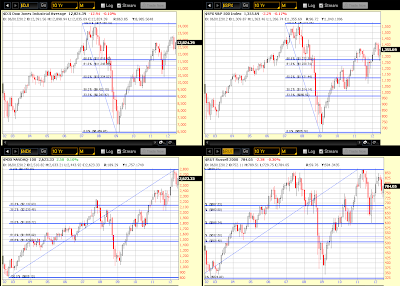
After Wednesday's FOMC interest rate announcement, press release, projections, and Q&A period with Mr. Bernanke, I decided to look at four different timeframes of the Dow 30, S&P 500, Nasdaq 100, and Russell 2000 Indices to see where they're trading at relative to each timeframe and in terms of relative strength/weakness to each other.
Each candle on the first chartgrid below represents a period of one year and the period begins in 1992. I've drawn a Fibonacci retracement on each one which begins in 2007 for the Dow and S&P, and 2002 for the Nasdaq and Russell (I didn't want to include the high of 2000 on the Nasdaq as that would distort the results of this exercise, so I chose the high and low of each of the four indices from 2002 to the present). You will notice on the Fibonacci drawing that I've shown some of the levels in bold and others in a thinner line thickness…the bold lines are the high and low, the 50% level, and non-traditional 33.3% and 66.6% levels…the thinner lines are the 38.2% and 61.8% levels. You'll see the purpose of the 33.3 and 66.6% levels in a minute.
All four indices are trading in the upper 1/3 of their respective Fibonacci range. In terms of relative strength and weakness within this 1/3 zone, the Nasdaq is the strongest, followed by the Russell, then the Dow, and finally the S&P. In terms of candle strength for the current 2012 candle (where price is trading relative to the 2012 candle high and low), the Nasdaq is the strongest, followed by the S&P, the Dow, and the Russell. The only one not trading above its current candle mid-point is the Russell. There is little resistance above current price for all four indices on this Yearly timeframe.
Each candle on the next chartgrid represents a period of one-quarter of one year and the period begins in 2002. You'll see the same set of Fibonacci drawings on each chart. Looking at this ten year period, the Nasdaq is trading the highest, followed by the Russell, then the Dow, and finally the S&P. Looking at the current candle and the prior one, price is currently in roughly the upper one-third of the 2012 Q1 candle on the Dow, S&P, and Nasdaq, and roughly in the middle on the Russell. There is little candle resistance above current price for the Nasdaq, but a bit more candle resistance on the Dow, the S&P, and the most candle resistance on the Russell on this timeframe.
Each candle on the next chartgrid represents a period of one month. The monthly uptrend is still intact on the Dow, S&P, and the Nasdaq, but the Russell has made a lower high. Price is moving up on all four indices after retesting the prior month's low. There is little candle resistance above current price for the Nasdaq, but a bit more candle resistance on the Dow, the S&P, and the most candle resistance on the Russell on this timeframe.
Each candle on the last chartgrid represents a period of one week. I've added another level on the Fibonacci drawing…the halfway level between the high and the top 1/3 level…I wanted to see where each was trading relative to this mid-way point in terms of relative strength to each other on a weekly basis. Using this point of reference, the Nasdaq is the strongest, followed by the Russell, then the Dow, and finally the S&P. In terms of candle resistance, the Nasdaq has the least, followed by the Dow, then the S&P, and finally the Russell on this timeframe.
In summary, in terms of what is the most attractive in terms of which offers the overall least resistance to upside movement, the Nasdaq 100 would be first, but it is also trading at the highest in terms of current value…so, you'd be paying a higher premium to buy Nasdaq stocks at the current level…next in line would be the Dow 30 stocks with less of a premium on value, followed by the S&P 500 stocks (with even less premium on value), and finally the Russell 2000 stocks (with the cheapest premium on value). The first index to be affected by increasing volatility and rising uncertainty in the markets would be the Russell 2000, so it's worth keeping an eye on it on these timeframes to see how it trades against the other three indices as the "canary in the coal mine."
It seems that the biggest impediment to further upside movement with conviction at the moment is the slowing economic growth in other world countries, particularly in Europe, as well as in China, Australia, and also, more recently, the U.S. and Canada (as well as potentially problematic financial stability). We may well see range trading continue within the upper 1/3 Fibonacci level for awhile until world governments implement combined fiscal, economic, and financial policies that will instill confidence in serious investment in the markets, as well as provide support for real growth in GDP, employment, and a reduction in the threat of deflation.
If these indices drop below the 50% Fibonacci level, that would be a cause for major concern…a drop into the lower 1/3 level could be catastrophic, causing compounding problems for many years to come…this underscores the need for real policy action by world governments sooner rather than later, as "later" may be too late since problems increase/compound in intensity and impact the longer they're left unresolved.


