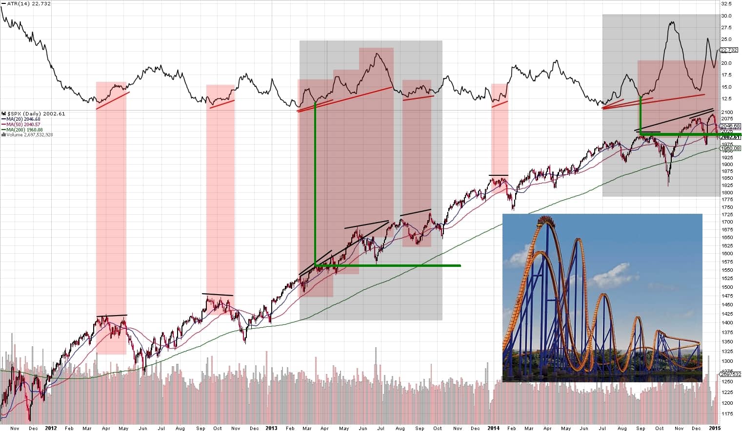
Hey folks, just wanted to share an observation I made today and my hypothesis that the market is at an adjustment point and working out where it’s going to go next. I share one single chart for your viewing enjoyment (click for larger view).

Slope initially began as a blog, so this is where most of the website’s content resides. Here we have tens of thousands of posts dating back over a decade. These are listed in reverse chronological order. Click on any category icon below to see posts tagged with that particular subject, or click on a word in the category cloud on the right side of the screen for more specific choices.
Hey folks, just wanted to share an observation I made today and my hypothesis that the market is at an adjustment point and working out where it’s going to go next. I share one single chart for your viewing enjoyment (click for larger view).
From time to time, I have offered up posts about the insanely-skyrocketing prices of homes here in my fair city (one of the few long-term “long” positions from which I have ever benefited). Now we have jumped the shark, as today’s morning paper reveals:

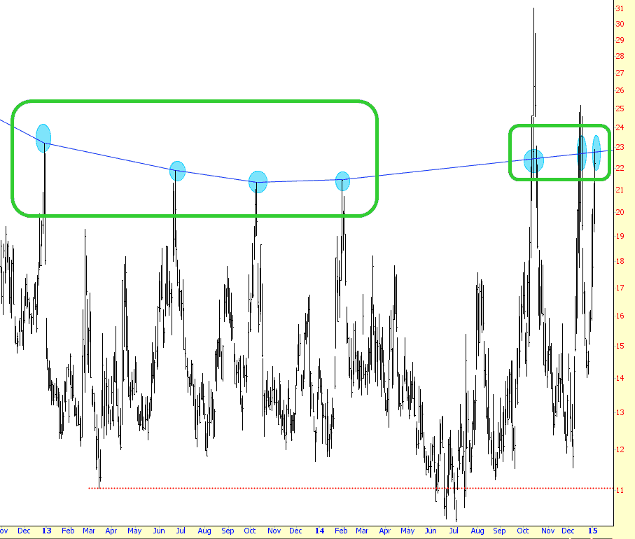
Here’s my chart of the VIX. I’ve put a blue dot at the peak of each spike. One thing is clear: the kind of market I enjoy (panic, mayhem, chaos) is going to be happening with more frequency than in the past, as illustrated by the rounded rectangles.
Times are changing, folks. The forces of evil (Yellen) will succumb to the forces of light and goodness (Slopers). Lay waste to the darkness. There will be blood.
With price approaching a major support level at 0.600 on this 3-year Daily ratio chart of the SPX vs SSEC (and diverging RSI), and with price essentially vertical on the 3-year Daily chart of the SSEC (and diverging RSI, MACD and Stochastics indicators), I’d say that we’re close to a blow-off top on China’s Shanghai Index. (more…)
